Grafana vs. Power BI vs SquaredUp
You’re part of a data-driven engineering team. You have a rich, complex, and dynamic set of tools but you’re struggling to discover and share insights from all that data. So, you're looking for a platform that will help unify it all.
Naturally, you want to compare Grafana vs. Power BI - the big names. Plus, there's a new player on the block - SquaredUp.
What problems are you trying to solve?
Before you choose a tool, you need to know exactly what problems you're trying to solve. Here are some of the most common data issues faced by engineers.
Although you hold ownership of your engineering tools, there is no simple way of visualizing and sharing all your tools’ data with the wider business. Maybe those tools don’t come with native dashboarding, or you simply don’t want to share access to them across the business to share reports and analytics.
Do any of these scenarios sound familiar?
- Your SREs and monitoring functions need to measure SLOs across multiple tools and teams.
- Your incident response team needs visibility of dependencies so they can rapidly spot the source of an issue rather than pull everyone off work for a ‘war room’.
- Your DevOps engineers need to constantly monitor their CI/CD pipelines so deployment to production doesn’t stop, but their tools don’t have monitoring baked in.
- Your platform and cloud teams need to report on total costs across multiple platforms
- Your Dev or Engineering lead needs to report on DORA (DevOps Research and Assessments) metrics through your dev tooling.
- Your managers are asking for insights into your KPIs and how they sit in the context of the wider business goals
But achieving this is difficult with your current set up and the limitations of the tools themselves. You need a dozen logins to multiple tools, which also means you need to know how to use them all. And then the data remains siloed so you can’t correlate the information.
So, you’re checking out the best options available: Grafana, Power BI… SquaredUp?
Here's your comparison of Grafana vs. Power BI vs. SquaredUp so you can see their strengths, weaknesses, and best use cases.
What is Power BI and what is it best for?
Power BI is a business intelligence and analytics platform, built by Microsoft, that is ideal for wider, non-technical business users and use by business data analysts. It has a familiar Microsoft user interface that makes it easier to use across a wide range of business functions.
Power BI connects to Microsoft products and supports a range of databases, like Oracle, MySQL, IBM DB2, SAP Hana, SQL Server, and more. You can also import data from files, Azure storages, and Salesforce reports, among others. Plus, the data can be filtered and sliced in many ways to explore the data further and you can add annotations to bring context. This gives you a huge breadth of insight across diverse functions in your organization. You can even set up alerts, though only within Power BI or send them to email.
In short, Power BI is best for business intelligence and analytics and ease of use. It can provide powerful insights into your business data and you have a lot of analytics capabilities to glean insights from across the business, from Finance to HR, and Sales to Marketing.
Power BI weaknesses
A weakness of Power BI is that there are not many engineering data sources - like Datadog, SolarWinds, Elasticsearch, Jira, etc. - that it connects with. So, you will be limited on what you can analyze in that arena unless you’ve already extracted your tools’ data into a database. It also requires a lot of data toil to make data BI-ready. Plus, there isn’t the ability to map your dependencies across tools to understand where an issue might be stemming from.
What is Grafana and what is it best for?
Grafana is a popular visualization platform for time series data, particularly in environments with heavy container monitoring (mostly Prometheus). Grafana is available as a free, open-source platform or you can choose a managed, cloud option.
Grafana has 30+ data sources you can connect to and a multitude of plugins that let you visualize infrastructure, application, and networks, etc. There is built-in support for time series databases like Graphite, Prometheus, Influx DB, and more. Plus, you can add in some alerting that integrates with familiar tools like Slack, PagerDuty, and Webhook events. Grafana even lets you query and combine different data sources in one visualization. You can then filter your data and add helpful annotations.
Grafana is best for visualizing KPIs related to time series data important to DevOps and NOC teams.
Grafana weaknesses
A weakness of Grafana for engineering teams is the lack of plugins to key engineering platforms, like SolarWinds, Nagios, Pendo, and others. Plus, there's the inability to roll up the data into higher-level dashboards for stakeholder overviews. You have to share all the details. You also end up with dashboard sprawl as dashboards remain disconnected from each other, so it lacks the context and relationships of the data. Plus, you can’t map infrastructure and application dependencies to help with finding the root causes of issues.
What is SquaredUp and what is it best for?
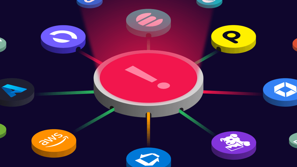
SquaredUp is a new unified visualization and analytics platform for data-driven engineering teams. It pulls data from your APM, observability, database, cloud, CI/CD, and infrastructure tools, and more, into one place so you can visualize it all and visually map and model relationships, like dependencies, among the data.
SquaredUp is more than just a visualization layer. SquaredUp sits on a data mesh architecture. This means that it doesn’t store any data – the data remains in the tool you’re monitoring. SquaredUp’s data mesh architecture creates a data virtualization layer that lets you pull data on demand, in real-time, and correlates the data across the source tools. That then allows you to monitor the data as though it were all stored in one place.
SquaredUp is best for real-time observability of any data across all your IT tools, using its 50+ plugins. Its power is in being able to correlate your data across all your tools so you can report on it live and spot issues before they become business problems.
SquaredUp weaknesses
You won’t find a lot of the mainstream BI plugins for Finance, HR, and CRMs, for example, in SquaredUp, so it won’t work well for business-wide BI. This is a platform tailored to IT engineering teams.
Feature comparison: Grafana vs. Power BI vs. SquaredUp
| Features | SquaredUp | Power BI | Grafana |
|---|---|---|---|
| Dashboarding and visualizations | ☑️ | ☑️ | ☑️ |
| Out-of-the-box dashboards | ☑️ | ☑️ | ☑️ |
| Supports a range of databases and data sources | ☑️ APM, observability, CI/CD, cloud... | ☑️ Finance, CRM, Marketing, HR... | ☑️ Containers, time series data... |
| Scales for extremely large-scale data environments | ☑️ | ☑️ | ☑️ |
| Combine data from multiple sources into one visualization | ☑️ | ~ | ☑️ |
| Send alerts to Slack, Teams, or ServiceNow | ☑️ | x | ☑️ |
| Method of storing/accessing data | Data mesh architecture (virtualized data layer) to correlate and map dependencies | Databases, live, or loaded with an ETL | Pulls in data on demand |
| Rolled-up dashboards for high-level oversight | ☑️ | ☑️ | x |
| Map and model object relationships | ☑️ | x | x |
The IT engineering team’s best solution
Grafana and Power BI are incredibly powerful tools and have huge user bases for a reason. But when it comes to catering to engineering teams, some of the most important plugins and capabilities are missing. SquaredUp has the missing pieces to create an observability portal specifically for engineering teams.
SquaredUp gives you 5 key functions for your unified engineering data:
- Unified search – real-time search across any data and metadata within your tools in SquaredUp with a preview of the data in a visualization as you search
- Unified analytics – lightweight SQL query engine on top of data so you can shape the data as needed before presenting it.
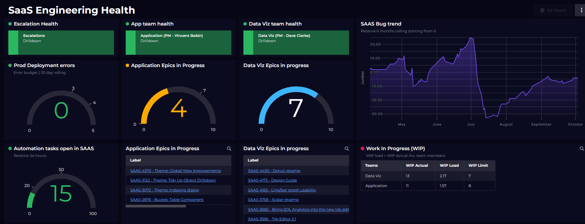
- Unified dashboards – visualize any data in real-time by connecting your tools with the 50+ SquaredUp plugins. You can unify data from multiple tools into one visualization with SQL query too.
- Unified monitoring – monitor the data in real-time and surface monitoring information to identify problems before they become business issues
- Unified roll-up – dependency mapping allows you to roll up data and statuses to higher levels so you can present data contextually for stakeholders
Without these capabilities, you have static data that you report on and react to retrospectively, you still can’t rollup the data and statuses to share with your managers, and your data isn’t correlated across tools or dependencies modelled. Let's fix that.
Why Arup chose SquaredUp
over Power BI
Arup, the design and architecture firm behind landmark projects like the Sydney Opera House, chose SquaredUp over Power BI.
Read their story to learn why.

Power BI is quite limited in how you spin up and deploy dashboards. You couldn’t get a direct plugin to AWS or Azure – you had to write a Python script. But management didn’t have permissions to view that Python script and there were only three of us who could rerun that script.
Tish Richardson, DevOps Engineer, Arup
Find out more about the SquaredUp observability portal:
Related content
Dashboard Story