Building amazing SLA availability dashboards
I was working with a customer recently, let’s call him Graham, who was completely new to SquaredUp and had an interesting use-case.
Whilst Graham was loving features like Visual Application Discovery & Analysis (VADA) his first priority was, as is so often the case, to deliver specifically what his boss was asking for.
In Graham’s case, his boss wanted dashboards which clearly showed the availability of key services and applications, which could then be easily accessible throughout the organisation. Of course, being a large organisation, the requirement wasn’t simply for one or two dashboards, but for many of them. What’s more, his boss wanted those to show both the overall availability of the application / services, and the availability of individual components making up the application.
Luckily, thanks to the power of Total Dashboard Architecture, this is extremely straightforward.
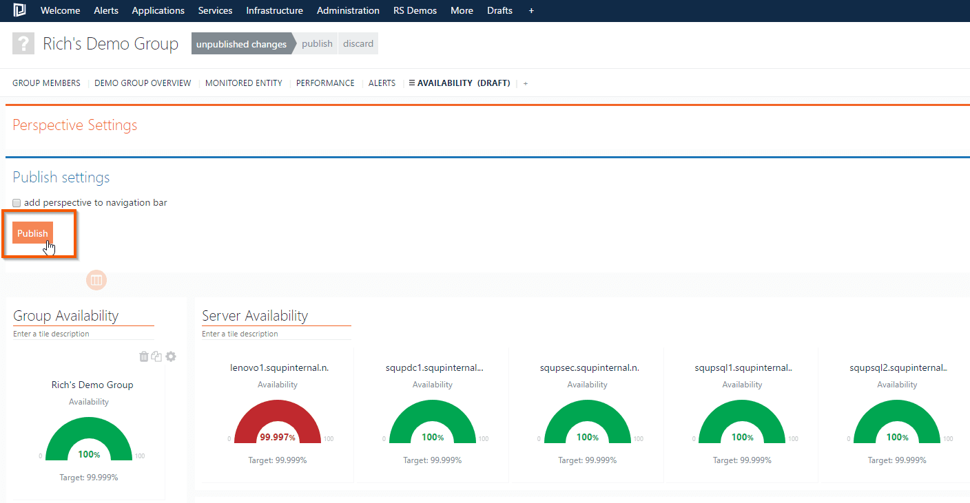
Let’s look at the finished result first and then I’ll walk you through the process of how I created this view for every single Group in our environment in less than 5 minutes!
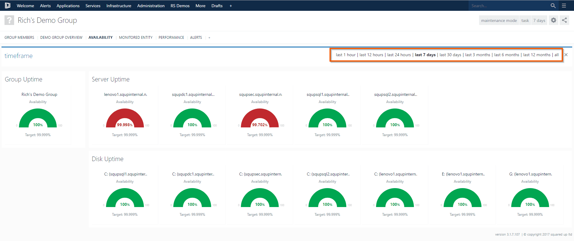
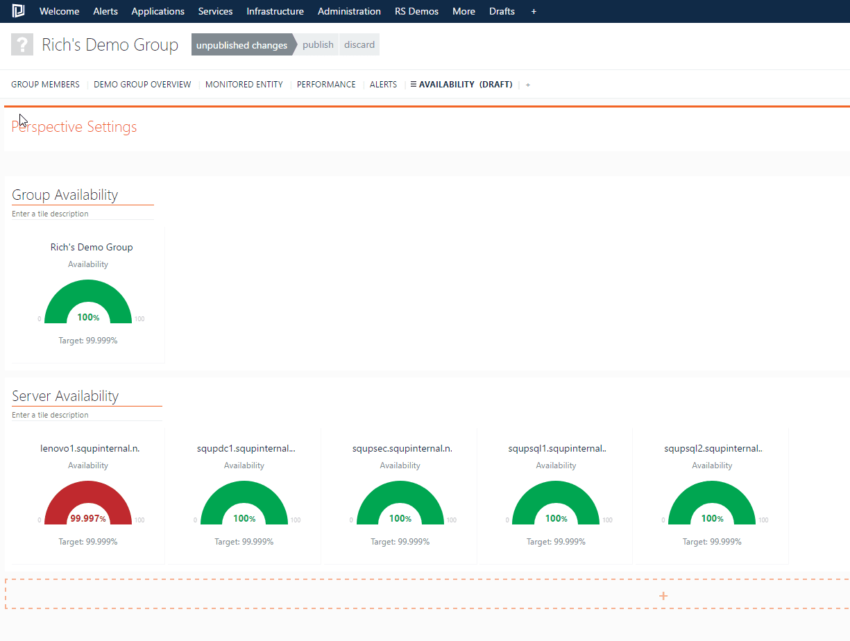
What we see below is a Perspective on my ‘Demo Group’, showing the uptime / availability of;
- the overall Group
- the Servers that are members of that Group
- the Disks hosted on those Servers
By default, we’re showing availability for the last 12 hours but, because there’s a page-level time frame, we can easily change that to look at availability over the last 1 hour, 24 hours, 7 days, 30 days, 3 months, 6 months or 12 months, that’s all just a click away.

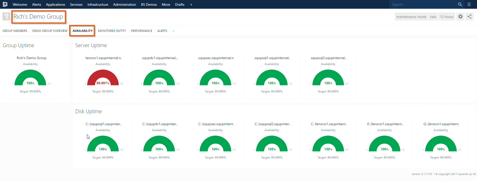
What’s more, as said, this isn’t just for my Demo Group, I’ve been able to make this available for every Group in my environment with no extra effort.
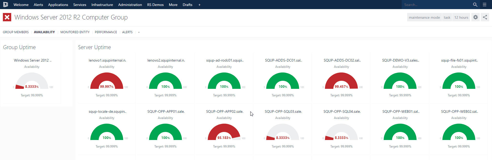
Here, for example, is the same view for our Windows Server 2012 R2 Computer Group (this Group is much larger so the rest of the view is cut-off in the screenshot below, but you get the idea…)
So, how did I build this? Easy! Let me walk you through it from scratch.
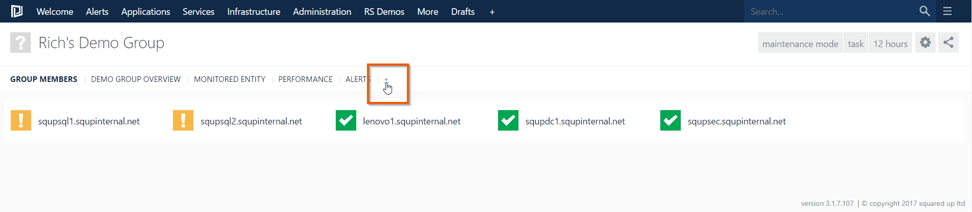
The first thing I did was drilldown to my Demo Group and look for the little + button to create a new Perspective.
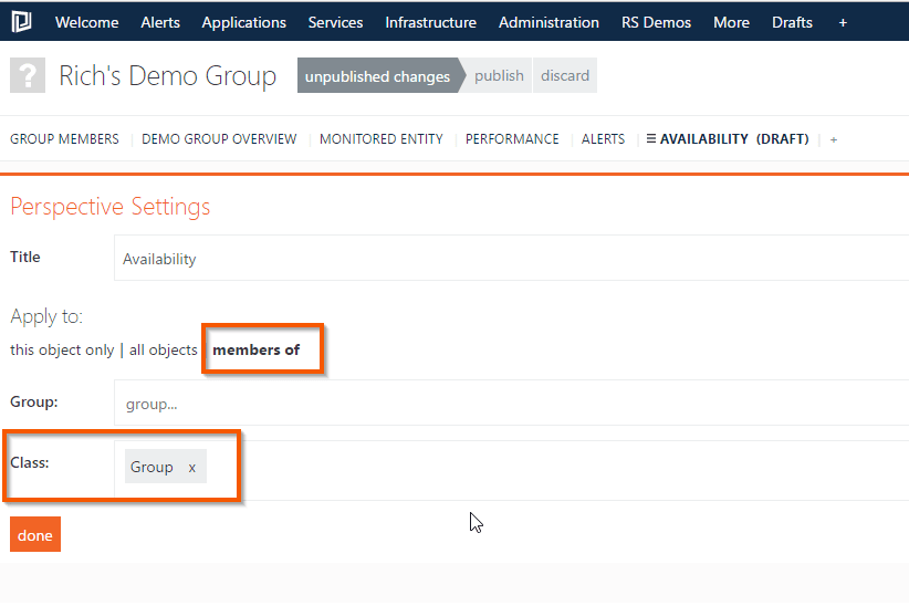
Because I want the new ‘Availability’ view I’m building to apply to all my groups and not just to my Demo Group, I’m going to target this Perspective at all members of the SCOM Class of ‘Group’
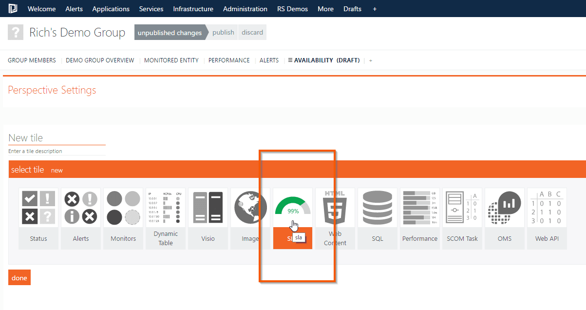
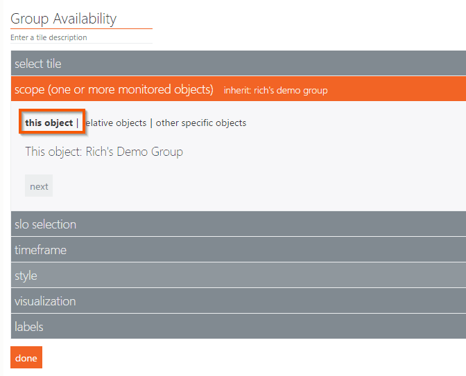
Next up, I’m going to start building out my view using the SLA Tile.
Because I want my first section to show the overall availability of the Group, I’m going to scope this section to just ‘This Object’, namely the Group itself.
Next I’m going to choose my SLO (Service Level Objective) from SCOM. For the purposes of this demo, I’m going to use a generic General / Uptime SLO, and I’ll use that for all sections.
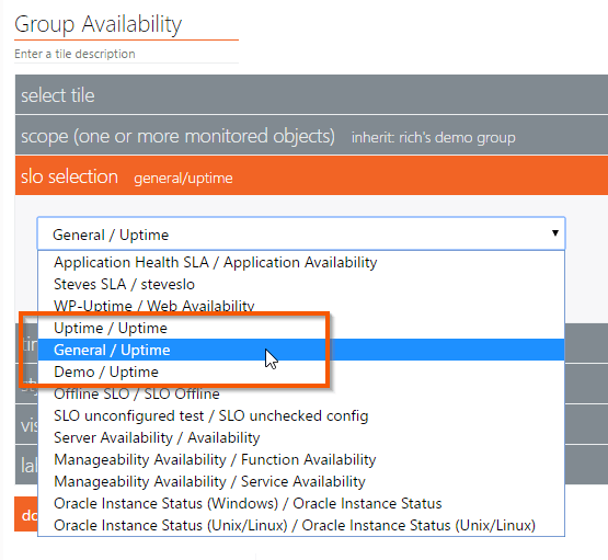
Note: In a real-world context, you’ll probably want to use something more specific and / or different for the respective Objects. For example, for the servers, using an SLO which only registers downtime if the server is unreachable - and not if it simply has a critical alert against it.
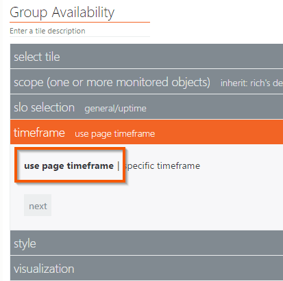
Next, because I want to be able to easily adjust the timeframe whenever I look at this view (as shown above) I’m going to set the section to ‘use page timeframe’ and I’ll do that for all subsequent sections.
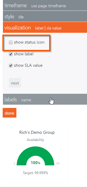
For style, I’m going to choose our larger-style dials and for the visualization options, I’m going to remove the status icon as I’m not interested in the current status of the object in this particular view, only in the availability against the SLOs (although this is by no means a requirement).
Ok, that’s the overall Group availability done, next it’s on to the availability of the Servers within the Group.
For the most part, building this section is exactly the same as above, so I’m only going to walk you through the parts that are different.
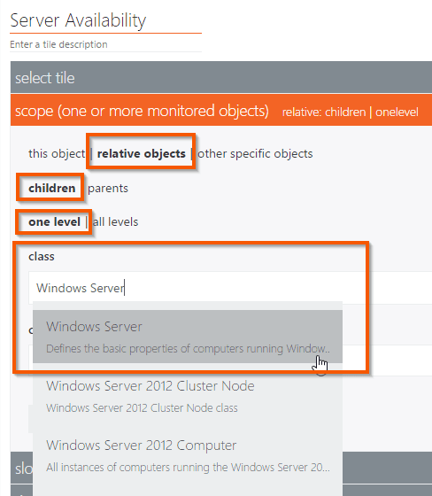
The key difference is in the scoping of the section. Here, I want to show not the overall Group itself, but members of the Group, so I’m going to scope to ‘Relative Objects’, ‘Children’ and to ‘One Level’ (as the Servers are hosted immediately below the Group in the SCOM object hierarchy). Lastly, because all my Servers are Windows Servers, I’m going to scope to the Class ‘Windows Server’
For the purposes of this walk-through, I’ve deliberately made my examples very generalised, but this can be done on a very specific basis if needs be - whatever meets your actual requirements.
The other settings are the same as covered above, so that’s that section done.
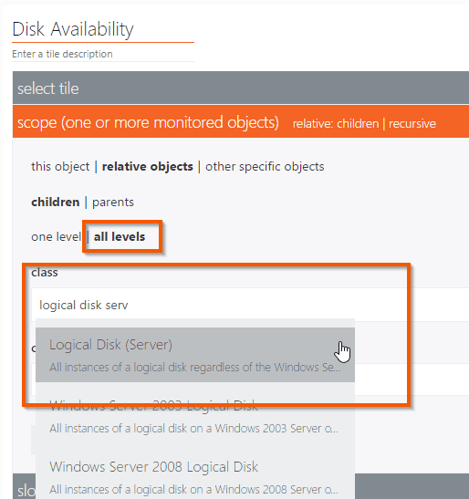
Lastly, I want to add the availability of each of the Disks on the Servers within the Group. Again, this is designed as a generic example, we might just as easily be showing, say, the availability of each individual databases hosted on our SQL servers.
As in the previous example, the scoping is key, but it’s just as straightforward as before.
Because the disks aren’t hosted on the Group, but on the servers which are themselves hosted on the Group, I still need to scope to ‘Relative Objects’ and ‘Children’ but this time to ‘All Levels’. I can then scope the section to the Class, ‘Logical Disk (Server)’.
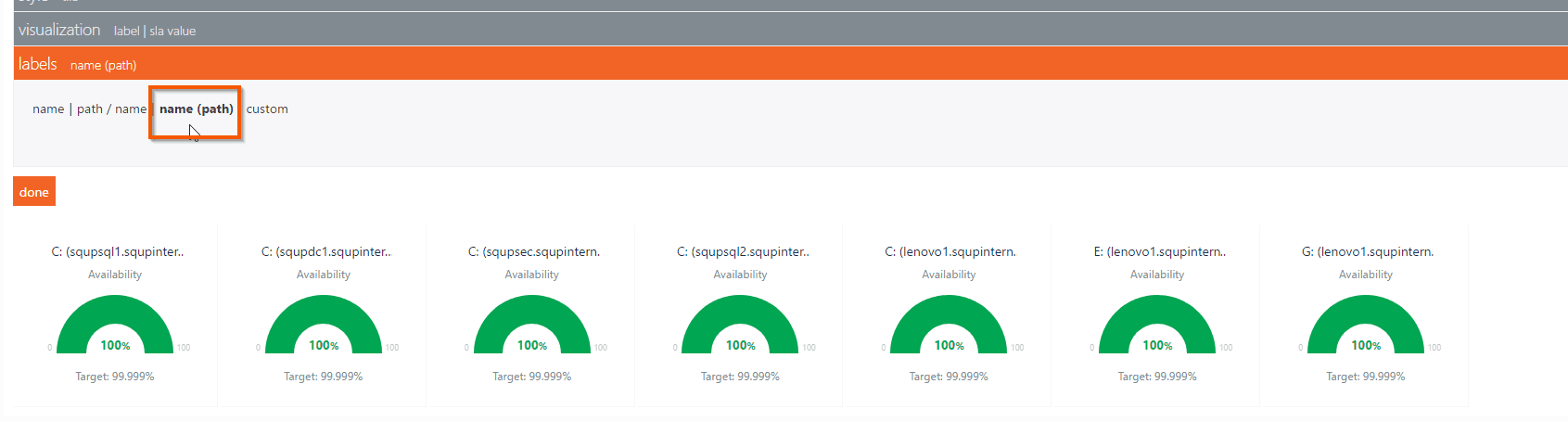
The only difference in the rest of the settings is that I’m going to tweak the labels option so I get a more helpful display option than the default display.
Lastly, I’m going to use the drag and drop functionality of the Dashboard Designer to tidy things up and hit publish.
Now, the really cool part is that because I’ve done this as a Perspective, rather than a Dashboard, this hasn’t just built for my Demo Group, it’s done for all my Groups, with no extra effort.
This now means that whenever I look at any Group, I can get to an availability reporting showing the uptime of the overall Group, of its Servers and of their Disks, all for multiple timeframes.
Now, I know I’m biased, but that strikes me as pretty damn powerful!
I’ve taken my time to walk you through things as carefully and in as much details as possible, but this whole process takes literally just a few minutes ?