
Ruben Zimmermann
Infrastructure Architect, SIG

In the last blog post, I walked you through how to connect to the Microsoft Graph API so you can start pulling in the M365 analytics to create a dashboard in SquaredUp. In this blog post, I’ll walk you through exactly how to create this dashboard.
I'm using the new SquaredUp Dashboard Server - download it for free!
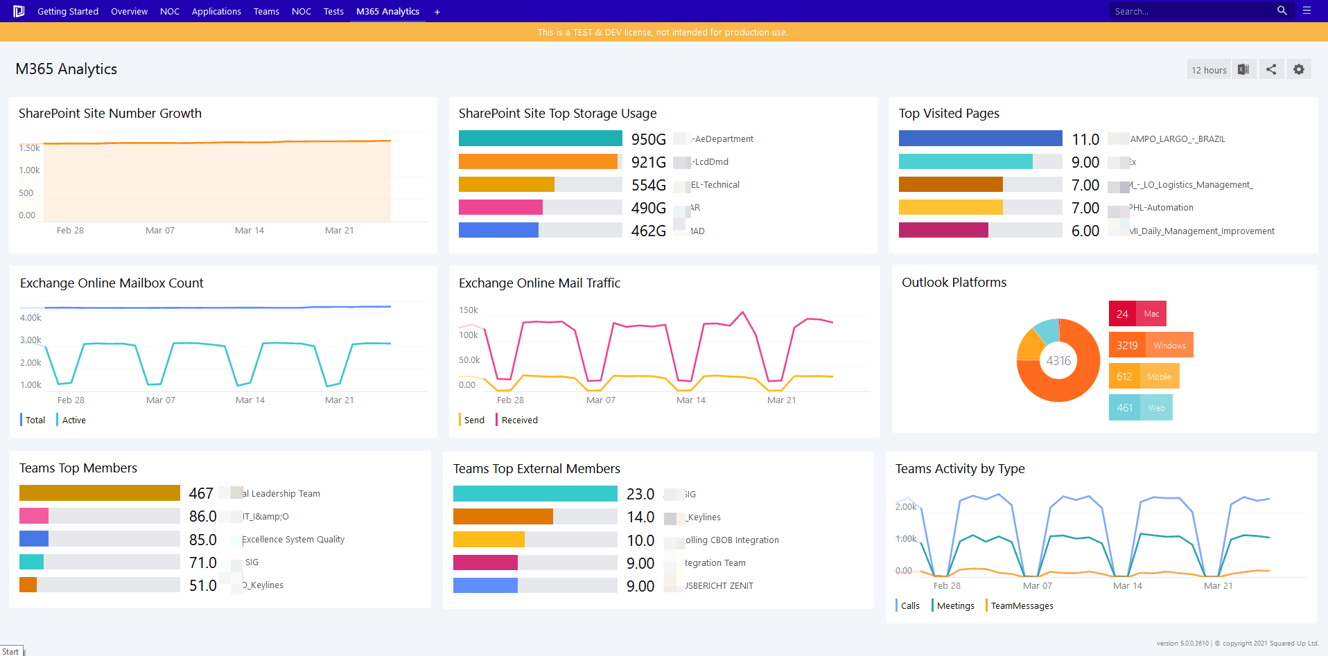
This dashboard will allow you to monitor key metrics for Microsoft 365 SharePoint, Exchange Online, and Teams so you can be proactive in assigning storage.
You’ve already set up the app registration and Web API provider, so you can start building your dashboard.
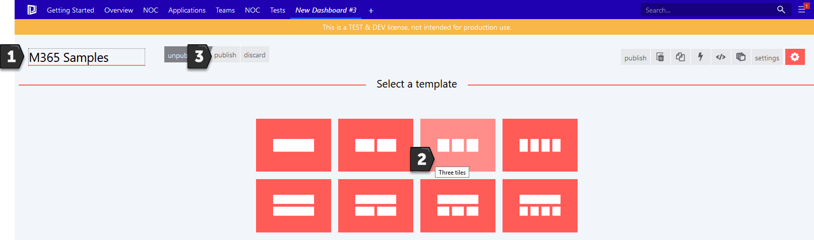
To create a new dashboard in SquaredUp that displays information about Exchange Online, OneDrive, SharePoint, and Teams, click the + button, name the dashboard – this one here is called M365 Samples, pick the Three Tiles template, and click Publish.
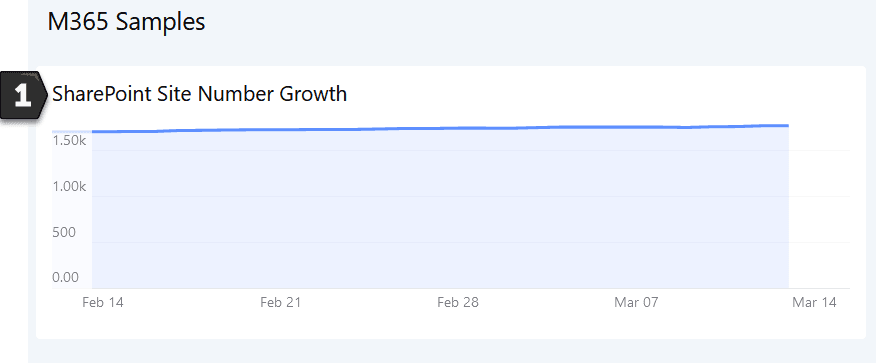
The first visualization we’ll set up is to monitor SharePoint Online. We want to visualize the site number growth as a line graph so we can manage storage.
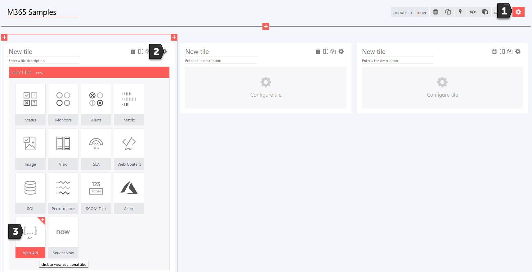
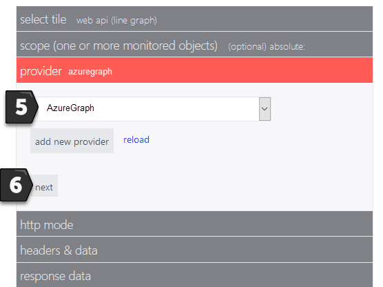
To set this up, hit the gear icon in the top right of the window to edit the board, select the left-most space and hit the gear icon there. In the Tile selection, choose Web API.
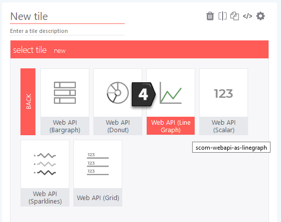
Select the Web API (Line Graph).
Choose AzureGraph as provider and click on Next.
In the http mode, keep get and paste the following URL and continue with next:
reports/getSharePointSiteUsageSiteCounts(period='D30')?&format=application/json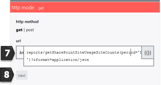
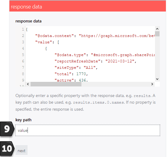
For the response data, specify the key path and type value and proceed with next.
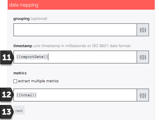
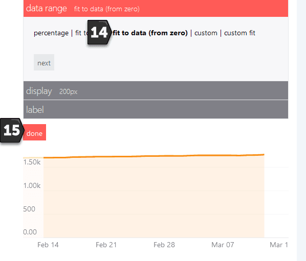
In the data mapping section, type {{reportDate}} for timestamp and {{total}} for the metrics and select next.
For the data range, select fit to data (from zero) and complete with done.
Last, type a header like ‘SharePoint Site Number Growth’ so anyone looking at the dashboard immediately knows what is being displayed.
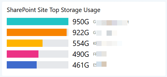
So that we can see exactly which sites are using the most storage, the second visualization we will create is a bar graph visualizing top five sites by storage usage.
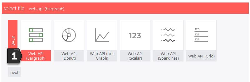
Hit the gear to edit the board, select the middle space and hit the gear there. In the tile choose Web API (Bar graph).
Choose AzureGraph as the provider and specify the following URL within the http mode (get).
reports/getSharePointSiteUsageDetail(period='D7')?$format=application/json&$top=5000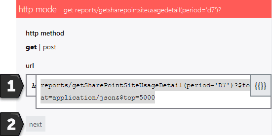
In the response data, specify value as the key path and proceed with the data mapping part.
Here, in grouping specify {{siteUrl}} and for the metrics, specify {{storageUsedInBytes}}.
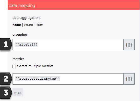
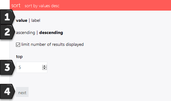
Within the sort section, sort by value, descending, and limit the result to 5.
Then, in the label section, choose custom and type in:
{{properties.siteUrl.replace(https://yourtenantname.sharepoint.com/sites/,““)}}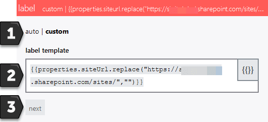
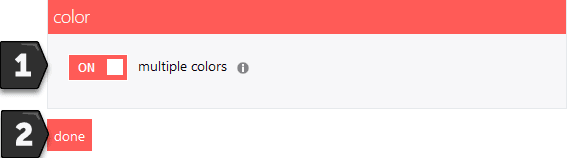
Last, enable multiple colors and finish with done.
All that’s left is to choose a descriptive header like “SharePoint Site Top Storage Usage”.
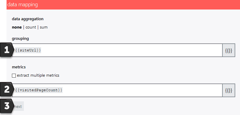
Next, we want to visualize the top five most visited pages in SharePoint Online.
Hit the gear to edit the board, select the right space and hit the gear there. In the tile choose Web API (Bargraph)
Follow exactly the same steps as you did for creating the previous SharePoint bar graph visualization, except for the data mapping part. There, specify {{siteUrl}} for grouping and {{visitedPageCount}} for the metrics.
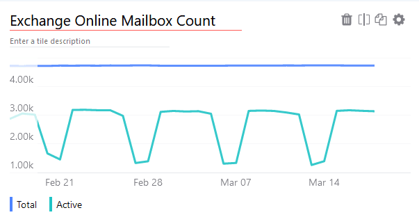
Now we can build some visualizations for M365 Exchange Online. First up is the mailbox count as a line graph showing both the total count and the number of active mailboxes.
Add a second row of tiles in your dashboard and start with the left one. Click the gear, select Web API (Line Graph) and specify the following URL:
reports/getMailboxUsageMailboxCounts(period='D30')?$format=application/json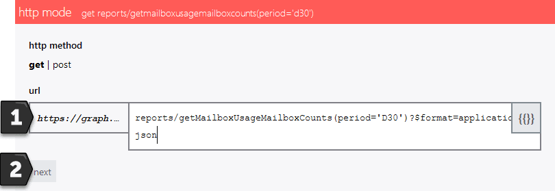
Keep next screens as above and keep the data mapping as {{reportDate}} for the timestamp value and for the metrics {{total}} and {{active}}. Proceed with Next.
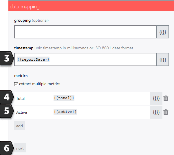
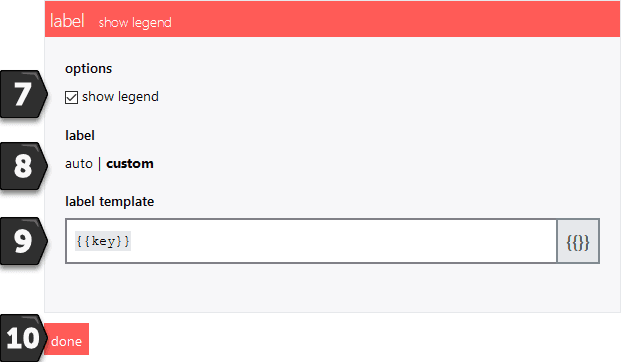
Finish the tile by checking show legend, chose a custom label, and pick {{key}} as the template.
Add a header like Exchange Online Mailbox Count and you will have a line graph showing both the total and active mailboxes in your M365 tenant.
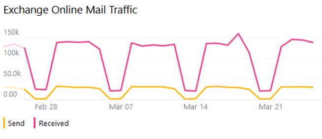
Now let’s visualize Exchange Online mail traffic. We want to be able to see how much mail is sent and how much is received in a line graph.
Start with the middle box. Hit the gear icon, select Web API (line graph) and specify the following URL:
reports/getEmailActivityCounts(period='D30')?$format=application/json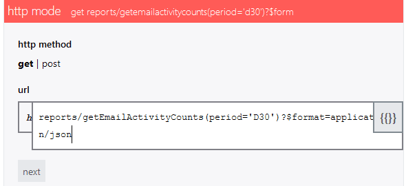
In the data mapping, specify the fields as follows:
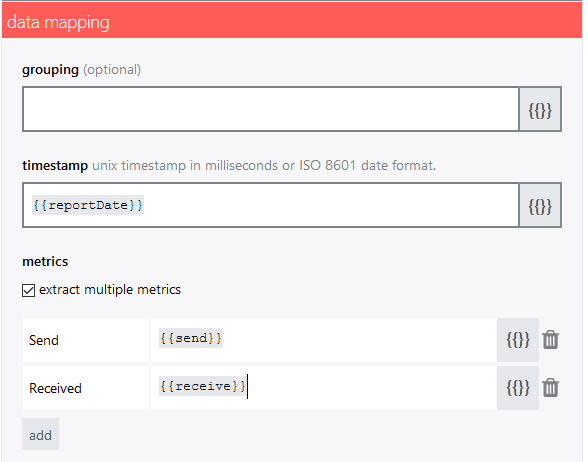
Adjust the remaining sections as we did before and you’ll have a clear visualization of the sent and received mail traffic.
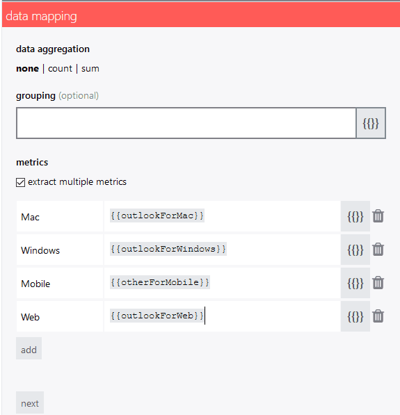
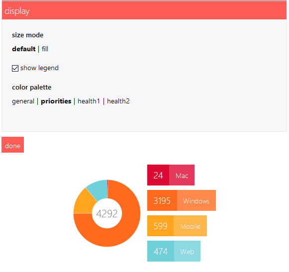
Our final Exchange Online visualization will allow us to monitor which platforms are used to access Outlook – Mac, Windows, Mobile, and Web. Because we want to see percentages of all the traffic, we can use a donut graph to best visualize that.
In the right-hand column, hit the gear, select Web API (donut) and specify the following URL:
reports/getEmailAppUsageAppsUserCounts(period='D7')?&$format=application/json
In the data mapping part then, choose no data aggregation and no grouping.
For the metrics choose Mac {{outlookForMac}}, Windows {{outlookForWindows}}, Mobile {{otherForMobile}}, Web {{outlookForWeb}}
Lastly, in the display section, check show legend and for the color palette choose priorities. This will neatly display all the platforms used to access Outlook in a clean donut graph.
Next, we’ll add Microsoft Teams analytics to the SquaredUp dashboard. We will visualize Teams top members, top external members, and activity by type in a third row of tiles.
Note: The next two graphs rely on M365-groups-reports. As in this company, M365-groups cannot be created by other means, they can be used for MS-Teams-statistics.
Add a third row of tiles in the Dashboard and start with the left one. Hit the gear icon, select Web API (Bargraph) and specify the following URL:
reports/getOffice365GroupsActivityDetail(period='D7')?$format=application/json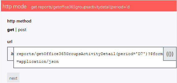
In the data mapping section, choose no data aggregation and grouping by {{groupDisplayName}} as a metrics {{memberCont}}
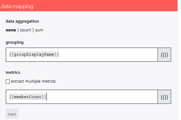
In the sorting section, order by value, descending and limit the number to 5.

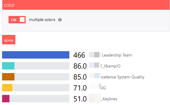
Finish this tile by enabling multiple colors and you’ll have a bar chart that displays the top five Teams members.
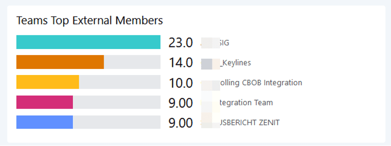
Now, start with the middle tile to create a bar graph of top external members.
Hit the gear icon, select Web API (line graph) and specify the following URL:
reports/getOffice365GroupsActivityDetail(period='D7')?$format=application/json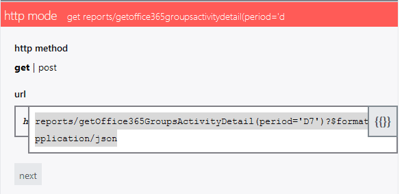
In the data mapping part, choose no data aggregation, grouping by {{groupDisplayName}}, with the metrics {{externalMemberCont}}
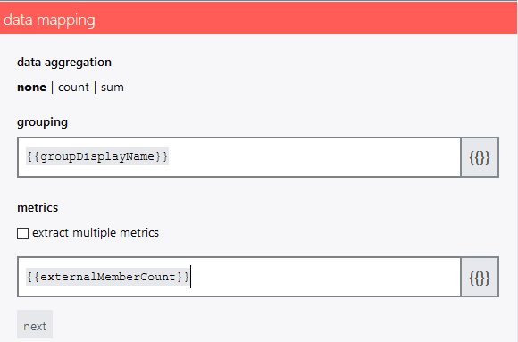
For the remaining settings, keep them as for “Teams Top Members”.
And finally, on the right, hit the gear, select Web API (linegraph) and specify the following URL to create a line graph of activities by type:
reports/getTeamsUserActivityCounts(period='D30')?$format=application/json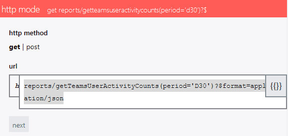
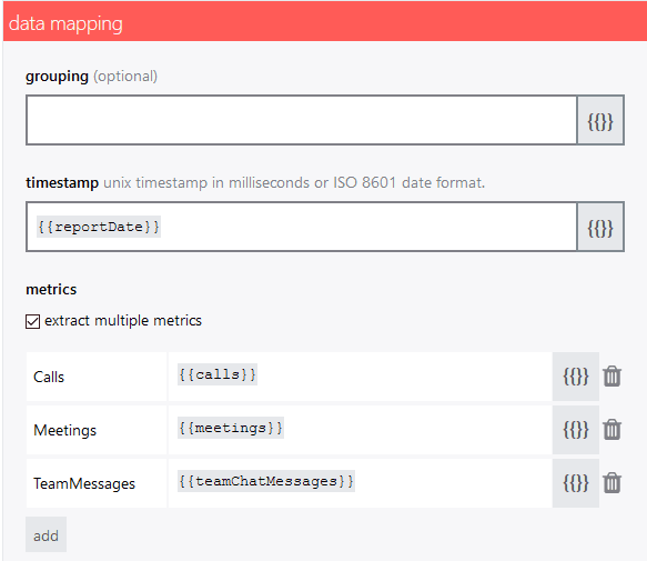
In the data mapping section, choose no data aggregation and no grouping.
For the timestamp, define {{reportDate}} and for the metrics choose Calls {{calls}}, Meetings {{meetings}}, and TeamMessages {{TeamMessages}}
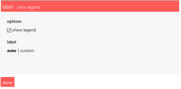
Finally, check show legend and keep the label to auto.
Your SquaredUp dashboard visualizing M365 data via the Microsoft Graph API is complete!

With SquaredUp, you can now impressively visualize any data that is exposed via REST APIs, like Microsoft Graph. By leveraging SquaredUp’s Open Access, you can also share this information among all teams without having to buy additional licenses. Share a link with colleagues, put the dashboard up on a wall monitor, or even embed it in a website.
Find out more about what you can do with SquaredUp’s latest Web API tile in this blog post by Vincent.
And if you haven't already downloaded the free Dashboard Server to create your own unlimited dashboards, download it now:
More about Graph API reports: https://docs.microsoft.com/en-us/graph/api/resources/report?view=graph-rest-1.0