Cameron Fuller
Director, Automation Solutions, Catapult Systems

We are delighted to have a guest blog from Cameron Fuller, System Center MVP for Cloud and Datacenter Management, Solution Director for Catapult Systems and automation evangelist. Today, Cameron shares how we can visualize free disk space in Azure using Microsoft tools and third party solutions. Scroll down to final section to see what he's got to say about SquaredUp!
One of the most common requests in the world of monitoring is to be alerted before a disk runs out of space. In SCOM we can alert when a disk is getting low on space and we can provide reports or dashboards which provide insights into what disks are getting low on space. But what about when you aren’t using SCOM – when you are using Azure Monitor and potentially Log Analytics? This blog post will take a simple example of “How can I visualize free disk space” by showcasing the various options which are available in Azure as well as via 3rd party solutions.
Historically the focus on free disk space has been to avoid conditions where a disk runs out of space (it’s far better to know when a SQL database is about to run out of disk space versus right after a SQL database ran out of disk space). This condition is commonly referred to as an under-allocated resource.
With the shift to the cloud, there is also a push towards identifying systems that have been given too much in the way of resources such as a system that was allocated too much disk space. We care about over-allocation in the cloud more than we could commonly care on-prem because we are being billed for resources we have allocated in the cloud monthly. IE: I don’t want to pay for 1 TB of disk space monthly if I am using 1 GB of disk space on the drive. These resources are referred to as over-allocated.
To complify this further (yes, I know it’s not a word but I’m still claiming it), what people want in a dashboard can vary greatly. Some want to know only the most recent state of the drive, others want to know the history and trend of the drives. Some want to know the state of all drives in the environment, others are only interested in the top X. So now we have over-allocated and under-allocated, historical and near-real-time all as options for this same question. Plus, we have a variety of methods available to visualize this information.
Finally, we also have the option to visualize in dark mode or not in dark mode in Azure or in the 3rd party solution I am discussing in this blog post. The visualizations shown in this blog post are NOT in dark mode as I do not like dark mode.
In Azure, there are four methods that I am aware of to visualize data from Log Analytics as a source of data and provide those visualizations on an Azure dashboard:
Log Analytics Kusto queries: Kusto queries of Log Analytics data can be written and then pinned to an Azure dashboard. An example of this is shown below: (showcasing a set of drives which may be over-provisioned)
log analytics visualization
Workbooks using Kusto queries: Workbooks are a new method to visualize Log Analytics data. An example of this is shown below: (showcasing a set of drives which may be over-provisioned)
workbook visualization
Metric-based visualizations: Specific metrics are gathered as metrics in Azure. An example of a metric based visualization for free disk space over time is shown below:
workbook visualization
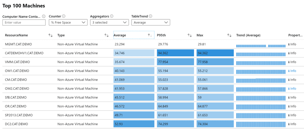
Another example of this across multiple machines with pre-built metrics is showcased below which is available directly in the existing Performance Analysis dashboard (not pinned to an Azure dashboard).
workbook dashboard
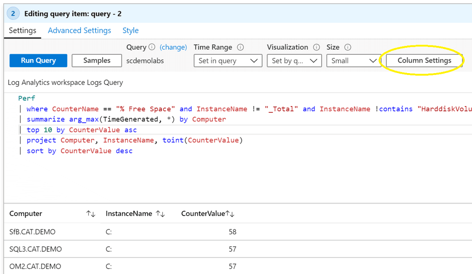
Within workbooks, you can do extremely powerful visualizations by using the “Column Settings” option shown below.
configuring workbook dashboard
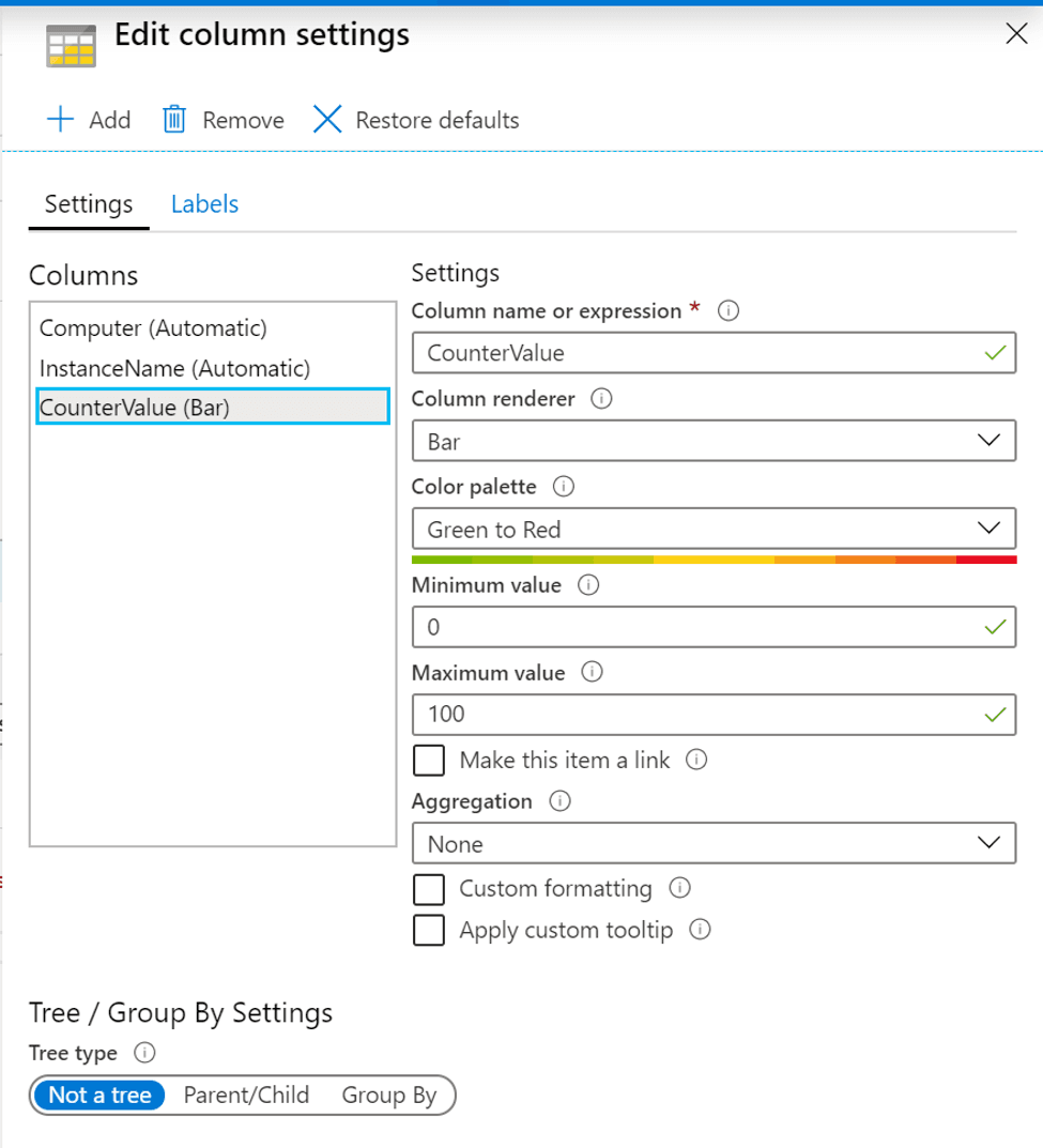
In this example, we can pick an existing column and render it as a bar which goes from green to red.
configuring workbook dashboard
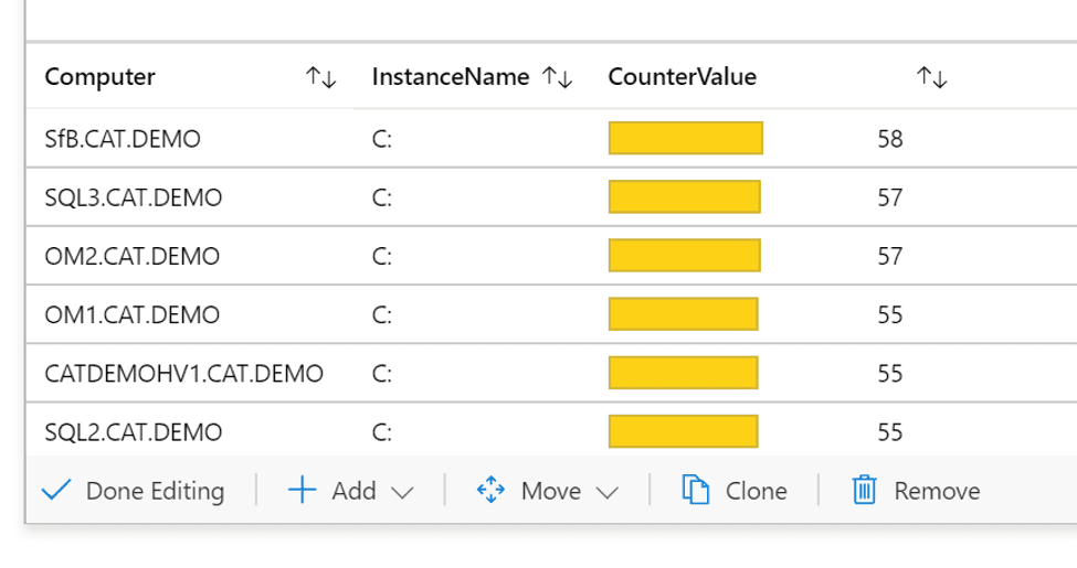
This adds a bar for the CounterValue field shown below with changes in color based on the value.
workbooks in Azure dashboard
Overall, workbooks are extremely powerful especially when you get used to how to use the Column Settings section of the workbook. Thank you to Tony N who pointed this out to me and walked me through a use-case!
OMS console dashboards (Legacy): At the beginning of Log Analytics there was an existing console that was available, and that console allowed you to develop your dashboards. Within these dashboards, you could pin the top-level view (shown below) for these dashboards.
legacy Log Analytics dashboard
These top-level dashboards could be drilled into and provide details such as the one shown below which shows free disk space over time.
legacy Log Analytics dashboard
While these dashboards are interesting, it’s not possible to pin the sub-dashboards to an Azure dashboard and this technology is now legacy so I would not recommend it.
Summary of Azure-based options: While there are several different approaches available to visualize this type of data in Azure, workbooks are the most robust option currently available. To paraphrase a colleague of mine: “Workbooks are the best for Log Analytics because they are free, the others are not or require on-premises infrastructure.” (Thank you, Stan!)
One of the biggest challenges on Azure dashboards as a solution is that the dashboard itself can only refresh every 30 minutes. This causes many organizations to have to look at other options.
Data visualization outside Azure in Microsoft solutions
Outside of Azure but still using Microsoft technologies we also have Power BI. Power BI can directly connect to a Log Analytics workspace to ingest data and visualize that data. The example below is a simple one that visualizes free disk space based on the results of the query made to Log Analytics.
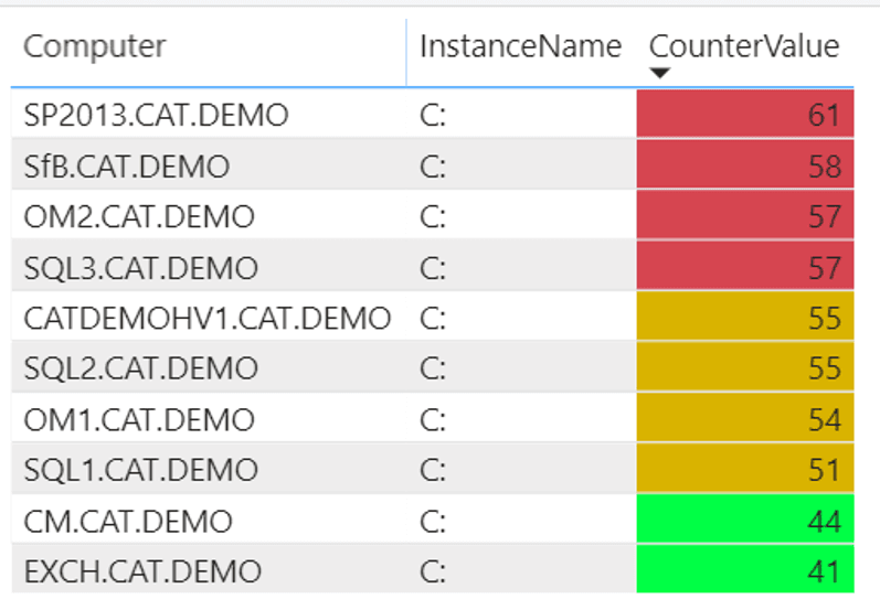
Power BI dashboard
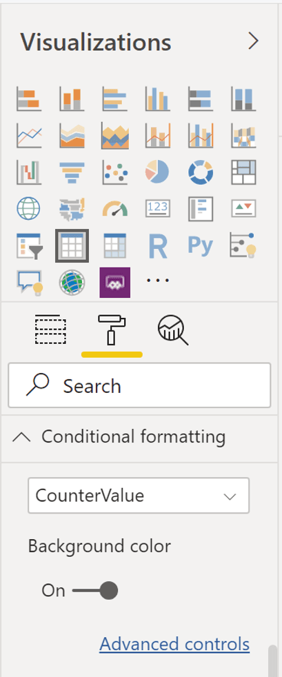
In this example, the field (CounterValue) is formatted with conditional formatting turned on.
Power BI Configuration
For this configuration, I defined the background color changing from yellow to red based on the value of the field (the example below thresholds were set to show the colors, not actual values). For free disk space, a good threshold for Red would be 90%, Yellow at 80% and anything under that as Green.
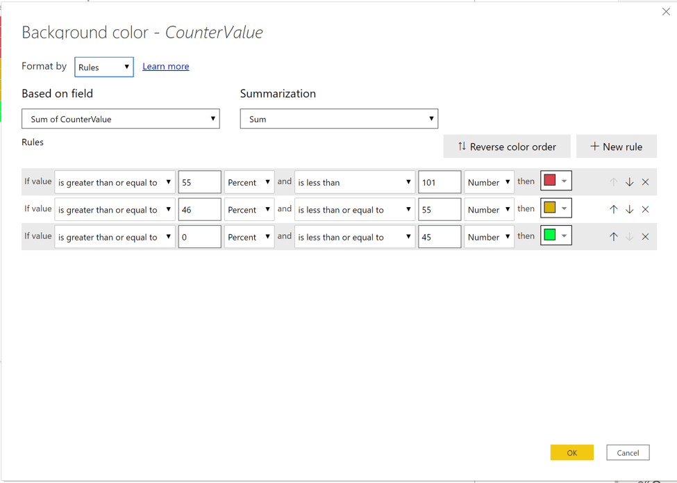
Power BI Configuration
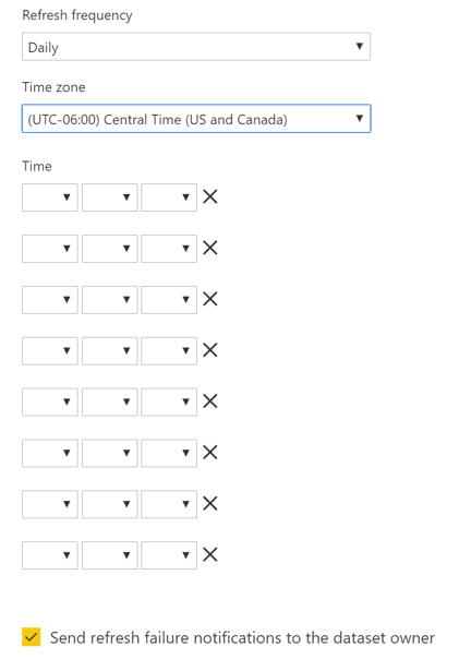
Challenges with scheduling updates to the data in Power BI. Based on my experiences you can schedule Power BI to update either daily or weekly. Within the daily, it can update up to 9 times a day (shown below) which is useful for many use cases but not for data that may be updated on an hourly basis.
Power BI Scheduling
One of the biggest challenges on Power BI as a solution is that the data can only refresh up to 8 times a day with Power BI Pro. With Power BI premium you can refresh up to 48 times a day (or ever 30 minutes on a 24-hour basis, or every 10 minutes during a focused set of business hours). This restriction has caused us to look at other options for data which needs to refresh more frequently.
Summary of Power BI options: Power BI gives some very powerful data visualizations with the major challenge being the ability to refresh data on a scheduled basis.
Data visualization using 3rd party solutions connecting to Azure data
With SquaredUp being the sponsor for the DFWSMUG on March 10th, I was able to spend some time kicking the tires on their solution for Azure. For those not familiar with SquaredUp, they have provided dashboard solutions over SCOM for a while now and they now have a solution for Azure as well.
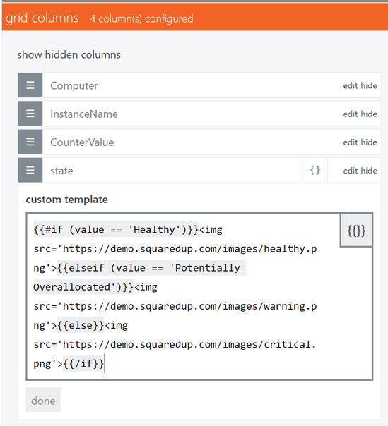
SquaredUp can provide visualizations from a variety of sources including Log Analytics. In the example below, the field of state was provided by the Kusto query but the results of that field are then color-coded using this configuration as part of the grid columns with a custom template.
SquaredUp configuration
The value I have for the custom template is shown below (thank you to SquaredUp support for this example!)
{{#if (value == ‘Healthy’)}}<img src=’https://demo.squaredup.com/images/healthy.png’>{{elseif (value == ‘Potentially Overallocated’)}}<img src=’https://demo.squaredup.com/images/warning.png’>{{else}}<img src=’https://demo.squaredup.com/images/critical.png’>{{/if}}
The result is an easy to understand visualization for the state of drives based on the value provided for the counter (in this case free disk space).
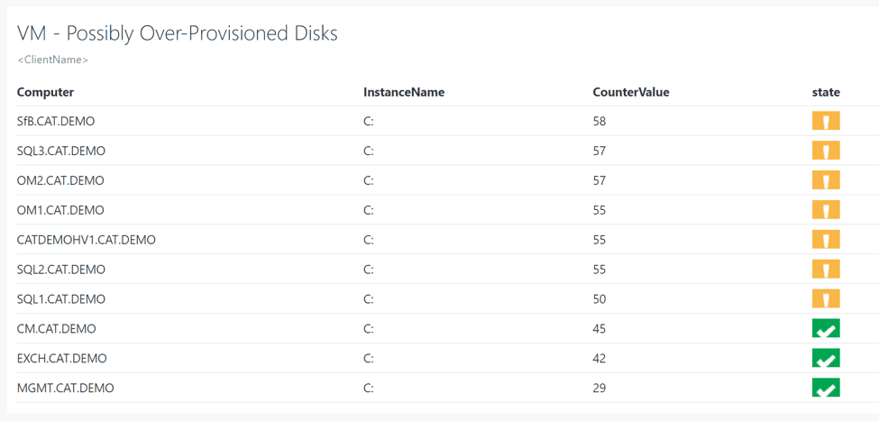
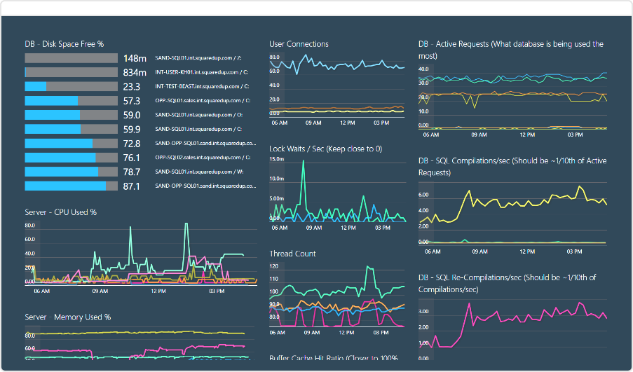
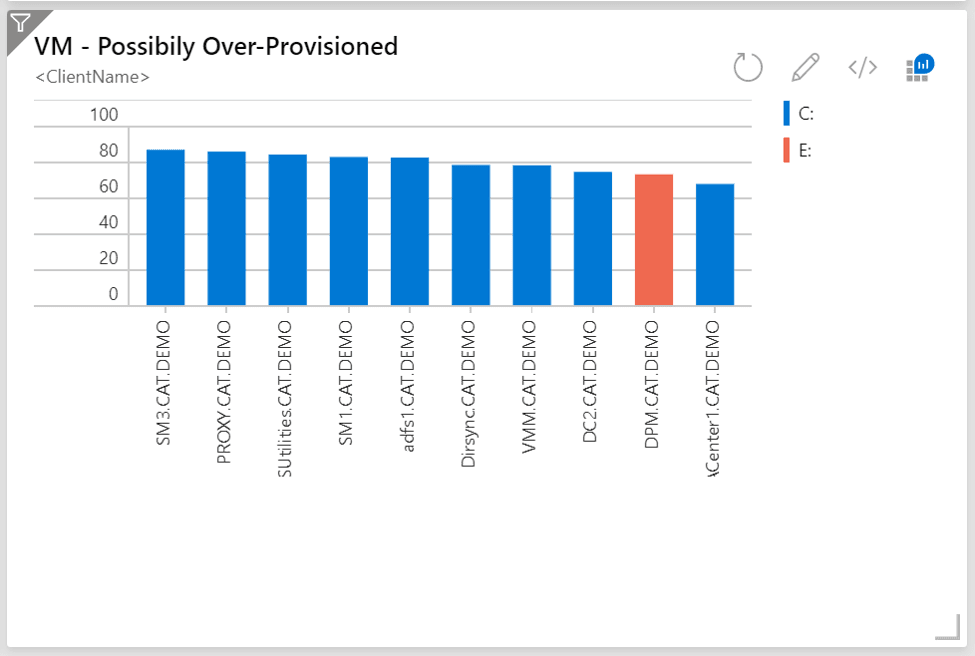
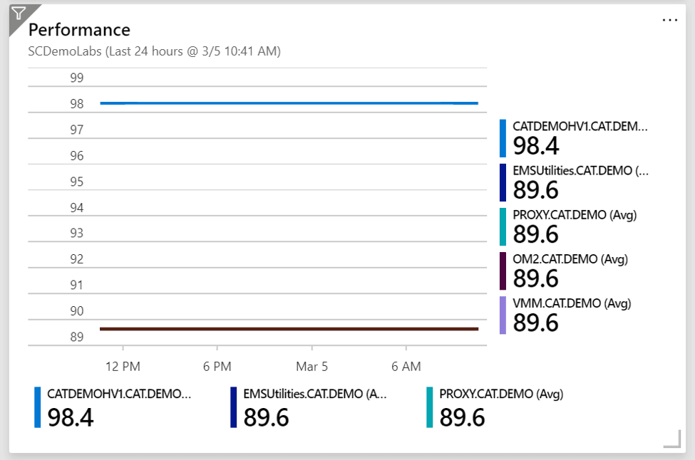
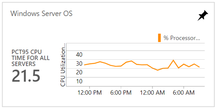
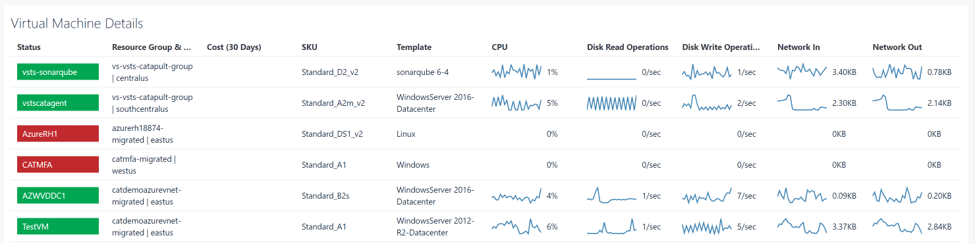
SquaredUp contains a variety of pre-built dashboards such as the one below for VM details.
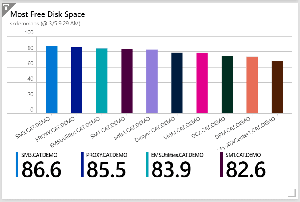
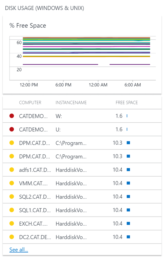
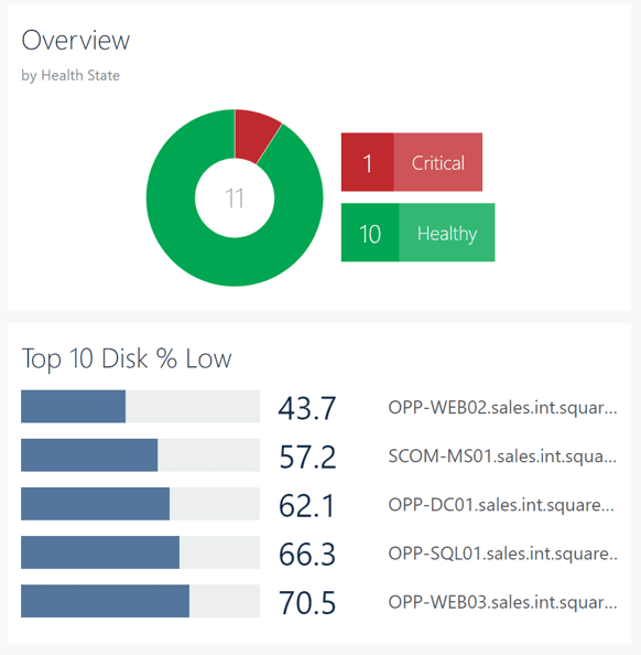
Or the one below to show the top drives with low disk space (pre-built as well).
If you want to kick the tires on this solution, they have a publicly available version of it available at https://demo.squaredup.com/.
Summary of SquaredUp: SquaredUp gives you the ability to create powerful custom dashboards and gives you pre-built dashboards for common requirements. If you need capabilities like these you may want to check them out.
For another great view of visualization options available check out this article from the docs team.
Everything is changing and evolving but there are a few recommendations I would make based on the current state of visualization for data in Azure.
Thank you to Sean T for this idea on this blog post!

Coffee Break Series
Coffee Break Series