Three reasons to upgrade to SquaredUp SCOM Edition
If your organization uses SCOM, you are sitting on a treasure trove of juicy data. Wouldn’t it be a dream to be able to effortlessly leverage all that data via a native integration?
You can easily do that with the SCOM Edition of our SquaredUp dashboarding suite. If you are using our free Community Edition at the moment, here are three reasons you should upgrade to SCOM Edition if you are dashboarding SCOM:
- Instant dashboards
- Application-focused drilldowns
- A worthy upgrade to the SCOM console
Let’s break it down.
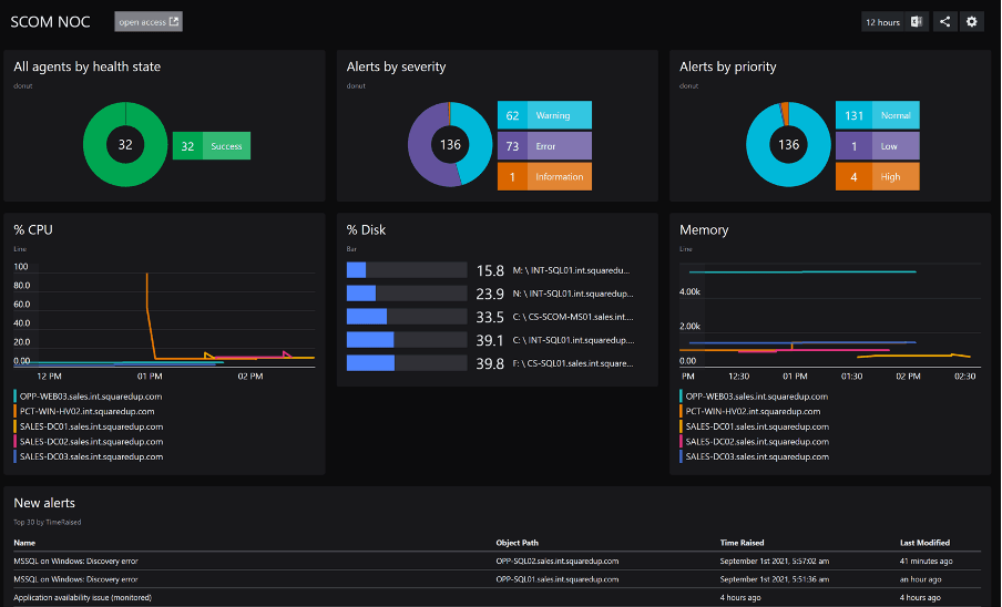
To begin, here’s a fairly standard SCOM NOC dashboard available out-of-the-box with SquaredUp SCOM Edition that oversees your IT infrastructure.
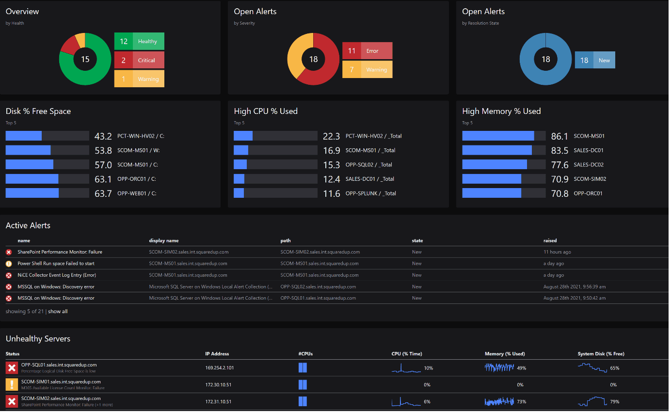
The dashboard includes a status overview of your servers, a summary of alerts categorized by Severity and Priority, a key CDM (CPU, Disk and Memory) metrics overview, a list of all alerts raised within the last set amount of time and a list of all the unhealthy servers in a table that contains some key properties and KPIs for each server.
Now let’s take a quick look at a similar dashboard I created for SCOM using Community Edition.
This is a very basic dashboard that gives you the overall picture of your SCOM deployment, along with some KPIs and the list of SCOM alerts. All of this is made with PowerShell scripts in the background.
At first glance, this might look very similar to the one I made earlier with SCOM Edition. So, what’s the difference? Glad you asked!
1. Instant Dashboards
To begin with, SCOM Edition can surface all your SCOM data instantly and effortlessly, via its SCOM native integration. The data is displayed in out-of-the-box dashboards which SquaredUp recommends based on the MPs you have installed, as well as “one-click” dashboards that leverage SCOM’s underlying object model.
The above SCOM Edition dashboard took me hardly 10 minutes to put together, including naming and formatting. The SCOM-driven UI makes it very quick and easy to create any tile. Add the drilldown, filtering, and exporting capabilities on top of this and it becomes even better!
Community Edition: To make this exact dashboard in Community Edition took me pretty much the whole day. The reason is quite simple, the Community Edition dashboard had to be made with Powershell, which meant I had to write a bunch of really long PowerShell queries to put it together.
2. Application-focused Drilldowns
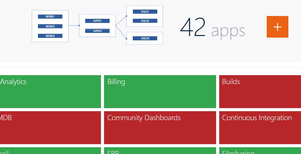
a. Map your applications to monitor true availability
SCOM Edition also has a unique feature called Visual Application Discovery & Analysis (VADA) that lets you map your applications and monitor them for true availability. If monitoring applications correctly in SCOM from the users’ perspective is something that has been a challenge for you, you NEED this!
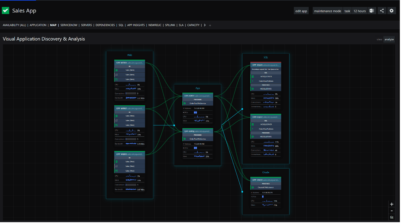
The great thing about VADA is that everything here is interactive. The map diagram is not only thorough, it is also color coded. See that red object on the top right in the component group? In a few clicks, you can drill down into it and find out what’s causing that object to be red.
As I click on the server, it drops me into this detailed analytics page of what is wrong with that object at the moment.
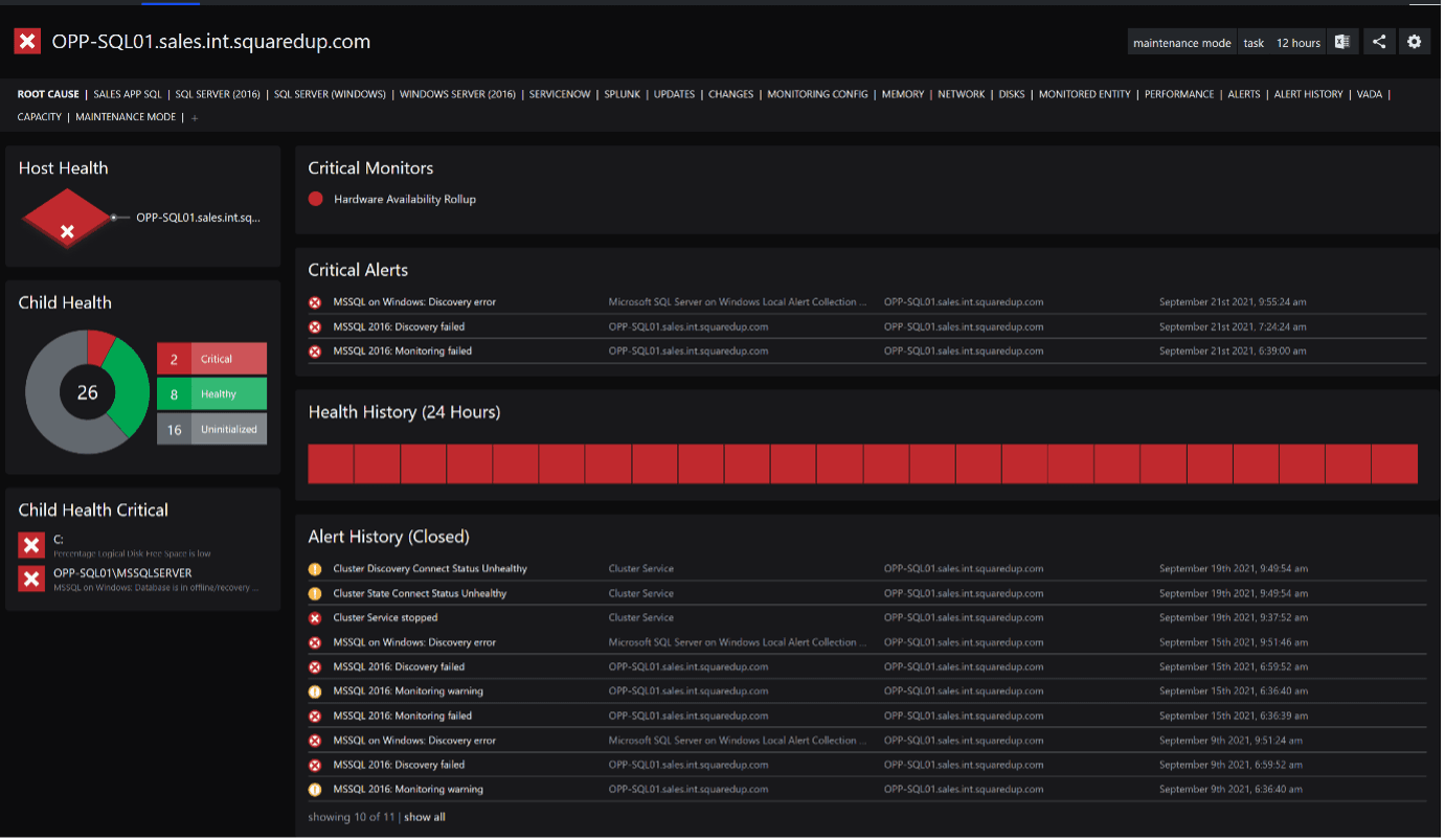
This is very useful when you’re troubleshooting the availability or the performance of your applications as it gives you a starting point to start fixing things.
Community Edition: This feature is not present in Community Edition.
“VADA is a tremendously powerful feature, allowing us to get a definitive handle on the exact topology and dependencies of all of our applications.”
Systems Engineer at Purdue University
b. Drilldowns and perspectives
As a matter of fact, the SCOM Edition dashboard is completely interactive, and you can drill down into anything to dig deeper and across the SCOM object model – allowing you to find the root causes of issues more quickly.
For example, going back to the SCOM Edition dashboard above, it shows me that there are 2 critical servers in my environment. I can simply click on the donut and it will show me the list of those 2 servers, along with some of its properties and KPIs (which are easily customizable).
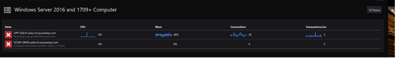
I can further click on one of these servers and it will drop me into a different view with a list of perspectives for that server.
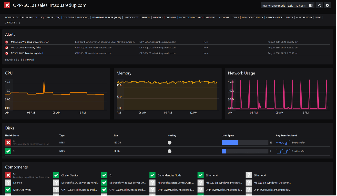
Note that at the top there are a bunch of perspectives, each pertaining to a specific role of your server in SCOM or even in other external tools.
How cool is that?! You’ll be able to easily see how it all links together, putting your data into context. This helps greatly with reducing the Mean Time to Resolution (MTTR) so your services are up and running efficiently in no time.
Community Edition: Community Edition has none of these cool features. This dashboard is a simple, read-only dashboard that offers little to no operability. While handy to share, this dashboard doesn’t allow me to drill down into any of the data or run root cause analysis on my SCOM environment.
“SquaredUp SCOM Edition has allowed us to avoid unplanned outages to critical clinical systems, so it’s been a huge win for us.”
Nicole Gyde, Senior Systems Engineer at healthAlliance
3. A worthy upgrade to the SCOM console
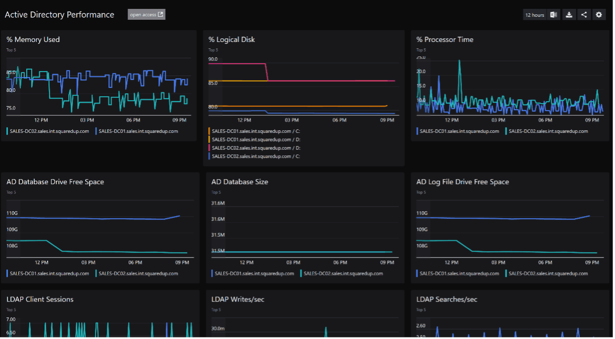
a. Performance reporting
With SCOM Edition, it is incredibly easy to visualize performance data that SCOM is already collecting.
You’ve already got loads of rules collecting the performance data in the form of metrics. In SquaredUp, it takes a matter of seconds to extract them.
Moreover, SquaredUp always pulls the data from Datawarehouse, so you can be assured that data is available for as far back as your data retention policies go for your Datawarehouse. All in just a few clicks!
b. Alert management
In SCOM Edition, you also get the ability to manage your alert lifecycle. Simply clicking on the alert will drop you into the detailed information surrounding that alert that you see in SCOM, and more.
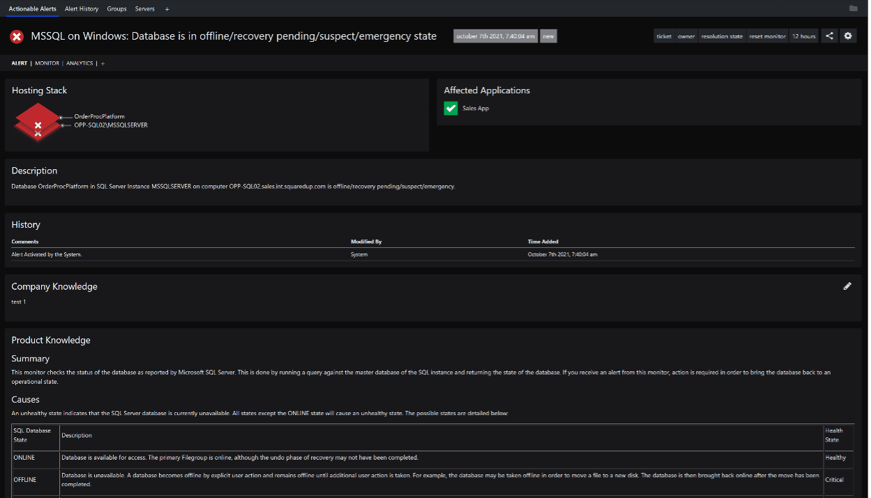
You may have noticed that apart from the usual information you see in the SCOM portal (like the alert description, company and product knowledge), you can also see the hosting stack for the object that is alerting. From this, you can tell if it is an isolated problem or a cascading failure dripping down from other objects. You can also see what applications are actively being affected by the degradation of performance caused by this particular object.
You will also notice that you’ve got some actions on the top right – to assign an ITSM (e.g. ServiceNow) ticket number / owner, change the resolution state for that alert and if the alert is coming from a monitor, even an option to reset the monitor right from the SquaredUp portal. Your users will rarely have to log in to the SCOM portal for daily alert management activities.
Community Edition: None of this is available in Community Edition.
Finally, no additional expertise is required when using SquaredUp SCOM Edition. As the dashboard is entirely driven by SCOM concepts, SCOM admins already have full knowledge of what's required.
With Community Edition – because this dashboard was made with PowerShell, you are limited by your PowerShell expertise. These scripts do require manipulating to fit into the right format, and that sometimes can be very tedious. SCOM knowledge isn't really as applicable here.
And there you have it, three big reasons to upgrade to SquaredUp SCOM Edition. In summary – Community Edition is a great product to sit on top of the sprawl of your tools and serve as a holistic dashboard across all of them. However, if it’s SCOM that you’re specifically looking to dashboard, SCOM Edition is the way to go. You not only get true visibility over your applications, you can also discover the root cause of any issue in a matter of a few clicks and easily see how all the moving parts relate to one another. Plus, you get a big upgrade to your SCOM console! All with an out-of-the-box dashboard that takes less than 10 minutes to create.
Sign up here for your 30-day free trial of SquaredUp SCOM Edition.