
You have Splunk and you’re heavily invested in it. How can you easily share you Splunk insights with your users without having to train them? With SquaredUp and the Splunk integration, it’s easy to pull out the data your users need, without the hassle.
Sample Splunk Dashboard
Here’s a dashboard that uses the same Splunk Index but converts the results into a variety of visualizations.
And here’s a peek at the query behind one of the visualizations.
It’s as easy as copy-and-pasting your existing Splunk queries. This dashboard takes the results from the search and places them into 30 minute bins. Then it performs some statistics by counting the host by time.
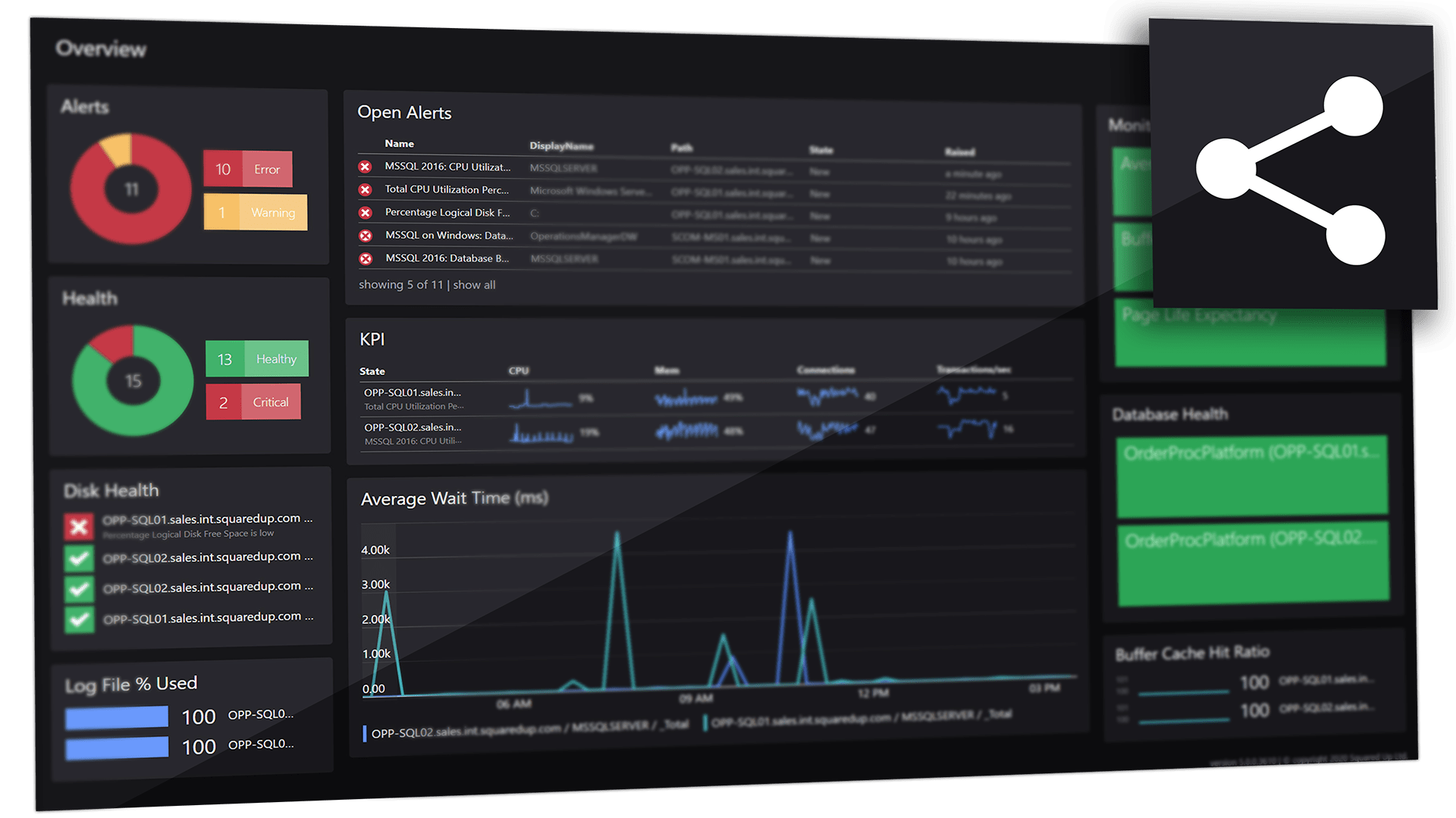
Share the insights across the team
Once you have the data visualized how you want, you can use Open Access to share it across the organization.
How to visualize Splunk data in five steps
STEP ONE
Select the Splunk integration tile.
STEP TWO
Choose how you want to visualize your Splunk data – a single value (scalar), a grid of data, a line graph, sparklines, bar, donut, or two different status blocks.
STEP Three
Select your provider.
STEP Four
Supply your Splunk Search query. Your query can be as straightforward (or complicated) as it needs to be to get the job done.
STEP FIVE
(Optionally) Add some finishing touches like showing or hiding columns, making the rows clickable, adding a legend or labels to get the point across.
Available across our suite of products
SquaredUp DS
Standalone
For the dashboard hero who needs to provide answers across the business.
SquaredUp DS
for Azure
For cloud teams who need to take control of Azure cost and performance.
SquaredUp DS
for SCOM
For monitoring teams who need to unlock insights from Microsoft SCOM.
Want to know more?
For some high-level use-cases, here are some articles about the Splunk tile:
How to add a Splunk provider
See article
How to use the Splunk tile
See article
How to integrate and visualise your external data
See article
GET STARTED TODAY
Zero to dashboard hero in 60 seconds
Start now with hundreds of customizable dashboards.