SCOM
Master SCOM, from basics to the best management packs, through articles from our experts.
Learn more >
Master SCOM, from basics to the best management packs, through articles from our experts.
Learn more >
Learn more >
Release Webinars
Hot on the heels of version 6.0, this DS for SCOM release brings a raft of updates, including improvements to the new auditing feature, the performance drill-down page, and more!
Release Webinars
Bigger and better than ever before, SquaredUp v6.0 brings you three major updates you won't want to miss.
Introductory Webinar Series
Join our Customer Solutions Engineer for a hands-on introduction to SquaredUp.
Blog
Extend SCOM so you can see everything in beautiful dashboards. SquaredUp makes the world’s most complex IT infrastructure beautifully simple to understand.
Blog
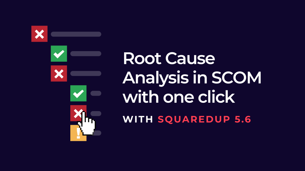
Imagine being able to diagnose issues in SCOM in one click. You can! Here's how to get one-click, SCOM root cause analysis.
Blog
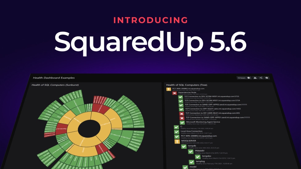
Our latest release covers features that were highly requested by the community. Check out the exciting new visualizations!
Datasheets
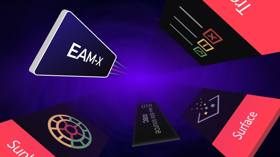
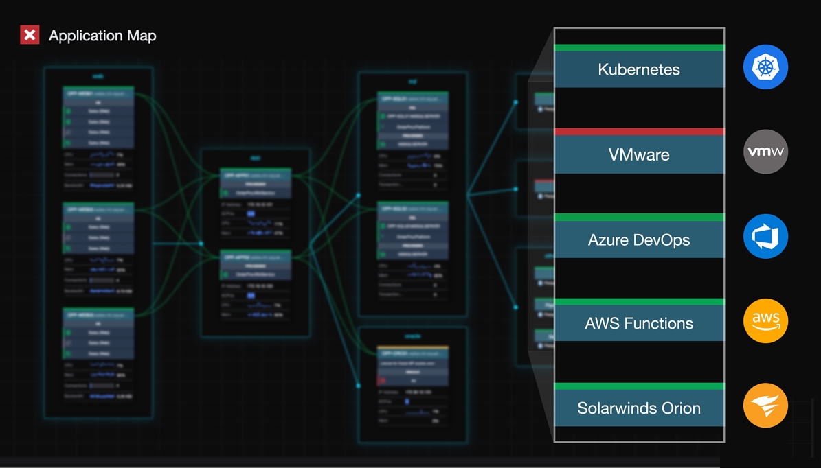
With SquaredUp’s EAM-X tier, you can extend SCOM by plugging in any Data Center or Cloud platform: VMware,Citrix, SolarWinds, Nagios, Azure Monitor, AWS Cloud Watch, Dynatrace, Prometheus, Kubernetes – anywhere data lives for your enterprise applications.

Blog
Got SCOM questions? Here are the answers to out top SCOM FAQs. Find out everything from how to upgrade to performance issues with TempDB.
Blog
SquaredUp just released 5.5 with new SCOM alert tile features, visualization changes with a click, and more. Discover what's new.
Blog
Let Sameer Mhaisekar walk you through installing the Azure Stack HCI MP in SCOM 2022.
Blog
Newsflash: it is now possible to extend SCOM to monitor Data Center, Cloud and DevOps spaces too! Read to learn about our latest monitoring solution.

Blog
Catch up on the latest SquaredUp Community news, including topics like PowerShell and Azure Monitor.
Blog
Your complete guide on how to upgrade to SCOM 2022. Find prerequisites, step-by-step installation walkthrough, license configuration, and more
Dashboard Fridays
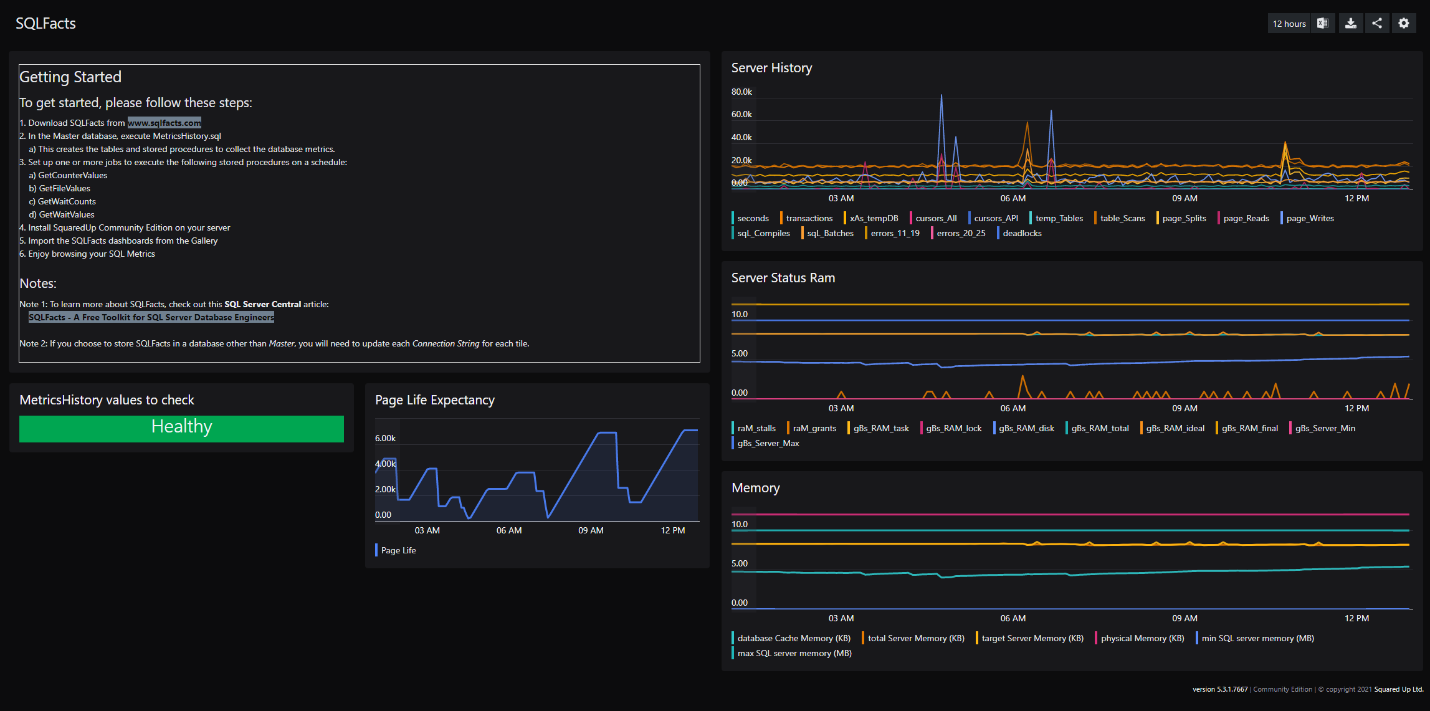
Sometimes all you want to do is visualize the data. By combining SquaredUp’s powerful visualizations with SQLFacts’ powerful suite of free tools, you get one uber-powerful too!
Webinar
Join our upcoming webinar to see our brand new licence tier - EAM-X - in action, and see the latest product updates in SquaredUp v5.5.
Dashboard Fridays
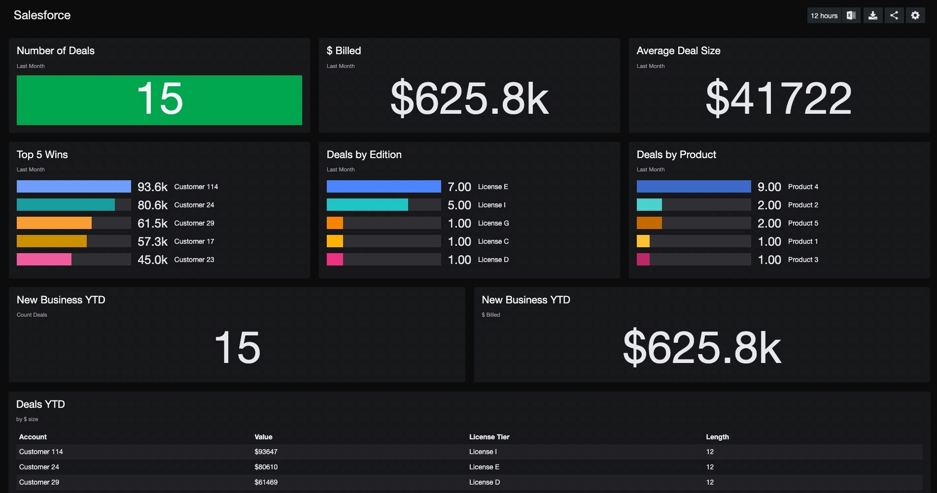
This free Salesforce dashboard communicates company performance in real time, in a way that engages teams across the business, e.g. Engineering and Marketing.
Blog
Catch up on the latest SquaredUp Community news, including topics like PowerShell and Azure Monitor.
Blog
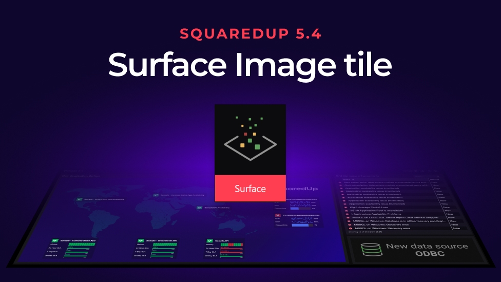
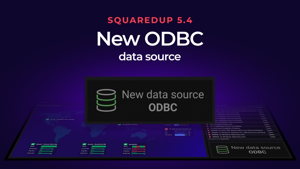
We just released the new SquaredUp 5.4 with some brilliant new features. Headlining as the two biggest updates were the new ODBC data source and a new visualization – the Surface image tile. The Surface tile lets you build stunning dashboards with any image. (If you missed the release announcement you can catch up by...
Blog
You can now connect to almost any database with SquaredUp's ODBC data source. New for 5.4 you can instantly visualize any data.
Blog
Catch up on the latest SquaredUp Community news, including topics like PowerShell and Azure Monitor.