Noorul Huda N
DevRel Engineer
When to choose each chart, and how to use them
As engineering organizations scale, project visibility becomes a real challenge. Engineering managers lose track of what's actually happening across multiple teams. Executives ask "are we on track?" and get conflicting answers. Status meetings multiply but clarity doesn't improve.
The root problem isn't lack of data, modern engineering teams generate tons of project information across JIRA, GitHub, CI/CD pipelines, and project management tools. The problem is making sense of all that data to answer simple questions: Are we progressing? Are we going to hit our deadlines? What's actually blocking us?
Burndown and burnup charts were designed to answer those simple “are we on track?” questions. Teams often treat them as an either-or choice: burndown for timelines, burnup for shifting scope. But the truth is, both matter. Each tells a different part of the story.
Here's what matters: the data feeding these charts needs to be solid and comprehensive.
Engineering teams spread their work across multiple systems:
The challenge isn't collecting this data, it's normalizing and correlating it in real-time to show accurate progress.
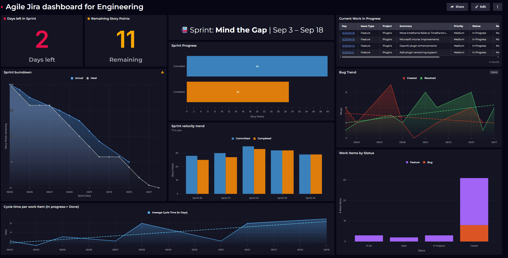
A burndown chart shows work remaining over time. It starts high and trends downward as tasks get completed. Think of it as a countdown timer for your project scope.

The chart displays two lines: An ideal burndown (the straight diagonal showing planned progress) and actual burndown (showing real progress). When the actual line stays above the ideal line, you're behind schedule. When it dips below, you're ahead. This immediate visual feedback helps teams adjust course before deadlines arrive.
Burndown charts are most effective for fixed-scope projects. When the work to be delivered is clearly defined, a burndown chart gives immediate visibility into whether the team is likely to complete it within the planned time.
For example, a development team working on a set of user authentication features might begin a sprint with 65 story points. Over the course of three weeks, the burndown chart shows those points steadily decreasing. By the halfway point of the sprint, if the actual line is above the ideal line, it signals the team is behind schedule. This early warning allows them to reduce scope or extend the timeline before the end of the sprint.
Burndown charts also reveal velocity patterns over time. Consistent early completions indicate capacity for additional work in future sprints, while persistent overruns suggest the need for capacity adjustments or estimate recalibration.
A burnup chart tracks two things: completed work trending upward, and total scope (which can change). Unlike burndown charts that can make scope changes look like setbacks, burnup charts clearly separate progress from scope growth.

The beauty of burnup is transparency. When stakeholders add requirements mid-project, the chart shows both steady progress and expanding scope. It makes clear that the team is maintaining consistent velocity, even as the finish line moves.
Evolving projects need burnup charts. Software development rarely follows the original plan perfectly. Requirements emerge, stakeholders request changes, and technical discoveries shift priorities.
Consider a cloud infrastructure team building a deployment automation feature. They begin with 140 story points but add new requirements for rollback strategies, security hardening, and multi-region support. The burnup chart highlights their consistent 15-points-per-week delivery pace, while also capturing how scope expanded from 140 to 190 points.
Client-facing work benefits enormously from burnup visibility. When clients see projects "taking longer than expected," the burnup chart demonstrates that the team maintained productivity while accommodating their additional requests.
For long-term initiatives, scope almost always shifts. Large migrations, platform rebuilds, and infrastructure upgrades all benefit from burnup charts because they show steady progress even as requirements evolve.
Now that we’ve seen how burnup and burndown charts tell different versions of the project story, the question becomes: why use both?
Both charts track progress, but they highlight it differently. Different stakeholders need different views of the same project data: what motivates a development team might overwhelm an executive, and what reassures a project manager might confuse a client.
The real value comes from using both charts strategically to meet these diverse needs.
Executives often prefer burndown charts for their clarity and urgency. A CEO looking at quarterly engineering objectives wants to see that countdown toward completion. Burndown charts answer the executive question: "Will we hit our deadline?"
But when scope changes occur (and they always do), executives also need to understand why timelines shift. That's where burnup charts provide crucial context, showing that teams remain productive even as requirements evolve.
Engineering teams working on stable features find burndown charts motivating and clear. There's nothing ambiguous about burning down from 80 story points to zero over two weeks.
But teams working on complex, evolving systems need burnup charts to demonstrate their consistent progress despite changing requirements. It's the difference between feeling like you're failing and recognizing you're adapting to new information.
Product managers live in the tension between scope and schedule. They need burndown charts to understand delivery timelines for fixed feature sets. But they also need burnup charts to communicate the impact of scope changes to stakeholders.
A product manager can show executives that the team completed 150 story points (burnup) while explaining that the original 200-point scope grew to 250 points due to user research findings. Both metrics tell part of the story.
Building these charts isn’t just about visuals, it requires reliable, consistent data. Teams often face challenges with incomplete updates, inflated story points, or tool migrations that disrupt historical data. The solution lies in smart data processing that validates and correlates information across systems, providing confidence in the insights presented.
Don't choose between burndown and burnup charts. Choose the right chart for each conversation.
Use burndown when you need to communicate urgency, demonstrate sprint progress, or motivate teams toward completion. Use burnup when you need to show sustained productivity despite changing requirements, explain timeline shifts to stakeholders, or maintain team morale during scope evolution.
The best engineering dashboards make both perspectives available because great project management requires seeing the full picture and not just the view that makes everyone comfortable. It requires keeping stakeholders aligned on reality, not expectations.
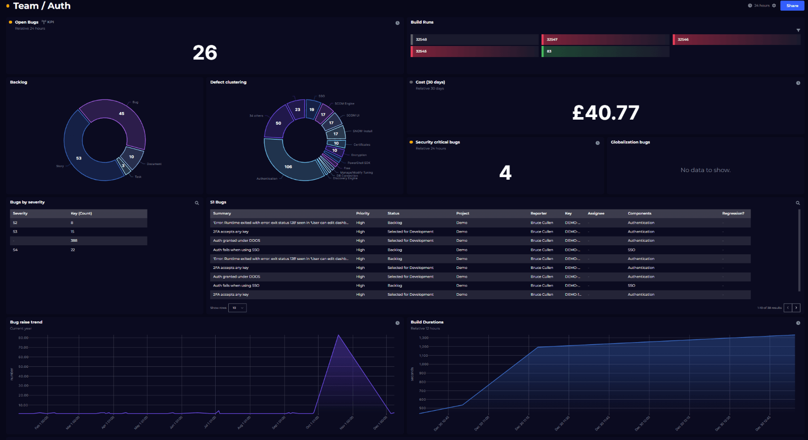
We built a dashboard just like that – showing a real-time view of sprint progress, work distribution, and delivery trends. See how we built our Agile dashboard.

DevRel Engineer


Getting started with SquaredUp is free and easy. Our free tier includes: