Tim Wheeler
Director of Engineering Excellence, SquaredUp

Getting started with SquaredUp is free and easy. Our free tier includes:
Get full oversight of your DORA metrics with this step-by-step guide on how to build a DORA metrics dashboard in SquaredUp.
Director of Engineering Excellence, SquaredUp
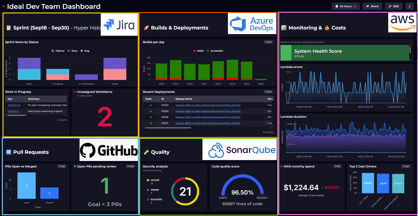
A DevOps DORA metrics dashboard is crucial for understanding the effectiveness of your teams in developing, delivering, and maintaining software. SquaredUp offers a sample dashboard for Azure DevOps that can be installed when setting up your data source. This guide will walk you through the steps to customize the dashboard tiles to reflect the metrics most relevant to your needs.
Read on to see how to take the sample Azure DevOps DORA dashboard and tailor it to your needs. Feel free to skip ahead by clicking on the links below.
We have also have other out-of-box Azure DevOps dashboards available if you'd like to check them out in our Dashboard Gallery.
As a brief overview, here are the 4 original DORA metrics and why you want to track them:
As with any set of metrics, you need to take DORA metrics in context together. That’s why building a DORA metrics dashboard will optimize your insights into your DevOps teams.
If you’re new to SquaredUp, you will need to create an account.
To get set up:
Below is an image of a connected Azure DevOps data source. In the top right there is an option to install sample dashboards. Use this if you didn’t add them when you first setup the data source.

The first change you can make is to use the dashboard variable at the top of the dashboard to select the pipelines that you want to include. This defaults to all, but can be one or several specific pipelines.
The Deployment Frequency metric displays the number of successful pipelines deployed to production over a specified time period. The second tile shows a line graph of daily deployments over a week.

The following steps detail options to customize this tile. These steps can be used in several of the tiles below:

There are several parameters on this tab you may want to edit to customise the tile to your needs:
On the timeframe tab you can select a different data range such as ‘30 days’. Note that when you do this, you will need to update the SQL tab to match. The example below is updated for 30 days.
-- total of all successful pipelines / no. of days
-- using 5 for working days
select
    count (*)/30
from dataset1
This metric can also be created for release pipelines. To do this:
The rest of the settings will be remembered so you can now save the tile.
You can apply all of the above to the second tile as it uses the same data stream. Should you need to switch to the ‘Release Runs’ data stream then you will need to also edit the ‘Shaping’ tab with the following settings:

This will count the number of rows of data and divide by 7.
If we had more tables of data, we could join them together before doing the same count. Click ‘Run Query’ in the top right and our result is returned. Finally, we will select our visualization.

These tiles show the total time for a PR to be created and then merged. In future articles we will look at how to track a code commit through to the build pipeline.

The following steps can be applied to both the Scalar and Line graph tiles. To customize:

SELECT
avg(DATEDIFF(hour, creationDate, closedDate)) as LeadTime
FROM dataset1What if you use a different tool for your pull requests? Not a problem, you can easily edit this tile to use a data stream from another data source. Below are the steps for GitHub as an example:


Next on the DORA metrics dashboard is change failure rate, this metric measures implementation quality by dividing the number of successful deployments by the number of incidents. To calculate this metric you first have to defines what an incident is, typically this is an outage or service degradation. In this example tile we are defining an incident as a priority 1 and severity 1 bug logged as an Azure DevOps work item.
This tile combines two different sets of data:
To customize:

SELECT
        [System.Id],
        [System.WorkItemType],
        [Title],
        [Created Date],
        [Closed Date],
        [System.TeamProject]
FROM workitems
WHERE [System.WorkItemType] = 'Bug'
AND [Priority] = '1'
AND [Severity] = '1 - Critical'
AND [Created Date] > @Today - 7
AND [System.TeamProject] = @projectFor more details on using WIQL:
https://learn.microsoft.com/en-us/azure/devops/boards/queries/wiql-syntax?view=azure-devops
If you use a different tool for tracking incidents, you can easily edit this tile to use a data stream from another data source. Below are the steps for switching the source of incidents to Jira, this assumes you have a saved Jira filter for your incidents:
TYPE = 'Bug' and Priority = 'Incident'The second tile in this row is for deployment failures. This is to support any investigation into pipelines that are failing to complete successfully. It uses the pipelines selected in the variable at the top of the dashboard to return data.
The Deployment Failures tile returns pipelines builds that have failed to complete successfully. This is configured on the Parameters tab.

The Shaping tab is also grouped on the finish time of each pipeline, so the data can be show as a bar chart.
To customize this tile we can make the same changes to the Build Runs data stream as shown in the deployment tile section.
The last of the 4 core DORA metrics is mean time to recovery (MTTR).

In this example tile we assume that outages are being logged as Work Items in Azure DevOps stored as bugs with a Priority of ‘1’ and a Severity of ‘1 - Critical’. To calculate the metric, we will take the average time that a bug is moved to Done. This done using the SQL tile.
To customize:

SELECT
        [System.Id],
        [System.WorkItemType],
        [Title],
        [Created Date],
        [Closed Date],
        [System.TeamProject]
FROM workitems
WHERE [System.WorkItemType] = 'Bug'
AND [Priority] = '1'
AND [Severity] = '1 - Critical'
AND [Created Date] > @Today - 7
AND [System.TeamProject] = @projectSELECT avg(datediff(day, [Created Date],[Closed Date])) as Days
FROM dataset1
where [Closed Date] < getdate()The Daily Incidents tile uses the same outage data as above and groups it by day to return a bar chart. You can edit the Objects and Parameters tab in exactly the same way as the MTTR tile. The key difference is that this tile uses grouping on the Shaping tab and doesn’t use SQL for any calculations. To customize:

Your bespoke DORA metrics dashboard should provide an overview of throughput with the deployment frequency and lead time metrics. Displaying these over time is a powerful way to see the impact caused by process change or personnel shifts.
In the bottom two rows, we focus on stability by tracking the change failure rate and MTTR. These crucial metrics helps us understand the amount of deployments that fail to enter production and the time spent resolving incidents.
Watch this interview to see how to create your own DORA metrics dashboard without using a template.
To get started, create a free SquaredUp account and connect to your desired data sources.
To see what other dashboards you can create, or our available out-of-the-box Azure DevOps templates, check out the Dashboard Gallery.