Sameer Mhaisekar
DevRel Engineer, SquaredUp & Microsoft MVP

Getting started with SquaredUp is free and easy. Our free tier includes:
This SquaredUp dashboard uses the Azure plugin to surface and visualize data stored in Log Analytics. We can query, summarize, and analyse the data stored in your workspaces via KQL queries.
DevRel Engineer, SquaredUp & Microsoft MVP
Accessing data stored in a Log Analytics workspace isn’t a difficult task in the Azure Portal, but building a dashboard to bring together the results of many queries can be challenging. Getting that dashboard into the right hands can also cause headaches for your security team.
Being told when a metric is outside of its normal threshold, or the number of unexpected entries in a table exceeds a limit, is also a vital step in a thorough monitoring approach, but Azure Alerts come with a cost and are cumbersome to configure.
It's also not unusual in a world of complex, distributed data that each dataset might be stored in a different Log Analytics workspace, and even in different regions, subscriptions, and tenants. Getting a singular view or compiling a complete dataset is, therefore, often out of reach with the native tools.
SquaredUp lets you build a state-of-the-art Azure Log Analytics dashboard with ease. By using configurable KQL data streams you can query, summarize, and analyze the raw logs and traces being stored in your workspaces. You can even bring your favorite saved queries directly into SquaredUp and see results immediately.
When you’re building a dashboard in SquaredUp, there are never any tool-specific steps to take to craft the perfect visualization, regardless of the data source. Displaying the results of a complex KQL query doesn’t require any heavy lifting. Then, when you need to take that a step further to calculate averages across different time periods or combine metrics into a single graph, it’s just a couple of extra clicks to bring more data into scope and get your answer.
SquaredUp also breaks down the silos that Azure creates between different Log Analytics workspaces. When getting your answer involves aggregating complex data sets from multiple tables, our SQL Analytics feature lets you bring in those disparate data sets and work with them using a familiar query language to create a new unified output.
As the possibilities created by Log Analytics are vast, the dashboard you want to build could be entirely unique. Fear not though, the method used to create this example log analytics dashboard is universal, regardless of the queries you’ve got in mind.
The tiles shown are powered by the tables inserted by the solutions for VMs, App Inisghts, and Sentinel.
The “Disk Space” and "Processor Utilization" tiles are powered by a simple query that returns these respective metrics for the given time period, from the 'InsightsMetrics' table.
InsightsMetrics
| where TimeGenerated > ago(1h)
| where Origin == "vm.azm.ms"
| where Namespace == "Processor"
| where Name == "UtilizationPercentage"
| summarize avg(Val) by bin(TimeGenerated, 5m), Computer //split up by computer
// Bottom 10 Free disk space %
// Bottom 10 Free disk space % by computer.
InsightsMetrics
| where TimeGenerated > ago(24h)
| where Origin == "vm.azm.ms"
| where Namespace == "LogicalDisk" and Name == "FreeSpacePercentage"
| summarize P90 = percentile(Val, 90) by Computer
| top 5 by P90 descNext, we have the "AADOperations By Type" tile that is running a KQL against one of my other workspaces. The raw data includes columns containing the Operation Name (Add/Update/Delete, etc.), along with some other columns. However what I'm interested in is the count of events for each operation type over a period of time, to show them in a donut viz.
So I'll go ahead and do some data summarization using the "Shaping" wizard.

As you can see, I've grouped the results by "AAD Operation Type" column and aggregated it by Count. This gives me a nice output of each "Operation Type" with number of times it was present in the result, which is perfect for a donut tile. There are also some other operations you can perform on the data to get it suitable for your choice of visualization.
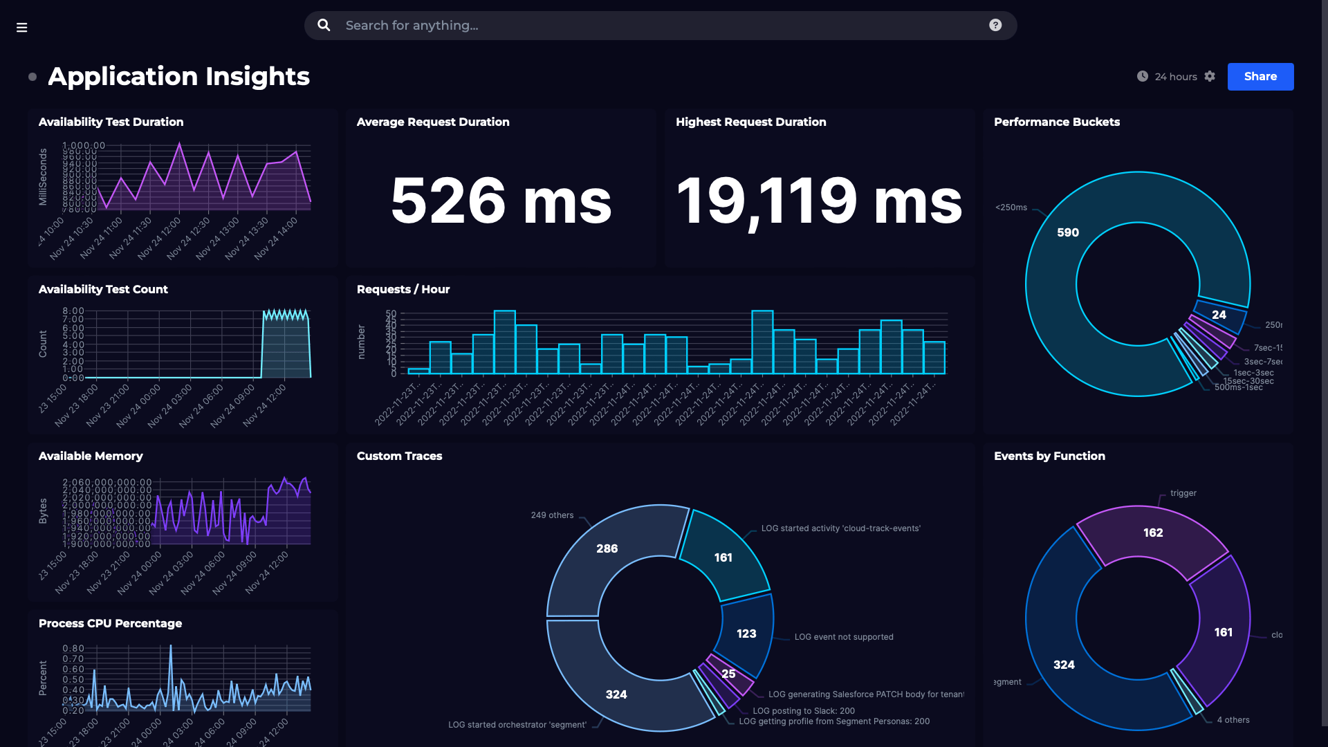
The "App Exceptions" and "App Requests" tiles are querying yet another workspace, where I'm streaming my Application Insights data for my app.
For App Exceptions, I'm querying the table with same name and simply counting the number of entries that were returned using the shaping options we previously discussed.
Additionally, I've gone ahead and enabled monitoring on it, so that I'll be notified when the number of exceptions cross 50.

For the App Requests, I'm running the following query.
AppRequests | where TimeGenerated > ago(12h) | limit 100This returns data with columns TimeGenerated, duration of the request, tenant ID and so on which I can use to plot in a time series.
However, as previously mentioned, this is only a sample to highlight the things that are possible to do with SquaredUp. Go on and try on your own queries and build your own dashboards - there are many, many other use cases you can come up with!
As this log analytics dashboard makes use of custom KQL queries, it isn’t included as standard as part of the Azure data source, but creating it yourself is quick and easy.
To see what other dashboards you can create, including Azure dashboards and Azure Application Insights dashboard, check out our Dashboard Gallery.


Monitor your Azure Application Insights environment using custom Kusto queries.