Adam Kinniburgh
VP Innovation, SquaredUp

Getting started with SquaredUp is free and easy. Our free tier includes:
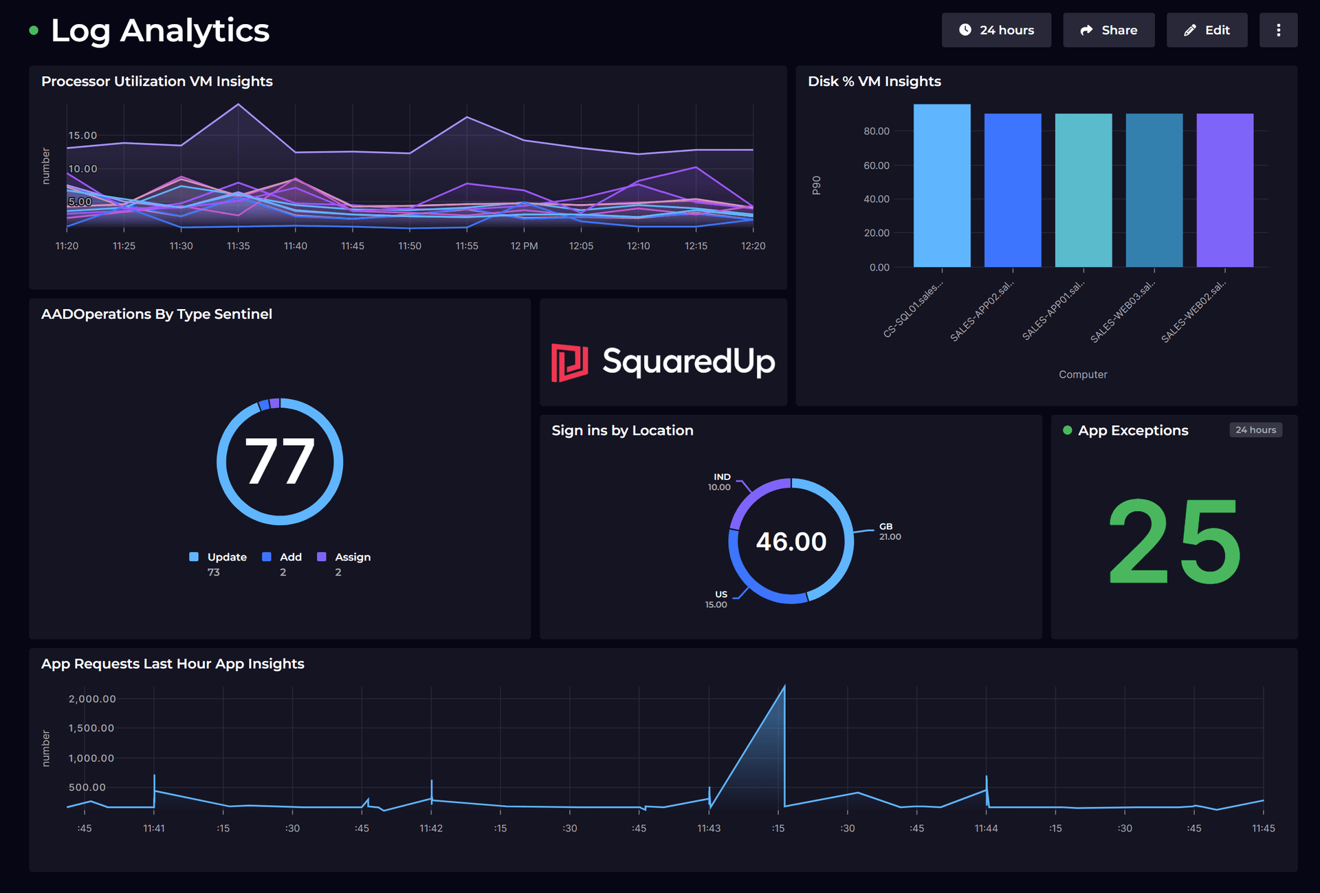
This SquaredUp dashboard uses the Azure plugin to surface key performance metrics from Application Insights. Common user experience metrics are all provided out of the box, and we can query, summarize, and analyse the raw logs and traces.
VP Innovation, SquaredUp

Accessing core application metrics that perform custom queries against the underlying Logs workspace isn’t a difficult task in the Azure Portal. However, building an Azure Application Insights dashboard that lets you bring these two sources of data together certainly can be difficult.
Being told when a certain monitor is outside of a desired threshold or when the number of unexpected entries in a Logs table exceeds a limit is also a vital step in a thorough monitoring approach, but Azure Alerts comes with a cost and is cumbersome to configure.
It's also not unusual in a world of complex, distributed applications that each component of the application might be storing data in different Application Insights and Logs workspaces, and even in different regions, subscriptions, and tenants. Getting a singular view or compiling a complete dataset is, therefore, often out of reach with the native tools.
SquaredUp lets you build a state-of-the-art Azure Applications Insights dashboard with ease, as common user experience metrics are all out of the box. Plus, by using configurable KQL data streams you can also query, summarize, and analyze the raw logs and traces being captured in the background.
When you’re building a dashboard in SquaredUp, there are never any tool-specific steps to take to craft the perfect visualization, regardless of the data source. Displaying the response time from an availability test alongside the exceptions count taken from a complex KQL query doesn’t require any heavy lifting. Then, when you need to take that a step further to calculate averages across different time periods or combine metrics into a single graph, it’s just a couple of extra clicks to bring more data into scope.
SquaredUp also breaks down the silos that Azure creates between different Application Insights and Logs workspaces. When getting your answer involves aggregating complex data sets from multiple tables, our SQL Analytics feature lets you bring in those disparate data sets and work with them using a familiar query language to create a new unified output.
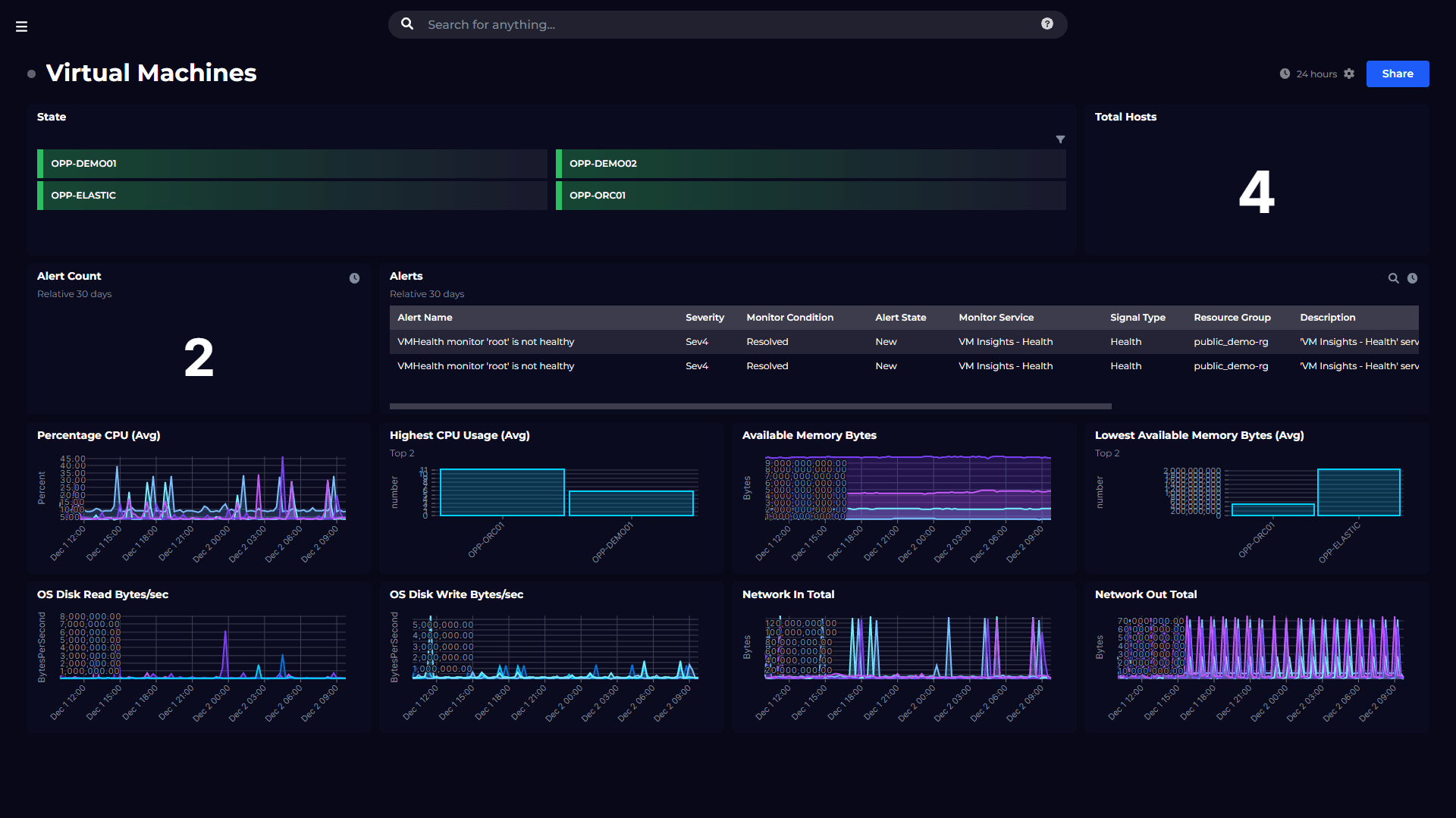
There are some core application metrics available out of the box with Application Insights that provide a good summary of how your application service is performing. The tiles in the left column display some of these common metrics in easy-to-understand line graphs
The other tiles on this application insights dashboard make use of a configurable data stream that performs a custom KQL query against the Logs workspace that holds all of the data for the Application Insights instance.
This query returns some standard data being collected by Application Insights relating to requests being made to the application. This data is then filtered or aggregated to provide the remaining visualizations.
As this application insights dashboard makes use of custom KQL queries, it isn’t included as standard as part of the Azure data source, but creating it yourself is quick and easy.
To see what other dashboards you can create, including a Azure Log Analytics dashboard, Azure DevOps dashboard, and other Azure dashboards, check out our Dashboard Gallery.


Monitor your Azure Application Insights environment using custom Kusto queries.