Adam Kinniburgh
VP Innovation, SquaredUp
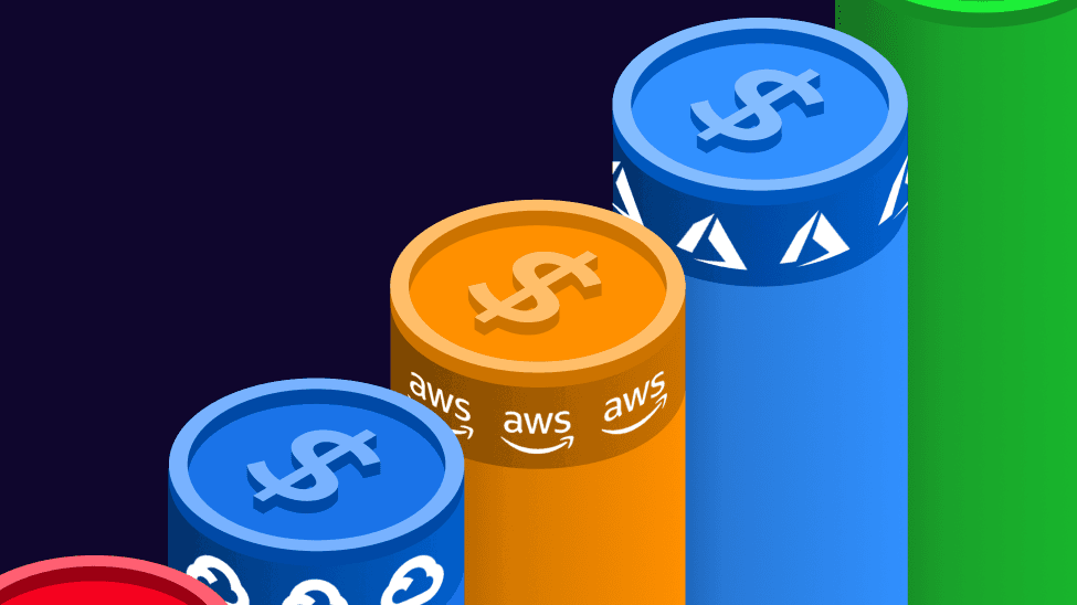
Although there are many great tools out there to get on top of application monitoring, there’s one vital metric that’s often overlooked by us technical folks – cost.
In the days of running apps on servers in private datacenters, the kit was a one-time purchase that the systems team had to deal with. But running apps in public clouds is a different story. Whether you’re running on VMs, containers in Kubernetes, or entirely serverless, execution of your code adds to the bill. So, chasing efficiencies is often time well spent.
In this blog, I’m going to walk through adding some cost data to an existing set of dashboards I use to monitor a fairly pricey Azure app.
Now I’m sure that, like me, you’re already thinking, “Everything I do is absolutely perfect first time, so there definitely isn’t anything that could possibly improve things.” So, what I’m expecting to see is that is my app is running like a well-oiled machine and not a single penny is being wasted. But maybe I’ll find that something isn’t quite right. Either way, tracking how my app is spending company money is a vital step to a well-rounded monitoring approach.
The setup for this app is pretty typical. Code lives in GitHub, changes are built and deployed using Azure DevOps, and the infrastructure all runs in Azure. We already have rich plugins for all these data sources, so getting a solid set of end-to-end dashboards put together was easy. All the cost incurred by this app is in Azure, and we already make it simple to stream costs into a dashboard, so adding this extra context will be a pretty simple task.
The core component of this app is an Azure API Management resource that runs sampleapi.squaredup.com. We use this to serve sample data into our products so that new users can get a feel for them without having to connect their own data.
Behind the Azure API front-end is a collection of Azure Function Apps, Logic Apps, and Storage Blobs that contain or generate the sample data on demand. The API is the big cost, but the cost is fairly static as there’s no consumption component.
What I really want to dig into here is the cost of my Function Apps and Logic Apps, which are entirely consumption-based. I’m not expecting anything eye-watering though.
I’m going to start at the bottom and work up, from granular to summary. So, here’s my dashboard showing the Function App. No alerts, which is always nice, but what I’d love to see here is cost over time, for the last 30 days.
I’ll start by adding a new tile in a useful place and opening the tile editor. Then I’ll create a scope that contains the Resource Group that holds my Function App components. The Function App is just one resource, but to run it there’s also a Storage Account and an App Service Plan, hence targeting the Resource Group. I want to see the whole picture.
Now that I’ve got my scope, I just need to pick the relevant Data Stream. I’m going to use the standard Cost data stream to see actual daily costs. I also want to fix my tile to the last 30 days.
So, great news – my Function App is practically free, coming in at only pennies each day. Phew. I think a Line Graph is the best visualisation to use here though so I get my “over time” view.
And, with a little layout tinkering, this fits nicely into my dashboard. On initial view it looks like there’s a lot going on with cost but, keeping in mind these fluctuations are in the range of £0.01 to £0.03 per day, it’s otherwise a fairly flat line in the grand scheme of things. Those other line graphs are tracking some significantly larger ranges in comparison, so I’m not likely to find any correlation here, and certainly no cause for concerns at this point.
I do want to keep an eye on this though, so I’ll turn on a simple threshold monitor for this tile so that SquaredUp can drop an alert into Slack if my cost ever spikes. It’s my first time configuring an error condition for cost exceeding a whopping £0.10 per day, but hey, it could alert me to something significant. I’ve turned on a warning condition too, at £0.05.
I’ve now moved onto my Logic Apps dashboard and repeated these steps to add my cost over time view and threshold monitor here as well. It’s a similar story, in that the cost looks a bit choppy but is over an even smaller range on a daily basis. This is great news.
The reason I say it’s great news is because my choice to use the relatively expensive Azure API service was motivated by two key things. First, performance, and second, reducing downstream burden through caching. It’s always worked really well so it gets a big tick for performance, and now I also have my proof that, despite millions of requests per day to the API, my downstream services are fairly quiet. Quiet = cheap. Good!
The final thing I want to do is add summary cost info to my top-level dashboard. I’ll bring in the few pennies I’m spending on my downstream services and combine that with all the other associated costs.
The first step is to create a new scope. I’m taking the same approach of targeting Azure Resource Groups to ensure that I’m scooping up everything that could be incurring a cost. But, unlike the previous dashboards, I’ve just multi-selected a set of groups.
One other thing I need to do, as I just want to a see a summary total cost, is use some grouping logic in my data stream. Azure is giving me a table of daily costs for my four resource groups, and I simply need to add all those values together to give me one number – my total.
I’m going to add one more tile to my dashboard before wrapping this up. I want to see my 30-day total cost but broken down by resource group. This will give me a view of the total cost of each part of the app. I’ll reuse the scope I just made, and again use the grouping logic in the data stream, but instead of just choosing to total my cost, I’ll also group by scope.
The output of this is a new table with a single data point per Resource Group, for the total cost over the last 30 days. I’ll go with a donut visualization and slot this in next to the total.
And here’s the finished product. I’ve got a close eye on my core technical metrics around availability and requests, but I’ve now got the extra context of cost as well. Brilliant!
The future potential for adding cost info to my otherwise classic monitoring dashboards is huge. Loads of what I do incurs cloud hosting costs, and not just in Azure. So, having better visibility of my multi-cloud apps is high on the list. Adding the granular resource costs to lower-level dashboards is a good start, but rolling those costs up into a multi-cloud summary would be cool. And not something I can do elsewhere either! I’ll write more about this in another blog post.
Publishing my cost reporting to a wider audience is likely something I’ll do as well, and probably something on your radar too. I don’t necessarily expect the interested parties to be checking all my technical dashboards to get at this info, but I can use SquaredUp’s KPI feature to publish my key metrics for others to use in their own dashboards. Very neat.
Until next time, folks.
VP Innovation, SquaredUp
Dashboard Story

Here's what our free tier includes: