Dan Watts
DevRel Engineer, SquaredUp
InfluxDB is a powerful open-source time-series database widely used for monitoring system performance, IoT metrics, and application telemetry.
With SquaredUp's InfluxDB plugin, you can effortlessly visualize and monitor your InfluxDB data, gaining real-time insights into your metrics alongside your other tools and services.
This guide will walk you through connecting InfluxDB with SquaredUp, creating dashboards, setting up monitoring, and sharing your visualizations.
Getting started is straightforward. If you don't have a SquaredUp account yet, signing up for the free tier is quick and easy.
Once logged into SquaredUp, click on the Settings gear icon and select Data sources.
Click on Add data source, search for InfluxDB, and select it. You'll be prompted to enter your InfluxDB connection details:
After filling in these details, click on Test and add. If the connection is successful, SquaredUp will set up the data source for you.

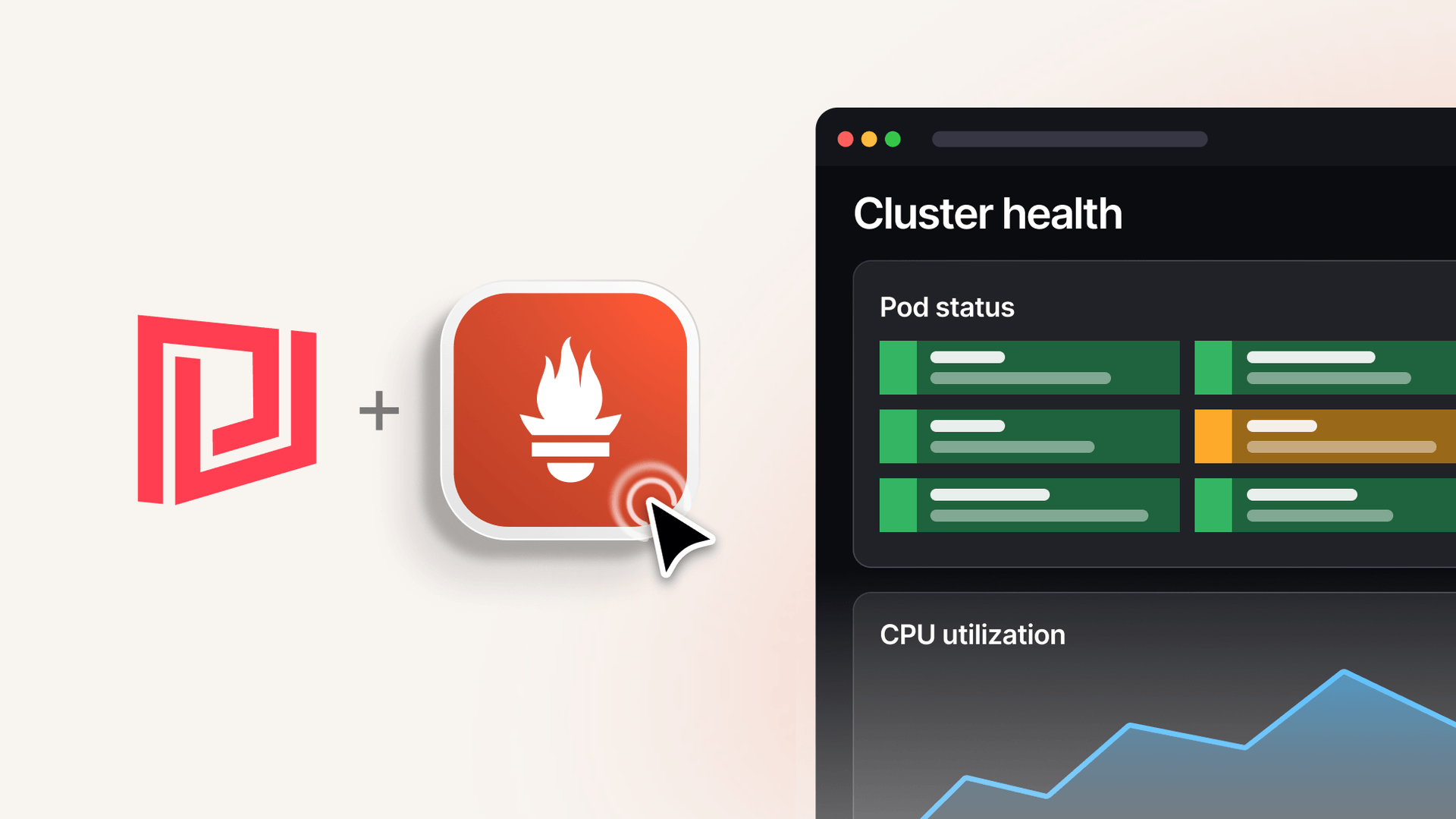
Now that the InfluxDB data source is configured, you can start building dashboards to visualize your data.

Repeat these steps to add more tiles and build a comprehensive dashboard that provides insights into your InfluxDB data.

Beyond visualization, SquaredUp allows you to set up monitors to alert you to specific conditions in your data.
Once set up, SquaredUp will display visual cues on the dashboard when the defined conditions are met, allowing you to stay informed about critical metrics.
Sharing your dashboards with colleagues or stakeholders is simple in SquaredUp, and it's a feature that's also available in the free tier.
Shared dashboards are read-only, making it easy to disseminate information across your organization.
By following these steps, you can effectively connect InfluxDB with SquaredUp, create insightful dashboards, set up monitoring to stay informed about critical metrics, and share your visualizations with others. Start exploring the power of SquaredUp and take your InfluxDB data visualization to the next level.
SquaredUp’s smarter dashboards help engineering, product, and IT teams make better decisions through a deeper understanding of their data. Visualize and monitor any data from any tool, all in one place. Sign up for free now!
DevRel Engineer, SquaredUp

Community | By Dan Watts
Visualize and monitor metrics from InfluxDB with fast and flexible dashboards.

Getting started with SquaredUp is free and easy. Our free tier includes: