Noorul Huda N
DevRel Engineer
Flexible Jira dashboards that paint the full picture of your projects
Jira is an industry favorite when it comes to managing software projects, yet its native dashboards can sometimes leave teams wanting more insight. The default views give a general update, but often lack the connection to the day-to-day activity happening in other parts of your workflow. As organizations use a wide mix of modern tools – from code repositories and cloud services to spreadsheets and reporting apps, it’s easy for critical details to get scattered or overlooked.
SquaredUp brings all this information together. Leveraging 70+ pre-built plugins, SquaredUp dashboards unify your Jira data with insights from a broad range of other platforms you rely on, whether for development, operations, analytics, or business. This way, your dashboards reflect the complete health and progress of your projects. With everything in one place, teams get a clear view of progress, collaborate better, and act quickly when priorities change.
Head over to the workspace you created and add the Jira data source.

Connecting to Jira is simple. Just have the following ready:

Once you’ve entered the required details in the data source configuration, click Test and Add. If everything is set up correctly, SquaredUp will connect to your Jira instance and automatically index the available objects.
From there, you can install the out-of-the-box Jira dashboards and start exploring your data right away.

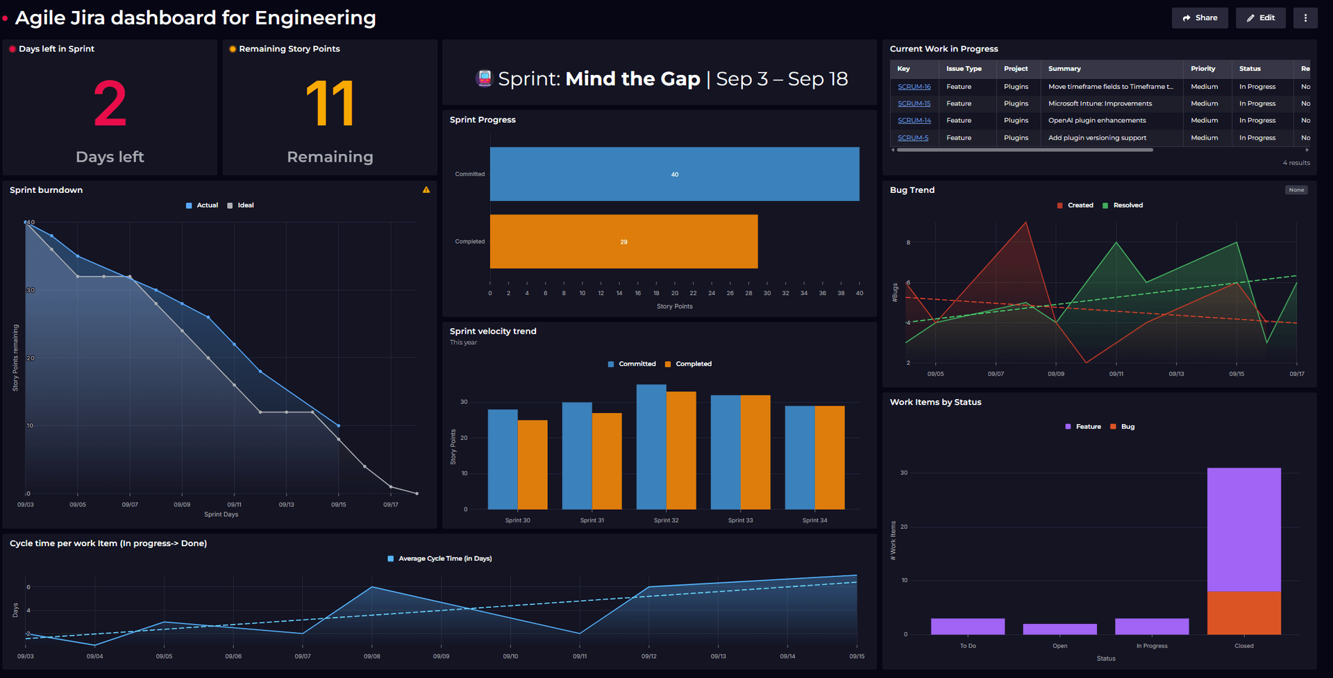
The Jira data source includes one out-of-the-box dashboard: Organization Overview. This gives you a high-level view of activity across your Jira projects.

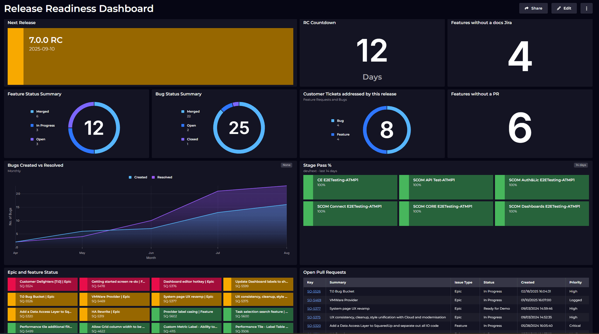
From this dashboard, you can click into individual projects for more detailed insights. For example, selecting a project like Automation opens Project-based perspectives such as:

If you want to make changes or share what you’re seeing, use the button in the top-right corner. This opens the dashboard in edit mode, where you can customize the view or share it with others.

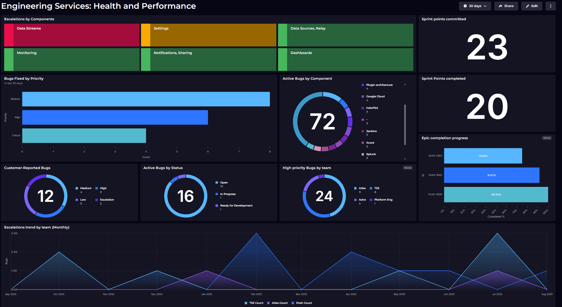
Just like projects, there are also Filter based perspectives:
These dashboards give you both an overview and detailed insights into work items.

Now it's time to explore the plugin and see what data we can visualize.
Start by creating a new dashboard, then add a tile to begin building your view.

From the list of available data streams, select “Work items.”
For this example, let’s say I want to view all the features from the project Squaredup Cloud that have the label feedback.
Use filters to refine the view. Multiple selections are supported.

In the Parameters section, start by selecting the statuses you want to include. Leaving it blank will include all statuses.
Next, choose the result type – in this example, we’ll display an aggregate count of open and in-progress tickets, grouped by assignee.
For the timeframe, select ‘Created’ to filter based on ticket creation date.
Once everything is set, click Done to apply the configuration.

For the visualization, I’d like to see this as a bar chart.

Now let’s explore the JQL Query data stream. This lets you build tiles directly from JQL, giving you more control over exactly what data you want to show.
It’s also more efficient. Instead of pulling all the data and filtering it later, JQL returns only what you need. That helps keep things lighter, especially if you’re working with a large number of issues.
For example, to see the total story points for active bugs from the past 30 days, I used this JQL query:
type = bug AND project = plug AND status not in (Closed) AND updated >= -30d and "Story Points[Number]" is not empty

Once I run this query, I can move to the Shaping section to add aggregation.

That’s it. The result shows me the total story points for those active bugs.

Now that we’ve explored data visualization, let’s look at how to stay informed through monitoring and notifications.
SquaredUp’s monitoring feature makes it easy to turn dashboard tiles into monitors, so you can get alerts when something important changes.
For instance, if you want to be alerted whenever a high priority bug is open, you can set that up quickly.

The tile status is currently red, indicating open bugs. Once all the bugs are resolved, the tile will turn green. You can monitor this status directly in SquaredUp, and you also have the option to set up Notifications.
Alerts can be sent through email, Slack, Teams, or any system that supports webhooks. For more details, check out our documentation on monitoring and notifications.

To share the dashboards, simply click the Share button. You can invite users to the workspace or generate a link to share the dashboard.

You've connected your data and started building insights, and there's so much more you can do.
Try new data sources, customize your views, and keep your team aligned with dashboards that provide the full picture.
Sign up for free and start exploring
DevRel Engineer


Getting started with SquaredUp is free and easy. Our free tier includes: