Noorul Huda N
DevRel Engineer
Dashboards aren't dead — they're what keeps your AI honest.
I recently gave a talk at Experts Live India 2026 about SquaredUp, and even before getting into the demo, there was one question I knew I had to address:
Is the dashboard era over?
It's something we're all hearing more. "Just ask AI." "Agentic AI will build your dashboards automatically." "Why bother with static views when a chatbot can answer anything?"
It's a fair question. Answering it requires a clear understanding of what a dashboard represents.
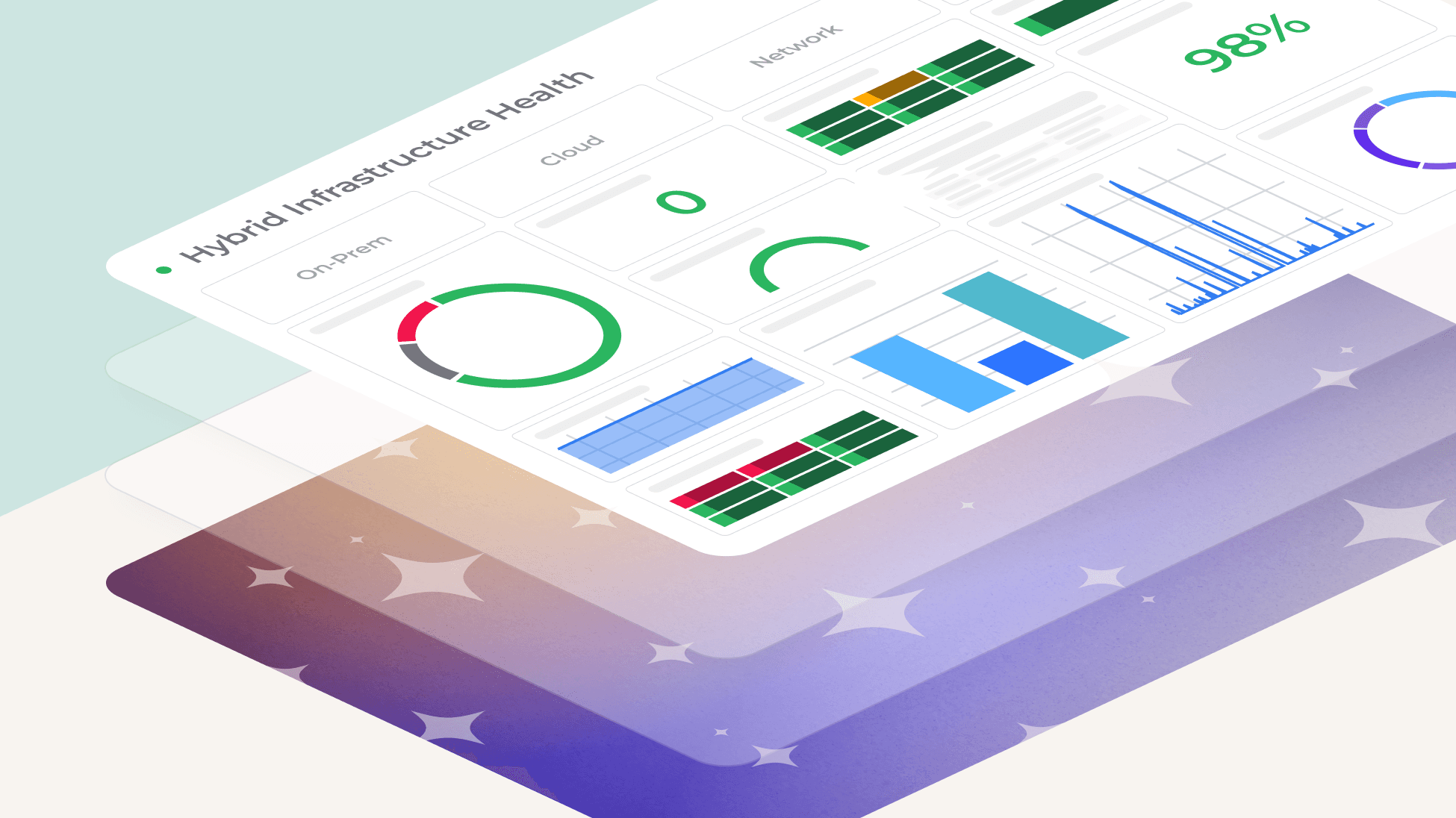
When we talk about dashboards, we don't mean static screenshots or weekly reports that someone emails around. We mean live visualizations of data — a real-time window into what's happening across your systems, right now. This is important because it’s where AI usually falls short.
Imagine a service outage at 2 AM. You don't need a language model's interpretation of the problem. You need to see the spike in error rates, the jump in latency, the dependency that just went offline.
Language models, while powerful, are prone to hallucination; their confident but incorrect answers during a crisis can send your team down the wrong path, leaving customers in limbo. In such moments, raw, live, undeniable data isn't merely beneficial — it's the only thing that gets you to the answer.
Raw data on its own isn’t enough. But neither is AI.
The real challenge isn’t choosing between them — it’s using them together properly. You need solid, reliable data, and then the right level of context and interpretation on top.
Teams usually fall into one of two traps. They either trust AI summaries without checking the facts, and then get burned when the AI is wrong. Or, they get buried in tons of raw data from different tools, and can't figure out what's going on fast enough to do anything.
The answer isn't to choose one over the other, but to build a strong base and get the fundamentals right first.
For data to be truly trustworthy, it can't be copied, transformed, or staged. The moment data moves through an ingestion pipeline, something can go wrong — it can be dropped, mislabeled, aggregated incorrectly, or simply go stale.
This is why SquaredUp connects directly to your tools via API, without any intermediate layer. The cost data you see is the cost data — pulled live from the Azure Billing API, identical to what you'd see in the Azure portal itself. The AWS metrics are the CloudWatch metrics, captured directly from your resources. There's no version of the truth. There's just the truth.
That's what makes it possible to trust what you're looking at — and to build on top of it with confidence.
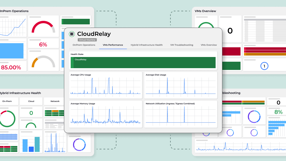
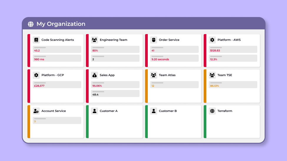
Once you trust the data, the next challenge is making it meaningful. A spike in error rates only tells you something is wrong. Understanding why requires seeing it alongside deployment history, infrastructure health, cost anomalies, and team activity — all at once, across every tool in your stack.
That's a different problem from data trust, and it requires a different solution. Not more dashboards — better connected ones. In practice, that looks like this:
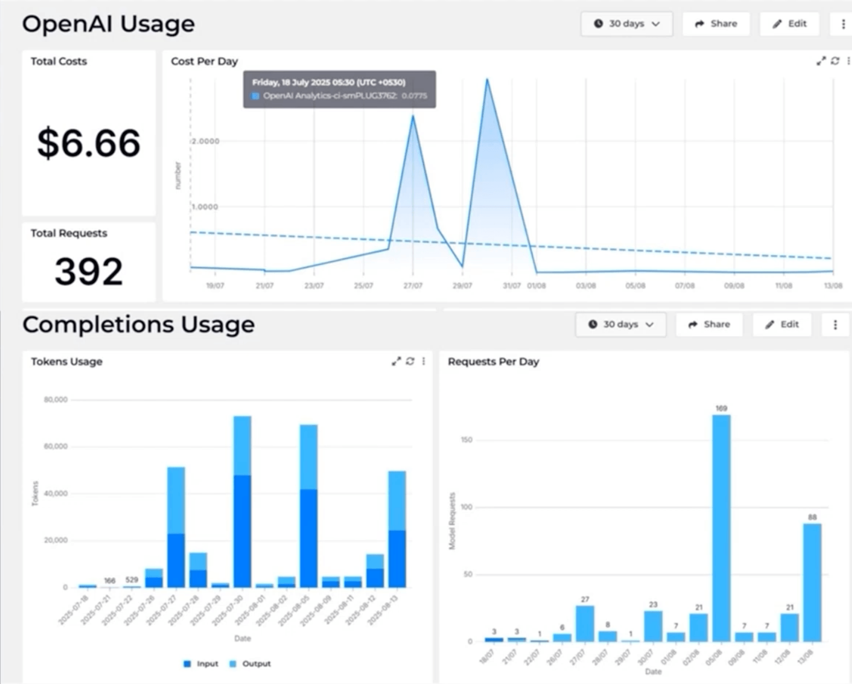
When your data is live, trusted, and connected across systems — that's when AI earns its place. It can spot anomalies you’d miss and flag patterns before they turn into full-blown incidents. AI built on clean, real data is incredible. AI used as a replacement for it is a massive risk.
The bad ones will. The ones nobody maintains, nobody trusts, and nobody can find — those are already dead. They just haven't been deleted yet.
But live visualizations of trusted, connected data? Those aren't going anywhere. In fact, they're more important than ever because AI is everywhere, and someone needs to keep it honest.
The future isn't “dashboards vs. AI”. It's dashboards as the undeniable source of truth that makes AI worth trusting.
When you have raw data you can trust, combined with context that connects it all, you're building what we call a data mesh. Fix that foundation, and everything else will naturally fall into place.
So, dashboards aren’t going anywhere. If you want to see what this looks like in practice, take a look at SquaredUp.
DevRel Engineer

Getting started with SquaredUp is free and easy. Our free tier includes: