Adam Kinniburgh
VP Innovation, SquaredUp
Our dashboards aren't just a pretty face. They sit on top of some very powerful technology. Unlike the other tools you might compare us to, our dashboards don't just float around in random folders serving only their casual onlookers. Instead, they form part of a structured map and have the power to share their data and signals with other dashboards around them. Even when you're not looking at them, they're serving a purpose.
Where most tools are just an unstructured mess that can easily sprawl out of control, SquaredUp brings order and context!
In this post, I'll explain just what that all means and how it can benefit you.

Put simply, health roll-up means taking the health from one object and using it to influence the health of another, typically something sitting higher up in your hierarchy. Health, that rolls up. In our context, we're talking about three key object types. Monitors, Dashboards, and Workspaces.
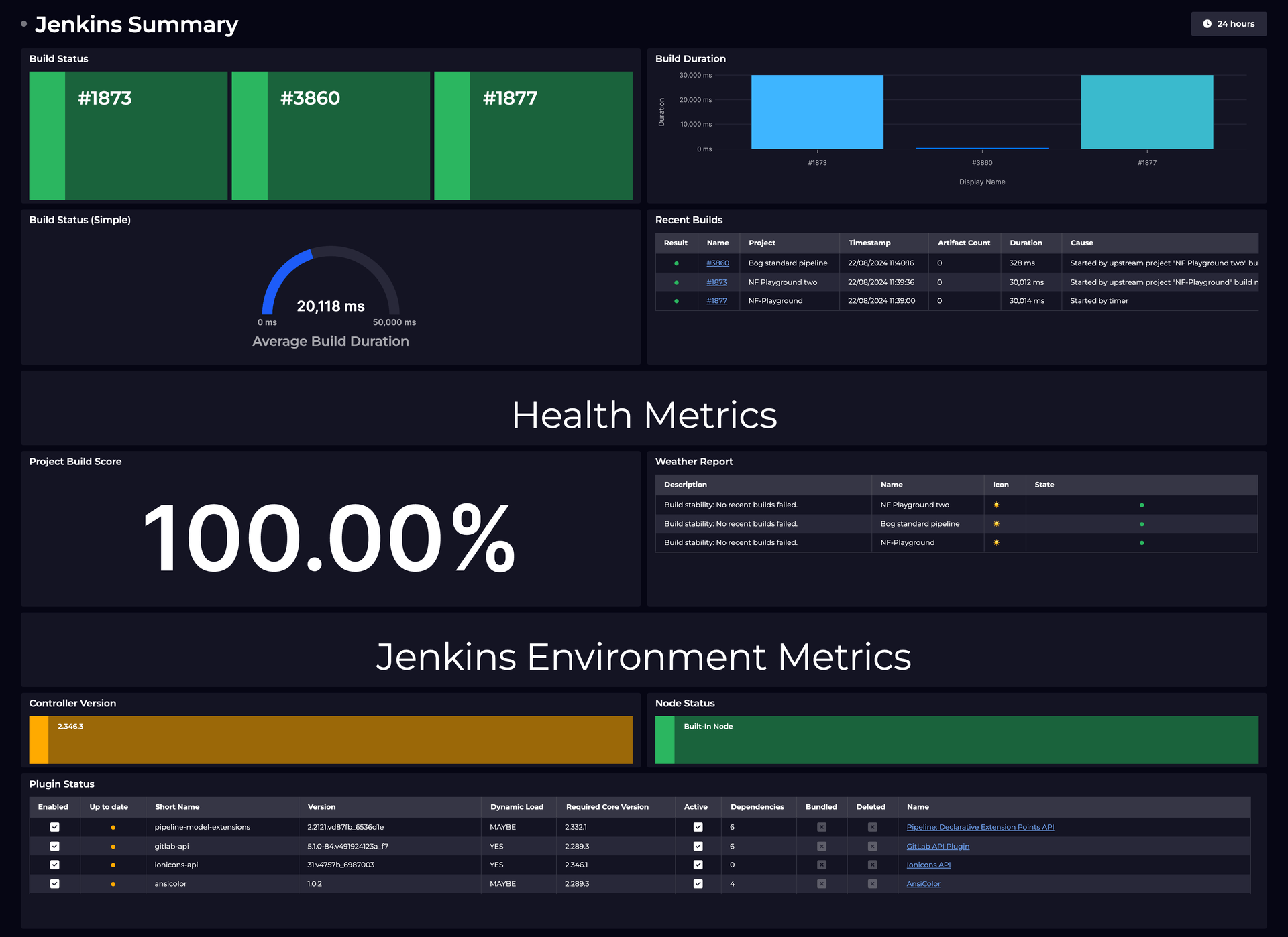
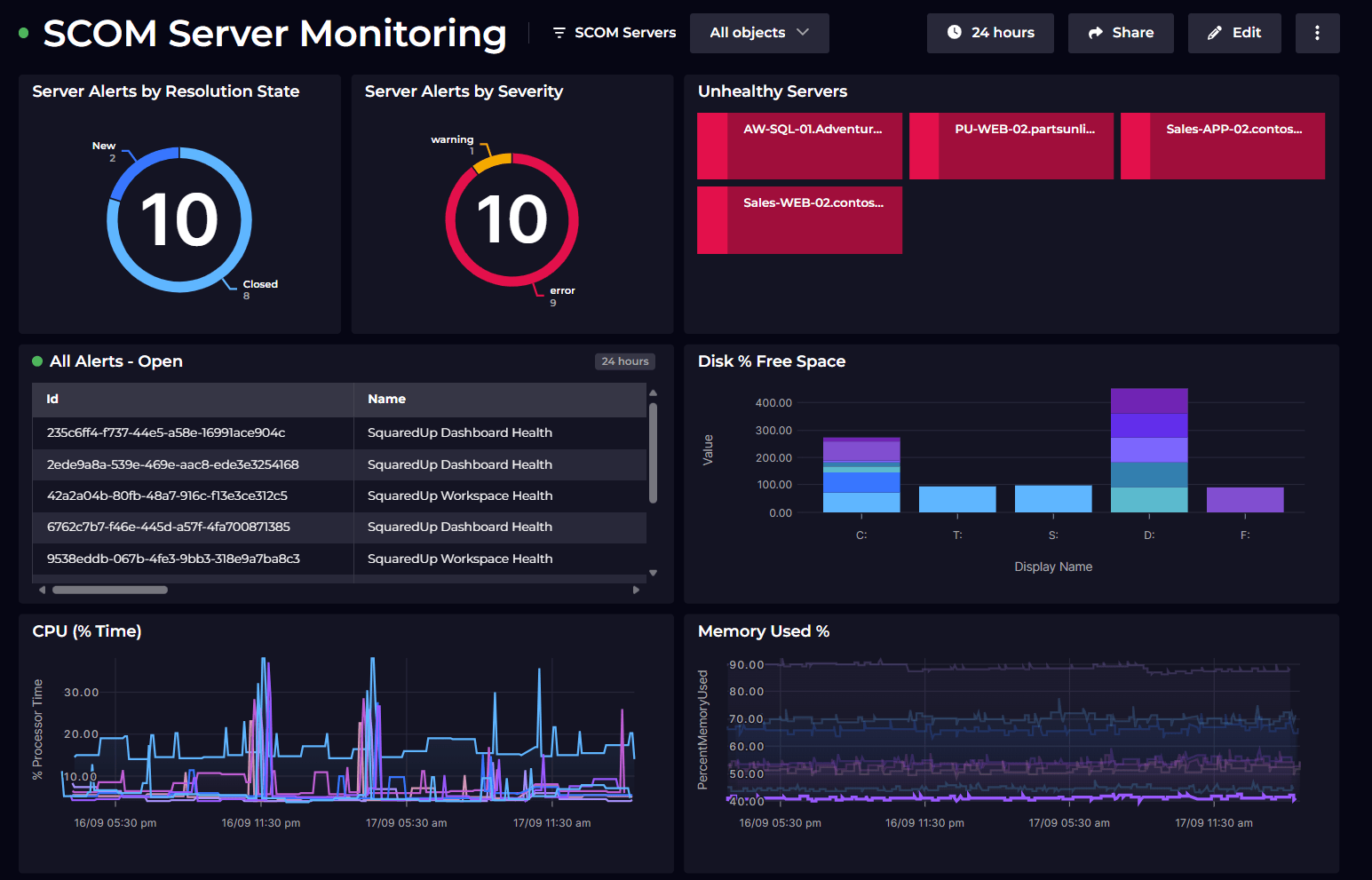
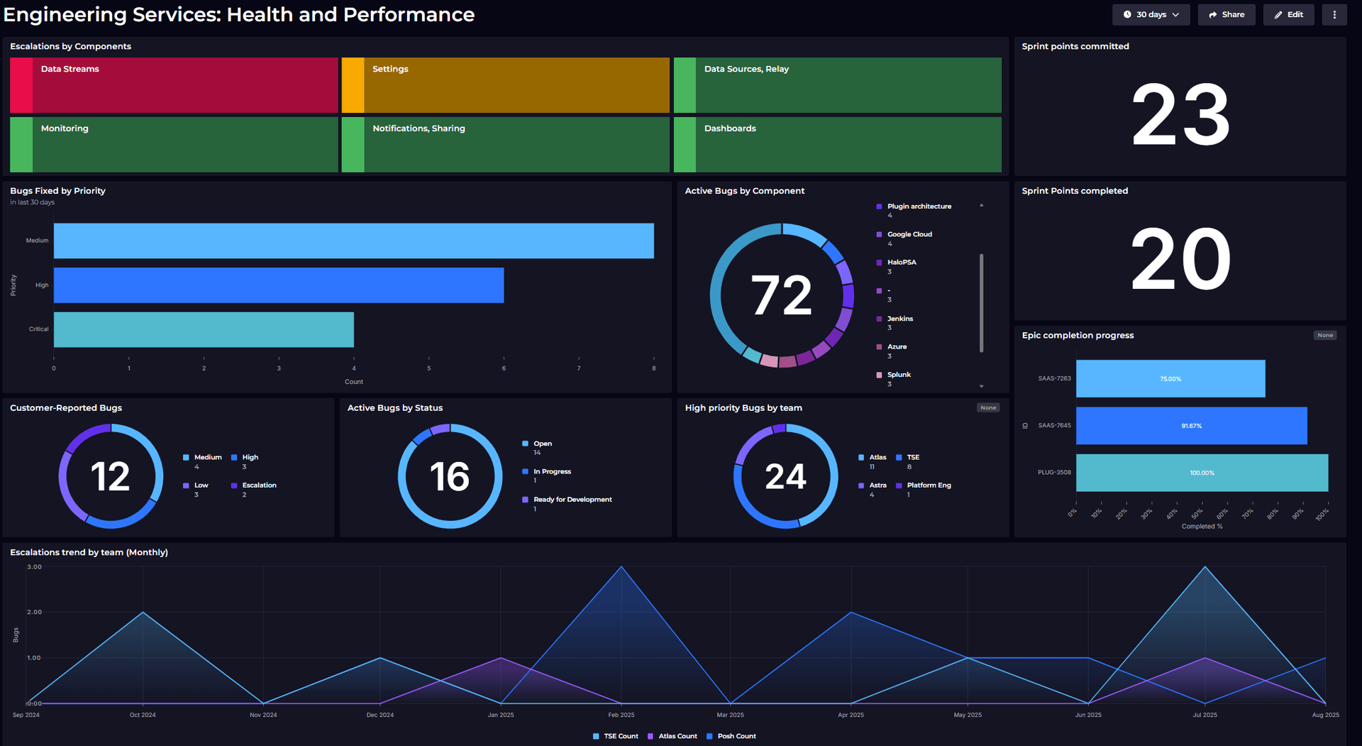
When you add a tile to a dashboard, you have the option to enable Monitoring (with a simple flick of a switch). This allows you to create a health state for the object(s) the data relates to, which we represent as a Monitor. Maybe it's a threshold on a metric i.e. when your response time goes over 100ms. Perhaps its a state monitor, used when another tool is already telling us something about object health.
Even at this lowest level, we're object-aware! If you're monitoring a line graph showing a collection of website response times, for example, we know exactly which of those data points tripped your monitor and can give you that rich context on your dashboards or in notifications.
Roll-up starts right from here. Your tile's health influences the health of the dashboard it lives on, and that dashboard influences the workspace it lives in. At the time of writing, our health model uses the state of the worst member in that roll-up. So if you have a dashboard with 2 tiles and one goes red, that "worst state" is what the dashboard inherits. This continues up the chain.
With a few dashboards in a few workspaces, with monitors enabled, the first win is that your global home view will light up like a Christmas tree. You can set the view to show Monitors, Dashboards, or Workspaces, and can then further filter this view by Tags, Health, or Types.
So with just a few monitors turned on, you're already a step towards that coveted "Executive View", uncluttered by busy line graphs and metrics, just the simple red, amber, green boxes they crave in the boardroom.
The filter preferences on this view are per user, so while your view might be all of the micro-service monitors from workspaces tagged up with your name, your boss might want to see all the application workspaces, and the exec team might want just department health.
Monitor to Dashboard to Workspace is just the start. That shows health in a very focussed way, but there's no structure yet. What if you want the health of a micro-service to impact the health of an upstream caller, or the performance of a sales rep to influence the health of their team... Now we're in the world of Dependencies.
SquaredUp was built to make dependency mapping simple and flexible. There are a few different ways to use all these juicy health states depending on what you want to achieve.
Easy... when building your dashboard, you simply choose the SquaredUp Health data stream and scope to the monitors, dashboards, or workspaces of your choice. All the things you create while using SquaredUp to view your data give you and your colleagues the ability to shortcut the need for repetition. You build the dashboard for the thing you know best, and your colleagues can simply take your word for it by surfacing those existing health states.
In this case, you'll get a simple block tile showing the state of those objects.

You can get a roll-up in this case by enabling a monitor on your new tile and choosing the State option. You're monitoring those existing monitors, in effect.
Now, if one of the objects you've chosen becomes unhealthy, your tile will become unhealthy too, as will your dashboard and workspace. That downstream health from somewhere in the ether is now rolling up into your workspace. Neat!

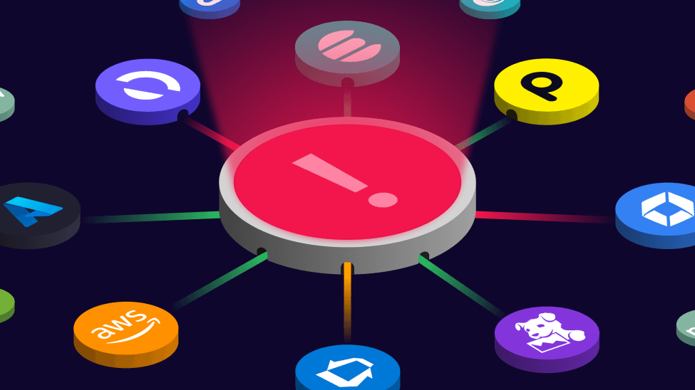
As a quick note at this point, now that you've got monitoring in your workspace, you can enable Notifications and SquaredUp can tell you via email, Slack, Teams, Zapier, webhooks, and more, when something isn't right. No need to wait for the other team to let you know they're in trouble.
But here's were it starts to get really fun! That connection you just made through your simple monitor, helps to enrich the entire object model for your organization.
From the Map pane, you can start to explore these relationships. The Map exposes the objects from your data sources too, not just your SquaredUp monitors and dashboards, so as you browse around you might discover things you didn't know before. Another team might be monitoring the same objects, for example, but for entirely different reasons.
Well I don't blame you... and I have some excellent news!
You've already got it. That last step has already built in all the knowledge we need to create an awesome organization-level map and to understand how health should move around. You built a dashboard and monitored some key metrics, your colleague surfaced that health state on their dashboard, and your boss built out their layer above, and so on. Kaboom, your whole organization is now beautifully mapped.
To marvel at your own greatness, simply move to your organization home and toggle the view from Tile to Map, and voila. From unstructured chaos comes structure and beauty!
With all of these dependencies in place, the health of each workspace will be inherited from all of those below. Issues with your lowest level services can be seen more easily, and why they're a problem can finally be understood.
Easy win! Any time you enable monitoring anywhere in SquaredUp, you're creating something that can trigger a Notification. We currently support sending notifications to email, Slack, Teams, ServiceNow, Zapier, and Webhooks.
Just jump into the Monitors tab from your chosen Workspace. You can create the destinations you need, and have fully granular control over what gets sent to who!
In addition to triggering based on Monitor conditions, our Notification API can be used to trigger a message whenever you want. Here at SquaredUp, we have notifications that include a whole dashboard being delivered to Slack channels at 9am each day. A great way to speed up those team stand-ups.
I started this article by talking about structured vs unstructured, and how all those other dashboard tools inevitably end up in the dreaded sprawl of unmaintained mess. Different versions of the same dashboard just to cater to different audiences, or even different deployments of the same tool just to get around disparate team silos.
Our mission is to build the next generation of dashboard tools, so we've made sure we don't suffer from any of those issues! By treating everything as distinct objects stored in our magical Map, making them searchable and reusable, and allowing users to share their hard work via health states and KPIs, we make it an absolute breeze to keep things neat and tidy.
The real beauty is that for most customers, "it just happens". With our object-aware approach and the simplicity of building those important relationships, it's actually pretty fun for people to identify all of the things that impact them and get them onto their dashboards. Simply point-and-click those relationships into existence and the entire organization benefits from that collective knowledge, all seamlessly correlated and colour-coded. No one person needs to achieve this on their own.
Health roll-up, made beautifully simple.
VP Innovation, SquaredUp

Getting started with SquaredUp is free and easy. Our free tier includes: