Noorul Huda N
DevRel Engineer

Getting started with SquaredUp is free and easy. Our free tier includes:
Here’s how you can easily track your team's sprint progress and delivery using SquaredUp
DevRel Engineer
In Agile software development, tracking the right metrics is key to keeping teams aligned and projects on track. However, many teams struggle with scattered data and lack of clear visibility into sprint progress, work status, and quality. A well-designed Jira dashboard brings all of this together in one place, making it easier to monitor delivery, spot blockers, and manage risks in real time.
Using SquaredUp makes this even easier. SquaredUp connects Jira data seamlessly with other tools and systems, allowing you to build customized, interactive dashboards that adapt to your team’s workflow.
Native Jira reporting can feel clunky when presenting to executives and offers limited options for visual customization. It struggles to combine Jira data with other business metrics and can slow down with large datasets. With SquaredUp, we can bring all that into one view. Instead of clicking through different Jira reports, we get a single dashboard that shows progress, quality, and delivery at a glance.
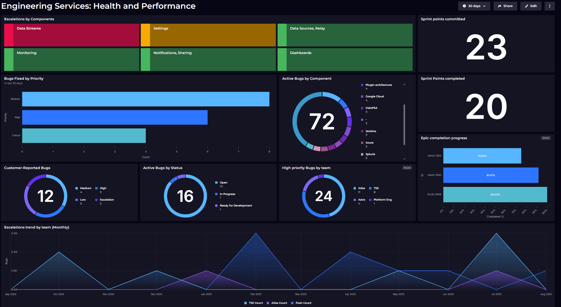
Our Agile engineering dashboard gives teams a real-time view of sprint progress, work distribution, and delivery trends. This dashboard shows:
This dashboard is designed with Scrum teams in mind, built specifically to track sprint progress and monitor team delivery metrics in real-time.
The most valuable view for engineers is understanding how much time is left in the sprint and how many story points remain. This helps assess whether the current scope is achievable or if work needs to be redistributed. That’s why these tiles are placed first, at the top of the dashboard.

Sprint dates are retrieved using JQL query datastream, and custom columns was used here to calculate the exact number of days left for the sprint end date.
Similarly, remaining story points are derived from JQL query datastream and with aggregation handled in the shaping section.
To keep teams proactive, monitoring is enabled on both tiles: the days-left tile raises an error when fewer than five days remain, while the story-points tile is color coded green for fewer than 10 points, amber for 10 to 20, and red if more than 20 remain.
An Agile Scrum dashboard without a burndown or burnup chart? That's almost impossible! Here’s how I built it.
Burndown shows progress against remaining work, while burnup shows progress against scope. I explain how to choose between the two here: Burndown and burnup: Two charts every engineering dashboard needs
I started with a JQL query to pull all work items from the sprint “Mind the Gap” in the Plugins project, making sure to include the story points column. That gave me all the sprint’s relevant issues with their story point estimates. I then grouped the results by resolved date and aggregated the story points, which showed me how much work was being completed each day.

To get the sprint’s overall total, I enabled SQL Analytics, added another dataset with the same JQL, and aggregated the story points. With both the resolved and total points in place, the rest was SQL. I generated a daily date series covering the sprint window (excluding weekends), calculated the cumulative resolved story points up to each day, and then worked out the remaining by subtracting that from the total.
For the ideal line, I assumed a steady linear pace, story points falling evenly from total to zero across the sprint’s working days and used row numbers over the date range to spread the decrease. Finally, I joined the actuals and the ideal line together by date, giving me a clean dataset for plotting the burndown line chart.

This part follows nearly the same approach as the burndown chart. I first used the initial dataset to pull all the story points that have been resolved so far, labeling that as Completed. Then, I added a second dataset to capture the sprint’s total story points (Committed).
Using SQL Analytics, I combined these two datasets and visualized the results with a simple bar chart showing progress as Committed versus Completed story points.

A velocity trend is essential for understanding a team’s delivery capacity over time. It doesn’t just show how much work was done in one sprint, it reveals the overall pattern of how the team is committing and completing work across multiple sprints, which helps in forecasting and planning future sprints more realistically.

To build this, I used JQL to pull in all the past sprints from the start of this year. For each sprint, I captured both the committed story points and the completed story points. Then, using SQL Analytics, I grouped the results by sprint and plotted them in a bar chart.
This makes it easy to see how the team’s velocity has been trending, whether commitments are consistent, and how close completion is tracking against commitments.
For this, I simply used a JQL filter to pull all work items in the current sprint with the status “In Progress”. Displaying them as a list gives the team a clear view of what’s actively being worked on right now.

This chart tracks the bugs that were committed as part of the sprint backlog and shows how many of them have been resolved. It gives clear visibility into progress on defect-related work within the sprint’s planned scope, making it easier for the team to see whether backlog bugs are being addressed alongside feature work.

This view shows all the sprint work items grouped by their current status like To Do, In Progress, In Review, Done, and so on. It gives the team a quick snapshot of where things stand: how much work hasn’t started yet, what’s being worked on right now, and what’s finished. Watching how the work is spread across these statuses helps spot any hold-ups and makes sure tasks keep moving smoothly through the sprint.

This metric shows how long each work item takes to move from In Progress to Done. Tracking cycle time helps the team understand how quickly work flows through the system once it’s picked up. Shorter cycle times usually indicate smoother delivery and fewer blockers, while longer ones highlight areas where work is getting stuck. Having this view makes it easier to spot outliers and improve the team’s overall flow efficiency.


With this dashboard in place, the team now has a clear view of sprint progress, quality, and delivery trends without having to dig into Jira manually. Workload distribution, story burndown, velocity, bug trends, and status breakdowns are all visible in one place, making it easier to spot blockers and adjust quickly. It’s not just a report, it’s become a daily reference point for alignment, forecasting, and continuous improvement.
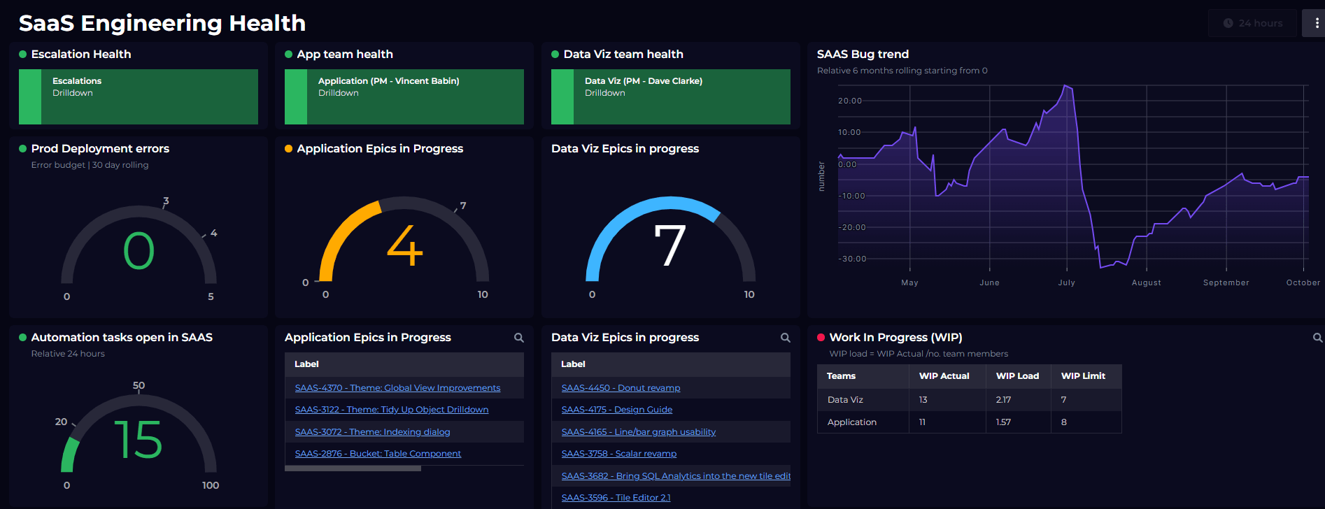
This dashboard focuses on Jira data, but the same approach works across tools (GitHub, CI/CD tools, monitoring systems) when you need broader engineering visibility. The idea isn't just to track numbers, but to give teams a single place to see progress, quality, and flow at a glance. By pulling data from different sources and shaping it into meaningful visuals, we turn raw information into actionable insights. The end goal is simple: keep delivery transparent, spot risks early, and help teams continuously improve.
If you're planning to build something similar, or just looking for inspiration to make your dashboards more insightful, feel free to explore more ideas on our Dashboard Gallery.
Alternatively, check out our other Jira / engineering performance dashboards:
And if you’re new to SquaredUp, simply create a free account to get started.