Noorul Huda N
DevRel Engineer

Getting started with SquaredUp is free and easy. Our free tier includes:
Clear insights into progress, quality, and the key signals that keep projects on track – powered by the Jira plugin in SquaredUp.
DevRel Engineer
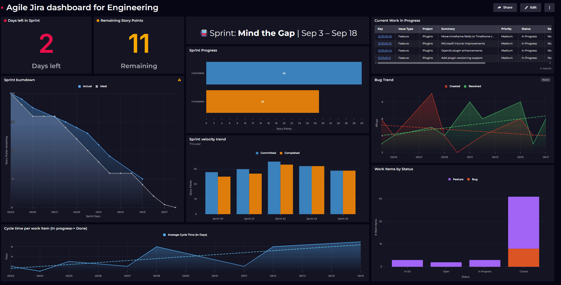
How do engineering teams consistently deliver reliable products? It begins with having a clear and unified view of their work. By tracking bugs, sprint updates, and team challenges all in one place, teams stay coordinated and on schedule.
Engineering leaders often find themselves searching across multiple tools to answer simple questions: Are we delivering what we committed to? Which areas need urgent attention? Are our major initiatives progressing?
Without a unified view, it's easy to miss early warning signs or spend valuable time hunting for insights instead of acting on them.
This dashboard focuses on the signals that matter most for engineering health. By bringing together bugs, sprint progress, epic completion, and escalations into a single view, it makes risks easier to spot and keeps teams aligned.
We focused on the vital signs that indicate whether engineering is healthy and performing – not every metric that could be tracked, but the ones that drive better decisions.
The dashboard covers five key areas:
Let's walk through each component of the dashboard and why it earned its place on our engineering health overview:
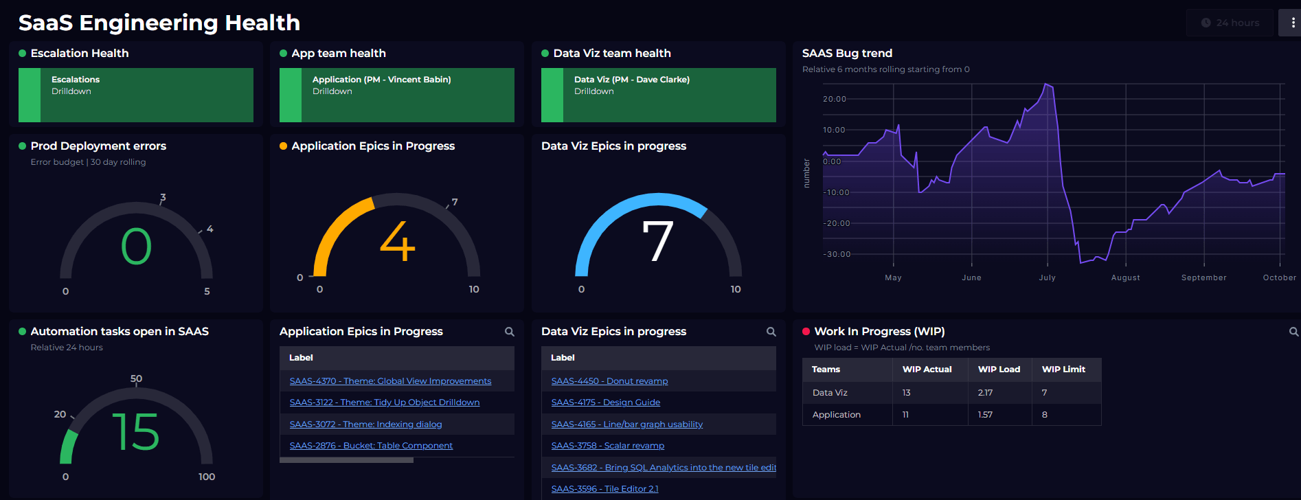
When customers escalate issues, it's not just a bug – it's a business risk. This tile shows us exactly which parts of our system are causing the most pain, with color-coding that makes critical areas impossible to miss.
We filtered for open escalations and applied custom color logic to highlight the most critical components in red, making hotspots immediately obvious. Instead of treating all bugs equally, we immediately see where customer frustration is concentrated, helping us allocate resources smartly and communicate proactively with affected customers.

This tile shows the gap between what we promise and what we deliver. It compares the story points we committed to with the work we actually finished in the past 30 days. For commitments, we look at bugs where story points were updated, and for completions, we use closed bugs. The point isn’t to be perfect, but to stay predictable so expectations are realistic and our planning keeps getting better.

This section gives us different views of bug health, such as trends over time, distribution by priority, customer-reported issues, and team ownership. We used JQL queries for bugs fixed in the last 30 days, open high-priority bugs, and customer-related bugs linked to support tickets, then show each in the format that makes the pattern easiest to see. It acts as an early warning for quality problems, helping us check if our bug-fixing is keeping up with new issues before they turn into customer-facing crises.

Individual tasks can be finished on time while major initiatives still fall behind. This tile shows the completion percentage of active epics based on their underlying work. We combine epic data with their child tasks and calculate completion percentages, focusing only on epics that are in progress. This helps connect day-to-day productivity with strategic progress, making it clear whether major initiatives are truly moving forward or just creating busy work.

Understanding which teams consistently deal with high-priority issues helps us provide targeted support and identify systemic problems. We pulled escalation data from three engineering teams over 12 months and visualized the trends as a line chart, using SQL to ensure missing months show as zero for continuous trend lines. This 12-month view reveals patterns that point to deeper issues - whether certain teams need additional resources, training, or architectural changes to reduce future escalations.
What makes this particularly valuable is seeing trends over time rather than just snapshots. A team might have a spike in escalations during a major release, which is expected. But if escalations are consistently climbing month over month, that signals something more fundamental - maybe technical debt in their codebase, unclear requirements, or capacity constraints that need addressing.
The monthly breakdown also helps us correlate escalation patterns with other events - new feature releases, team changes, or infrastructure updates. This context turns escalations from reactive into proactive team health management.

This concludes our walkthrough of the dashboard. What began as raw Jira data is transformed into a clear view of engineering health, highlighting progress, risks, and priorities at a glance.

We hope this example shows how meaningful engineering metrics can be visualized to drive better outcomes. The key is picking metrics that lead to action, not just measurement. Every tile here answers a question that shapes how we run engineering.
Want to build better visibility into your own engineering health? Begin with the questions that matter most to your team.
If you're planning to build something similar, or just looking for inspiration to make your dashboards more insightful, feel free to explore more ideas on our Dashboard Gallery.
And if you’re new to SquaredUp, simply create a free account and start building your own dashboards today.