Noorul Huda N
DevRel Engineer

Getting started with SquaredUp is free and easy. Our free tier includes:
How we helped a major US manufacturing company pull data from different tools into one highly customized DORA metrics dashboard.
DevRel Engineer
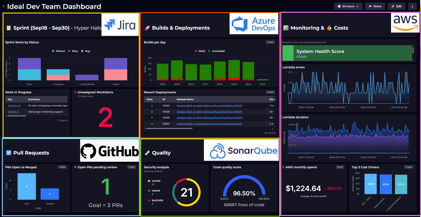
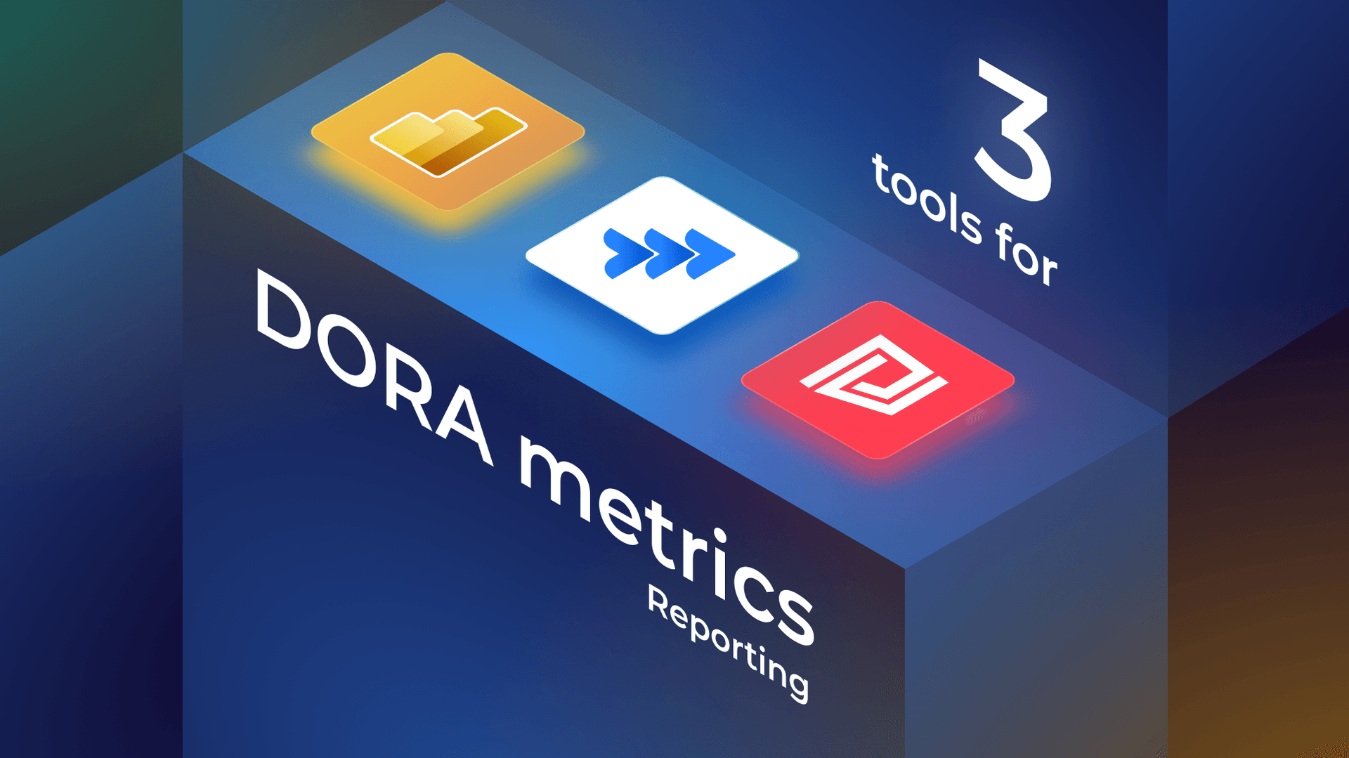
Many large enterprises rely on multiple tools to deliver software, but stitching those tools together to measure performance is anything but simple. We helped a major US manufacturing company solve the problem, pulling data from Jira, Azure DevOps, and ServiceNow into one DORA metrics dashboard.
The data needed to measure DevOps metrics is distributed across several tools.
Different teams used:
Each tool did its job well, but none of them showed the full picture. There was no simple way to trace how work moved from idea to production, making it tough to measure performance or spot opportunities to improve.
ServiceNow did offer out-of-the-box DORA metric insights that were a helpful starting point. However the company needed more flexibility. They wanted to define each DORA metric in a way that aligned with how their teams actually worked, and that wasn’t something the default ServiceNow setup could easily support.
They needed a way to bring together data from Jira, Azure DevOps, and ServiceNow into a single dashboard that reflected how their teams actually worked. SquaredUp offers pre-built DORA dashboards as a strong starting point. But the real value came from how easy it was to tailor DORA metrics within the dashboard to reflect their own delivery process.

Using the pre-built dashboard in SquaredUp as a springboard, the reporting team adjusted each metric to reflect their needs, combining data across tools where necessary.
Here is this company’s take on their DORA Metrics, one by one:
1. Deployment Frequency
This metric followed the standard DORA definition, so the out-of-the-box SquaredUp tile worked well with little to no modification. They adjusted the query timeframe to 30 days to align with their reporting needs, but otherwise the default tile worked out of the box.

2. Lead Time for Changes
For Lead Time, they combined data from Jira and ServiceNow using SQL Analytics. Each Jira ticket was linked to a corresponding change in ServiceNow using a custom field for the change number. This let them stitch the two data streams together and calculate lead time based on how their work actually flowed:
Lead Time = Resolved date of the ServiceNow Change – Created date of the linked Jira issueA simple SQL query stitched the two sources together, giving them full control, and since the tiles were fully customizable, they could adjust or extend the logic anytime.

3. Change Failure Rate
They used the Table Query data stream in SquaredUp to pull all change requests from ServiceNow and calculate the percentage of changes marked as unsuccessful based on their internal criteria. Here’s how they did it:

4. Mean Time to Recovery (MTTR)
They used ServiceNow’s incident data, focusing on Priority 1 cases, to measure how long it took to resolve the most critical issues.

The result was a dashboard that reflected their actual delivery performance. It was easy to share with stakeholders, display on team monitors, and adapt as their processes evolved.

If you're curious to see how SquaredUp could work for your team, you can start by creating a free account and connecting your own data sources.
Happy dashboarding!