Noorul Huda N
DevRel Engineer

Getting started with SquaredUp is free and easy. Our free tier includes:
See what’s done, what’s blocked, and what’s next. Bring clarity to release tracking with this SquaredUp Jira dashboard.
DevRel Engineer
Two weeks before launch, every product team scrambles. Features are unfinished, documentation is missing, tests are failing, and customer issues keep popping up.
The core questions are simple but rarely easy to answer: Will we hit the deadline? Which features are at risk? What’s blocking us? Are quality issues improving or not? These should be straightforward, but too often they aren’t.
To see the full picture of release health we end up in a frenzy, jumping between tools, chasing tickets, and manually checking if key tasks are done. That last-minute panic shouldn’t happen. Good release management is about having a clear view in real time, from start to finish. We should be able to see release health at a glance, spot risks early, and make decisions with confidence.
Our Release Readiness dashboard gives product and engineering teams a real-time view of what's ready, what's at risk, and what needs immediate attention. This isn't just a demo – it's the same dashboard our squads use every week, whether troubleshooting with developers, discussing status in management meetings, or presenting updates to leadership.

The dashboard covers the essential signals for release confidence:
Many of the tiles in this dashboard started as standard tiles from SquaredUp’s out-of-the-box Jira dashboards. The Jira plugin includes ready-made dashboards so teams can get started quickly. The real strength, though, is in customization. Each tile whether bug trends, feature progress, or release countdowns, can be adapted to fit specific projects, workflows, or priorities.
Here’s a walkthrough of how we built some of the key tiles in our Release Readiness dashboard.
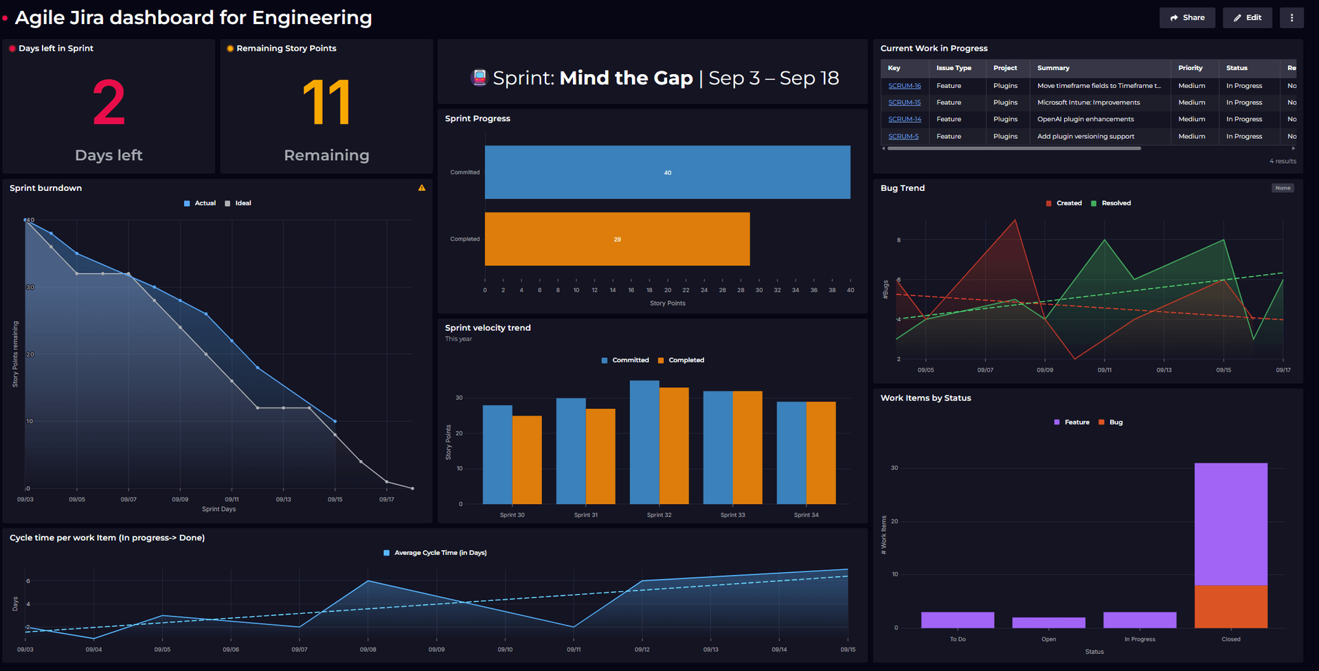
The most important question for any release: how much time is left? We show the next release with a dynamic color-coded countdown that turns from green to amber to red as the deadline approaches. We filter upcoming releases and apply custom logic so the urgency is immediately visible - green when there's time, amber when it's getting close, red when we're in crunch mode.
The countdown shows the release date, so everyone knows the deadline. It’s a simple visualization that keeps the team aware of time pressure without needing to check calendars or ask.

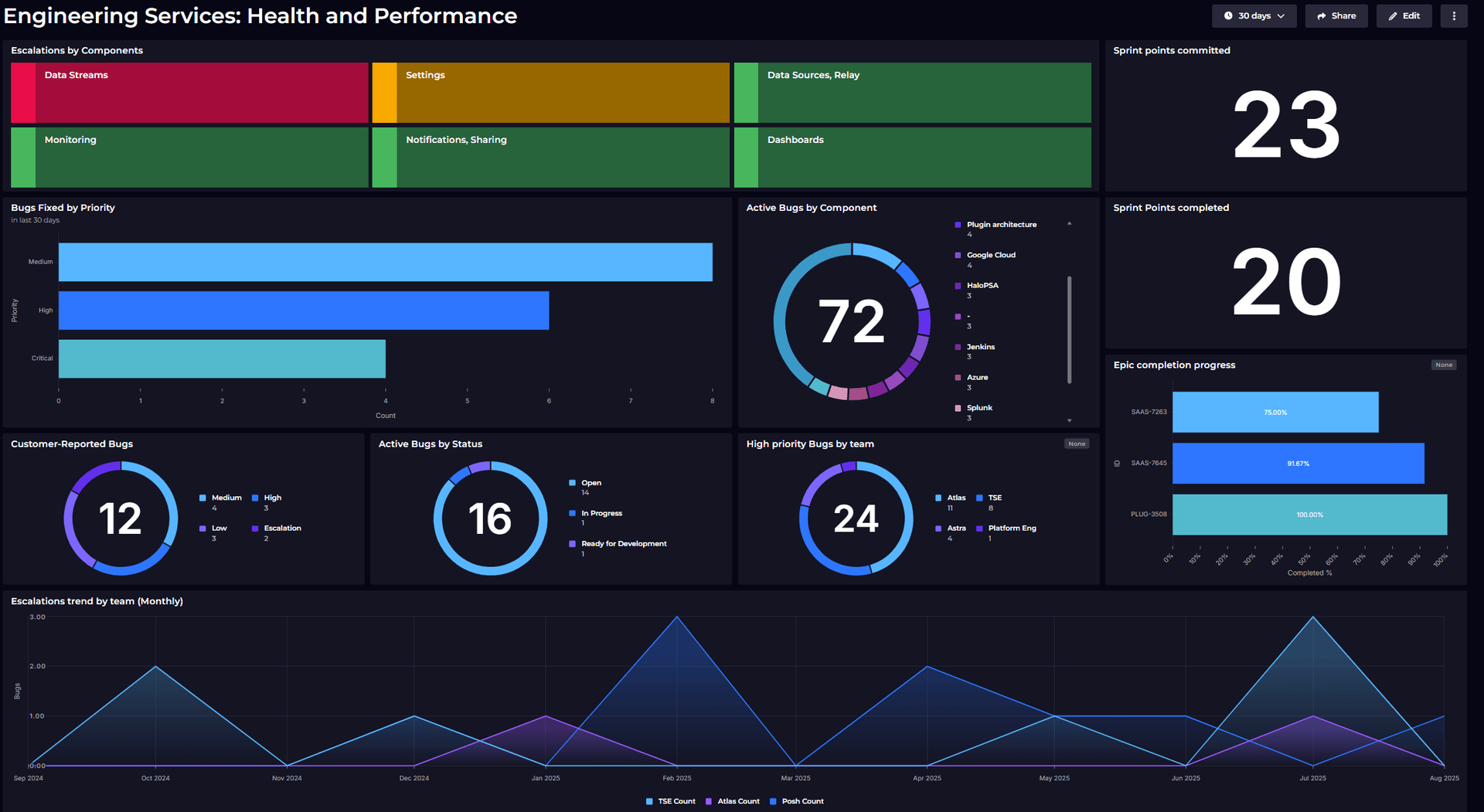
Two companion tiles display the status of all features and bugs for the release -what’s done, in progress, or blocked. We focus on the specific release version and show this as donut charts grouped by status.
This gives product managers a quick check of release progress based on actual data, not assumptions. The visualizations also make it easy to spot if too many items are stuck or if the “Closed” portion isn’t growing fast enough.

Customer-facing issues often shape release priorities, so this tile tracks which support tickets are being resolved in the upcoming release. We filter for work items linked to Zendesk and exclude anything marked “Won’t Do” to reflect genuine customer impact.
This keeps external feedback visible in release planning and highlights the value being delivered to customers. It also helps decide which bugs deserve attention when time gets tight.

Some details are easy to miss before a release but can cause problems at the last minute. These two tiles highlight features without documentation tickets and pull requests still waiting for review.
We filtered the features that don’t have linked documentation or still have open pull requests. These quick checks help avoid last-minute scrambles and make sure nothing goes out unfinished.

The key question for release quality is whether we’re fixing bugs faster than we’re creating them. This tile helps answer that by showing the monthly trend of bugs reported versus bugs resolved over the past 18 weeks.
It uses SQL analytics to combine data on created and resolved bugs over time, giving a clear view of whether bug-fixing efforts are keeping pace. When the number of new bugs starts to exceed the number of bugs fixed, it serves as an early warning that quality problems could slow down or delay the release.
By looking at the trend over time, teams can tell the difference between normal ups and downs and serious patterns that require action.

This tile gives a health check of major work items and code reviews still in progress. It pulls in the epics and features tied to the release and shows their status with simple colors: green for completed and merged, red for blockers, and amber for tasks still in progress.
The view makes it easy to see whether key initiatives are on track for the release deadline. It also highlights pull requests that are waiting for review, which are a common cause of delays in the final weeks before launch.

This tile measures quality confidence by tracking the stability of automated tests. It shows pass rates across different stages using data from our Azure Devops - CI/CD pipeline. Colors make the status clear: green for pass rates above 99%, amber for slight drops, and red when rates fall below 80%.
A dip in test stability is often the first sign of release quality issues. Catching this early allows teams to fix problems before they block deployment. At its core, this tile answers a simple question: are we confident enough in our quality to ship?

Release planning stopped being about chasing updates and became about managing risks early. Product managers could share timelines with more confidence, engineers spotted blockers sooner, and everyone had visibility into release health without constant check-ins.
The biggest shift was in the conversation. Instead of asking “will we make it?” the focus became “what do we need to do to ensure we make it?”
That brings us to the end of this dashboard story. By combining Jira data with other sources like Azure DevOps, and using custom visualizations, it’s now much easier to get a clear, actionable view of our release progress
If you're planning to build something similar, or just looking for inspiration to make your dashboards more insightful, feel free to explore more ideas on our Dashboard Gallery.
And if you’re new to SquaredUp, simply create a free account to get started.