Noorul Huda N
DevRel Engineer

Here's what our free tier includes:
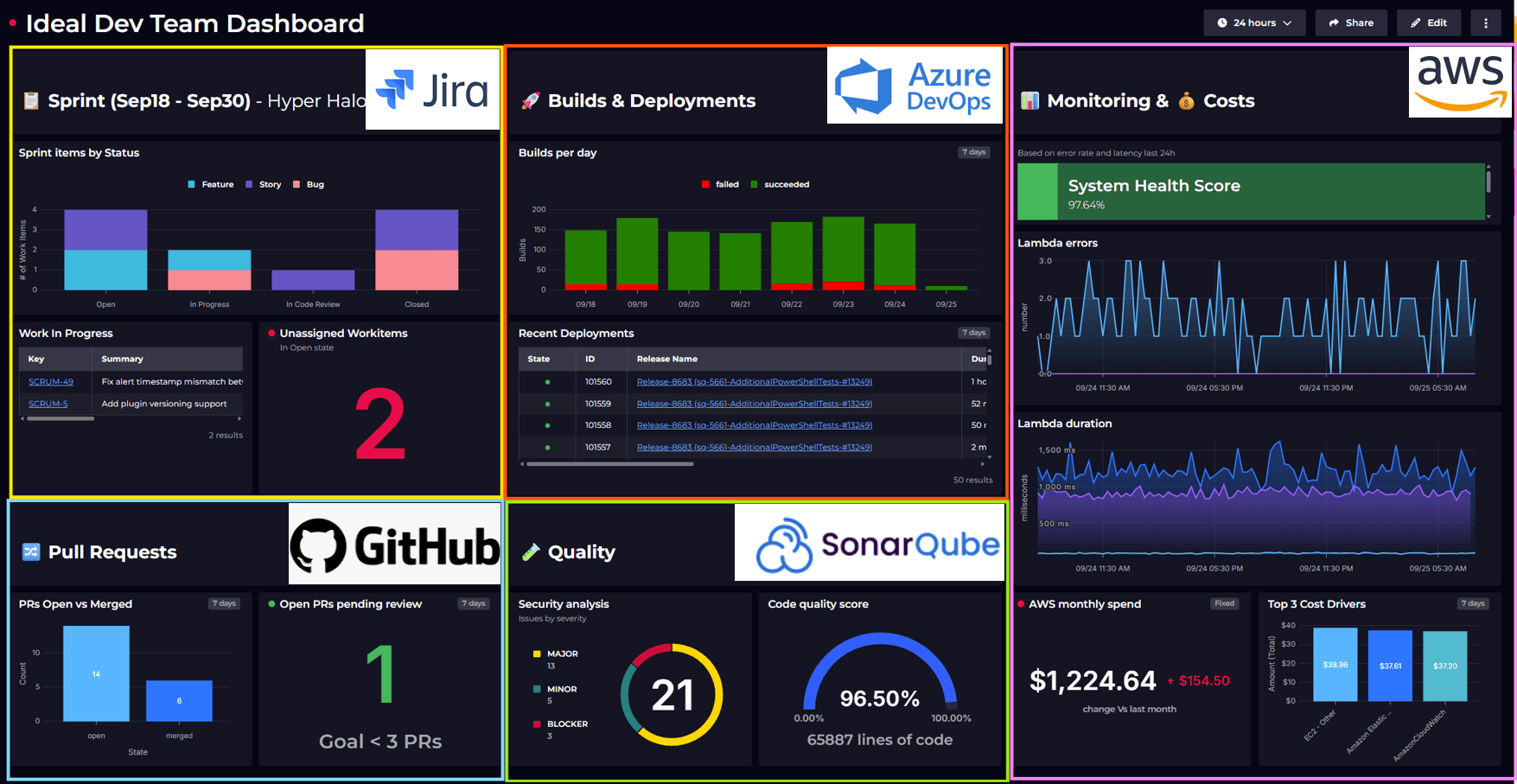
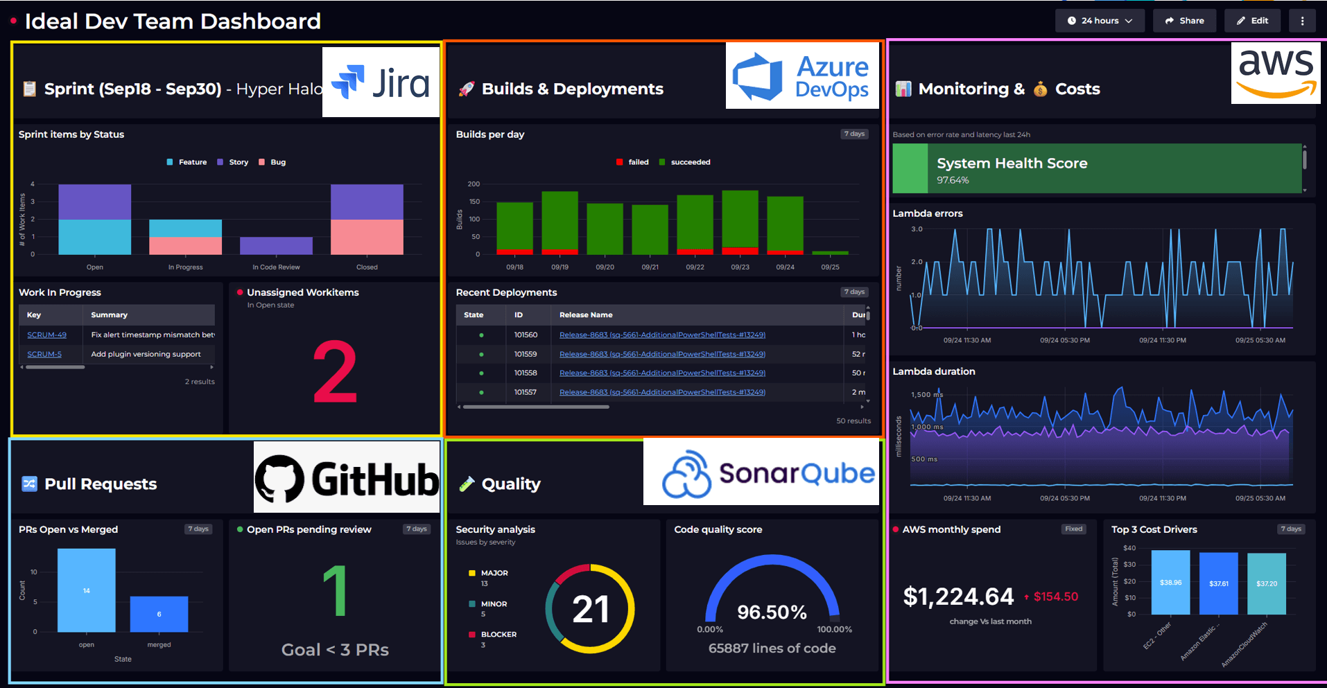
See all your security & code-quality metrics in one place with SquaredUp.
DevRel Engineer
I was watching Tim's video where he built GitHub security tiles, and it got me thinking - If visualizing GitHub data is this easy in SquaredUp, then why not pull in everything else we need to see?
Tim Wheeler – Director of Engineering at SquaredUp, showed Dependabot alerts, code scanning, and secret scanning alerts, and how simple it is to surface them in SquaredUp. But anyone working in security knows that's only part of the story.
GitHub Advanced Security is a great starting point, but you still need visibility into code quality and pipeline security. I'm using SonarQube for that, and the reality is that you're constantly jumping between tools. You check GitHub for vulnerabilities, then SonarQube for code quality, then cross-reference with your CI pipeline to see what's deployed, which is exhausting.
It became clear that the problem wasn't the tools; it was the lack of a unified view. What if we could finally see all that critical context - the code, the alert, the production status, all in one place?
That's what this dashboard does. It combines GitHub security data and SonarQube metrics to answer real questions:
I took Tim's approach and pushed it further. The goal was to give teams a dashboard that tells them what matters and what to fix, and alerts them when something critical shows up, without drowning them in noise.

Up here, the focus is on what needs attention right now. These four metrics tell us if we're exposed today.
To learn more about how quick and easy it is to set up monitoring and notifications, take a look here: Monitoring & Notifications
Next, we show the engineering health of the codebase. These four metrics tell us if our codebase is healthy enough to prevent future issues.
At the bottom, these trends answer the big question: Are we getting better or worse?
You see vulnerability trends over time by severity on the left, and on the right, how much remediation is actually happening month by month.
Overall, this dashboard helps teams focus on real, exploitable risk instead of raw alert volume scattered across tools. It gives leaders a quick way to see whether things are actually getting safer over time, and it lets engineers move from chasing alerts to making clear, informed security improvements.
If you're tired of context-switching between security tools, try building something like this. Start with the data sources you already have, connect them through SquaredUp, and get the critical metrics visible to take action.
Ready to build your own? Create a free account and connect your GitHub, and start improving your security visibility today.