John Hayes
Observability Advocate, SquaredUp

Most engineering teams today have a multiplicity of tools to meet all of the different challenges they face. Some people characterize this as a problem and describe it as 'tool sprawl'. At SquaredUp, we just see it as a fact of life that no tool can excel at every job and engineers will want to choose the best tool for each task. Many companies have multiple toolchains spread across different teams and departments.
If you are a DevOps manager, you may have teams running a number of different CI/CD pipeline technologies e.g. GitHub Actions, Azure DevOps, Jenkins etc. Whilst this works for individual teams, getting a clear overview of pipeline performance can be challenging.
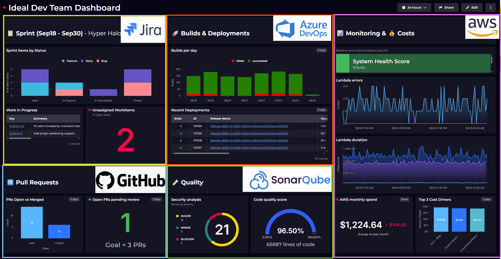
In this article, we will look at how you can use SquaredUp's range of DevOps plugins to create dashboards for Azure DevOps, GitHub Actions, and Jenkins pipelines and then create a summary dashboard to monitor and view key insights across all of your pipelines.
GitHub Actions is a relatively new kid on the block, but Microsoft has invested heavily in its development, and it has subsequently gained traction. The dashboard below was created using the GitHub Workflow Runs data stream in the SquaredUp GitHub plugin.

To build this dashboard just add the GitHub plugin and select the Workflow Runs data stream:

Then you can just select the repos that you want to include in your dashboard.

The data stream will bring back all workflow runs - including built-in workflows such as Close stale issues and PRs. We can easily exclude these with a simple filter:

You can find the rest of the steps for creating this dashboard in this Getting Started article.
The dashboard below was created using our Azure DevOps plugin. This is an out-of-the-box data source - so SquaredUp does all the heavy lifting. All you need to do is connect the plugin to your Azure DevOps organization and it will automatically populate a set of ready-made dashboards by running queries against your pipelines, repos and work items.
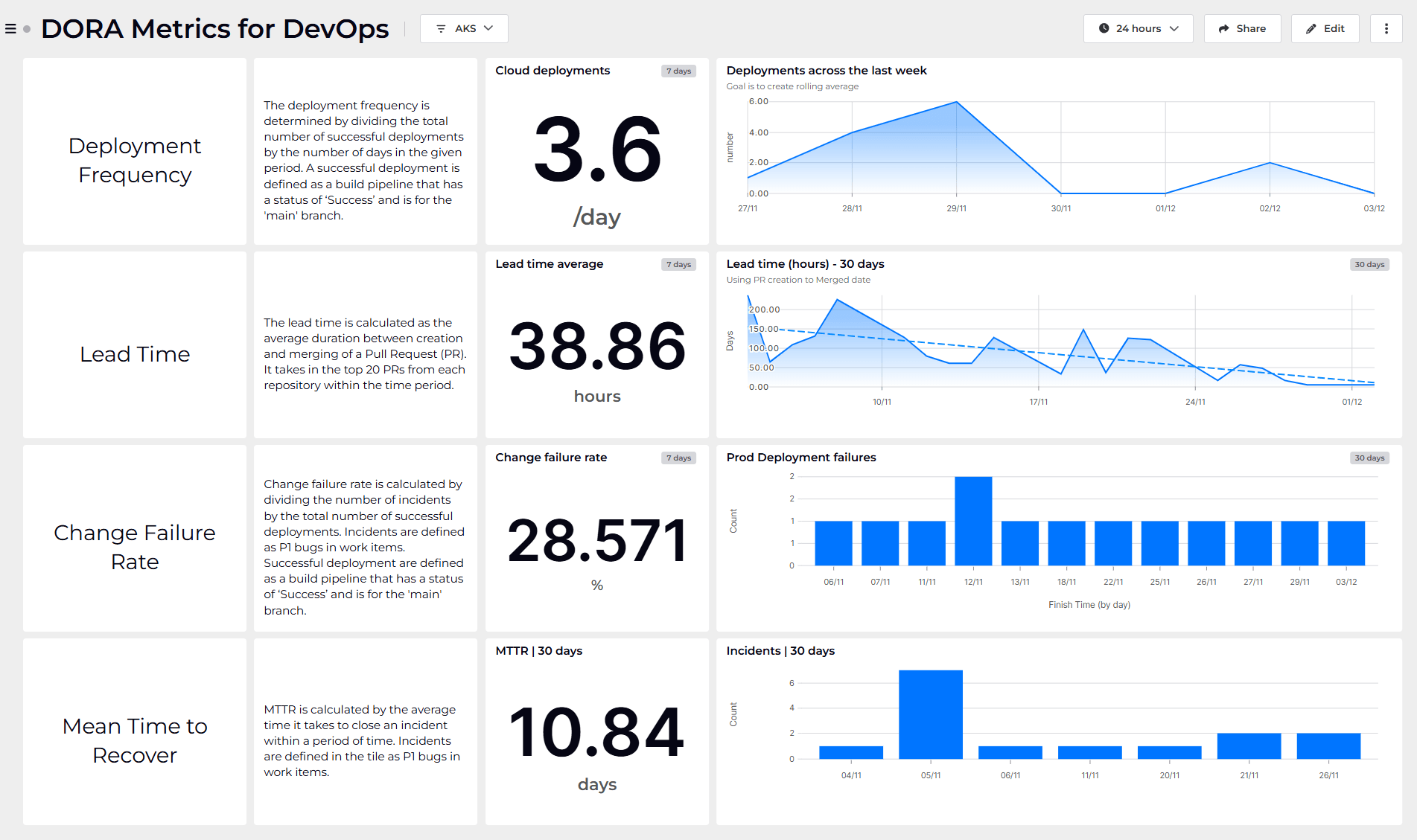
The Performance Metrics dashboard gives us rich insights without having to do any configuration:

As well as seeing the build success rate, we also get detailed analytics on build duration as well as build queue statistics. In addition to this, the Azure DevOps plugin also provides out-of-the-box dashboards for Releases, Deployments, Work Items and Test Metrics.
Jenkins is one of the most venerable of DevOps stacks and it still boasts a considerable userbase. The dashboard below shows how the SquaredUp Jenkins plugin provides a rich set of analytics not only on pipeline performance but also on the Jenkins environment itself:

The Jenkins plugin exposes 12 data streams, retrieving data on a range of concerns including Builds, Plugins, Nodes, Folders and more:

In the build summary below, each card represents a specific build, making it easy to see whether the builds passed (green) or failed (red) at a glance. These help the team instantly assess the state of key build pipelines. As well as the colour-coded cards, we can also a list of recent builds as well as key metrics such as build duration for specific builds as well as an overall average.

In SquaredUp, dashboards are smart and interconnected. This means we can roll up insights and warnings from individual dashboards and see them in one place in a higher level view. We are going to add Monitors to each of our dashboards, which will help us to track failures in workflow runs. We will create our Monitor on our GitHub Actions dashboard, but we can use exactly the same process for our Azure DevOps and Jenkins dashboards.
To create the Monitor, we will add a new tile to our dashboard. Again we will select the Workflow Runs data source, but this time we will add a filter to only return failed runs.

Next, we will select the Scalar visualization, which will give us a strong visual indicator of our build health. Then on the right hand panel we will select the Monitoring tab and slide the toggle to turn monitoring on. We are going to create a simple monitor which will enter an error state if the count of workflow runs with a status of Failure is greater than zero:

Once we click on Save, the tile will be added to our dashboard:

All three of our dashboards have been created in a workspace called DevOps Pipelines.
Our monitors automatically roll up to this workspace. This means that the Workspace dashboard automatically gives us an overview of pipeline health across all three technologies. We have high-level visibility without any additional effort.

This is a tremendous illustration of the unique secret sauce that sets SquaredUp dashboards apart. Our dashboards are not simple snapshots - they are context-aware and connected. They can join the dots of your organizational and technological graph and combine insights fluently and intelligently.
If you don’t have a SquaredUp account, no worries! You can sign up for our Free Forever plan and get dashboarding right away!
Observability Advocate, SquaredUp


Getting started with SquaredUp is free and easy. Our free tier includes: