John Hayes
Observability Advocate, SquaredUp
If you are part of an engineering team, monitoring the performance of your CI/CD pipelines is a high priority. With the SquaredUp GitHub plugin you can view key metrics for your GitHub repos and workflows all within a single pane of glass. We also have plugins for Jira, Circle CI, Azure DevOps and more. So even if you are using many different tools you can still get an end to end view of your processes.
In this article we will look at installing the SquaredUp GitHub plugin and how you can use it to create dashboards to monitor your GitHub Action workflows. We will also look at how you can turn that leverage the power of SquaredUp to go further and define health monitors as well as sharing your dashboards with colleagues.
Getting started is pretty easy. Just create a new dashboard and select the GitHub data source:

If you are accessing public repositories, then you will only need to enter the name of your GitHub organisation. Otherwise you will also need to include your GitHub API Key.

Once you have clicked on the Test and add button SquaredUp will finish setting up the connection:

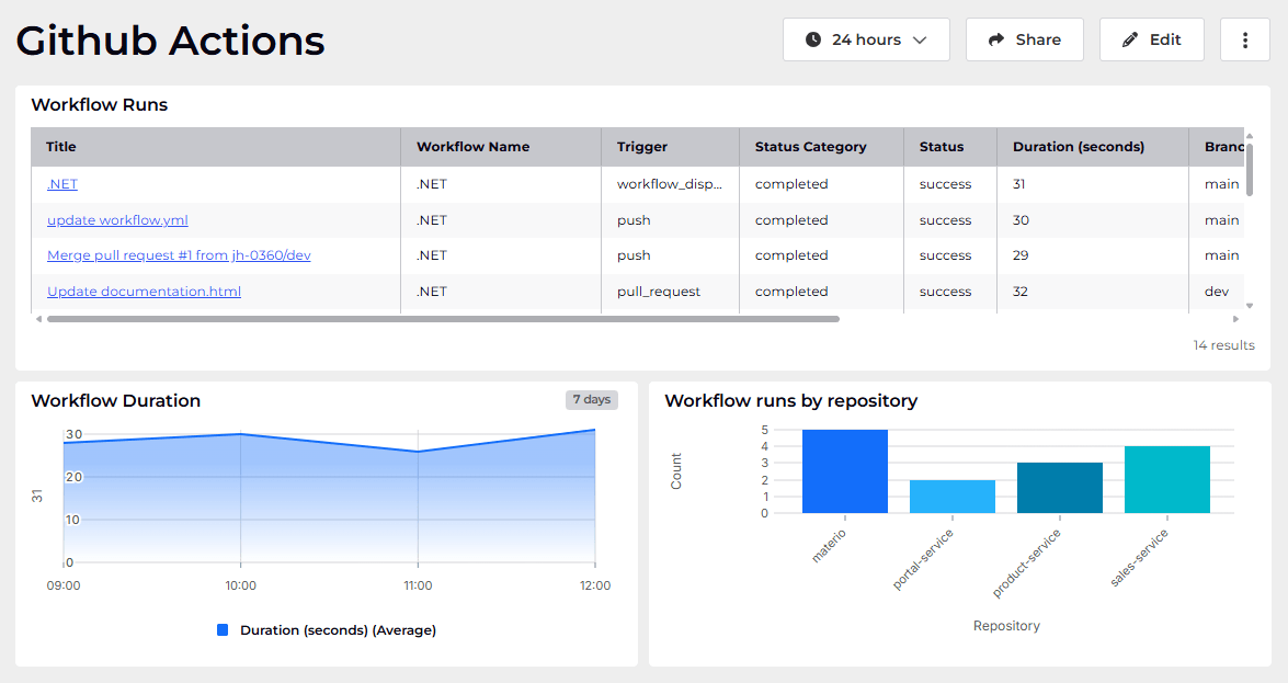
When you click on the Explore dashboards button you will see the ready-made Repo Overview dashboard, which will provide you with key metrics and summaries for your repo. A SquaredUp data source organises the data it retrieves into logical groupings called Streams. We are interested in Github Workflows, so we will select the Workflow runs data stream:

This will then show us a list of all of the repos available to us. We will toggle the Dynamic selection option to switch it on. This will select all of our current repos as well as any that we add in future.

In the Timeframe screen we will set the value to 7 days rather than the default of 24 hours:

Then we will just select the default options and save our dashboard. We will now see a table view of our data:

Next we are going to create a line graph to show average build times for our repos. So we will add a new dashboard tile and once again select the Workflow runs Data Stream. Next we will select the Line Graph visualisation:

Then enter the following values for mappings:

For our visualisation we want to see a separate line for each different repo, so we will define a grouping for Repository on the Shaping screen. We will also set the Bucket to display the data in hourly intervals:

When you click on Save you should see a visualization like this:

Next we are going to create a bar chart to view total workflow runs grouped by repo. So, once again we will add a tile and this time select the Bar chart visualization:

For the Mapping configuration, we will set the X-Axis to Repository and the Y-Axis to Count. Then, in the shaping screen, we will Group By Repository:

When you click on Save you should see a visualization something like this:

In SquaredUp, dashboards are smart and interconnected. So we can roll up insights and warnings from individual dashboards and see them in one place in a higher level view. We are going to add a Monitor, which will help us to track failures in Workflow runs. We will add a new tile to our dashboard and this time we will select the Scalar visualization:

Then in the Parameters screen we will select Failure as the Status.

Then on the right hand panel we will select the Monitoring tab and slide the toggle to turn monitoring on. We are going to create a simple Monitor which will enter an error state if the Count of Workflow runs with a Status of Failure is greater than zero:

Once we click on Save, the tile will be added to our dashboard:

We have created our dashboard within a Workspace called DevOps. If I now go to the default dashboard that Workspace, you can see that the Monitor has rolled up. This means that I can have a single view of all of the Monitors across all dashboards in my workspace:

With SquaredUp you can also easily share your dashboards – even with users who do not have a SquaredUp license. Clicking on the Share button at the top of your dashboard will give you a number of options for sharing and managing permissions:

If you don’t have a SquaredUp account, no worries! You can sign up for our Free Forever tier and get dashboarding right away!
Observability Advocate, SquaredUp


Getting started with SquaredUp is free and easy. Our free tier includes: