Sameer Mhaisekar
DevRel Engineer, SquaredUp & Microsoft MVP
Jenkins is an open-source automation server widely used for continuous integration and continuous delivery (CI/CD), enabling developers to automate the building, testing, and deployment of software projects.
Jenkins requires a good layer of visualization as it provides real-time visibility into pipeline performance, build statuses, test results, and deployment progress. This helps teams quickly identify and address issues, track key metrics, and maintain a high level of operational transparency, which is essential for fast, reliable software delivery.
Let's look at how you can get started with Jenkins dashboards using SquaredUp's plugin.
Deploying the Jenkins plugin is pretty straightforward. All you need is the username and password of an account that has read API permissions, and the Jenkins server URL.

Deploy the Cloud version of Jenkins if this URL is publicly accessible or the on-prem version if it's not. You will need to configure the Relay Agent for the latter. You can consult the in-product instructions or the documentation here.
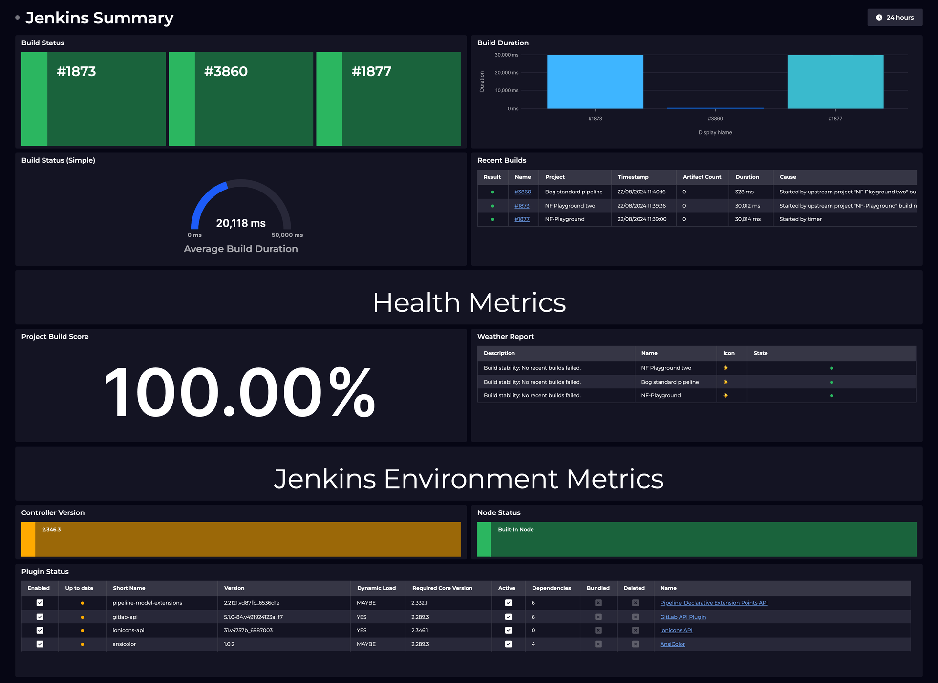
Currently, the Jenkins data source comes with one out-of-the-box dashboard - Jenkins Activity.

This dashboard is aimed at giving you quick insights about your Jenkins deployment at a glance. It includes metrics like recent and active builds, the health of your nodes, and the plugins deployed.
You don't have to rely on this one dashboard, however. Let's take a look at creating our own dashboards.
Hit the + button on a new dashboard to create a tile. You'll be greeted with this screen:

This screen lists out the other data sources you've got installed in your workspace and a list of data streams you recently used. For now, let's select the Jenkins data source.
This takes us to the list of data streams available for Jenkins. As you'll notice, there are a few of different data streams available. You can jump to the exact specific service/component you're interested in via the tags on the left.

Let's try out the Weather Report data stream which displays a weather icon for the Project or Folder in scope based on the number of build failures. We can map these icons to health states in SquaredUp for easy identification and hierarchal structure.
After selecting the data stream, we move on to selecting the objects. I'll select a couple, and you can see in the data returned - the object, corresponding details, and a score pertaining to the build success rate for that object (project or folder). You'll also notice the weather icon and corresponding health state mapped by SquaredUp.
From the right hand menu I'll choose the Block viz, so I can see the state of all objects side-by-side. Just like that, our tile is ready!

You can optionally apply some shaping and filtering on the data in the next part of the configuration, or apply advanced data manipulation and processing using SQL Analytics. For now, we don't require that.
SquaredUp monitoring makes it easy to turn our dashboard tiles into monitors, so that we can be alerted about changes. Let's set it up now. I'll set up monitoring for when the latest value of this metric crosses a threshold.
Switch over to Monitoring tab on the top right and toggle it on.

I've set up the monitor such that it will turn red when it sees an object which has health state of error.
Not only can I see this in SquaredUp, I can also set up Notifications to let me know if any alerts are raised so I can be aware anytime. They can be sent as an email, as an IM message or forward it over to any of your automation workflows.
If the monitor triggers, we can receive a notification by email, Slack, Teams or via any system that supports webhooks. Read our docs to learn more about monitoring.

Sharing is very simple in SquaredUp. We just hit the share button and have the option of inviting a user to the workspace, or sharing just the dashboard via a link:

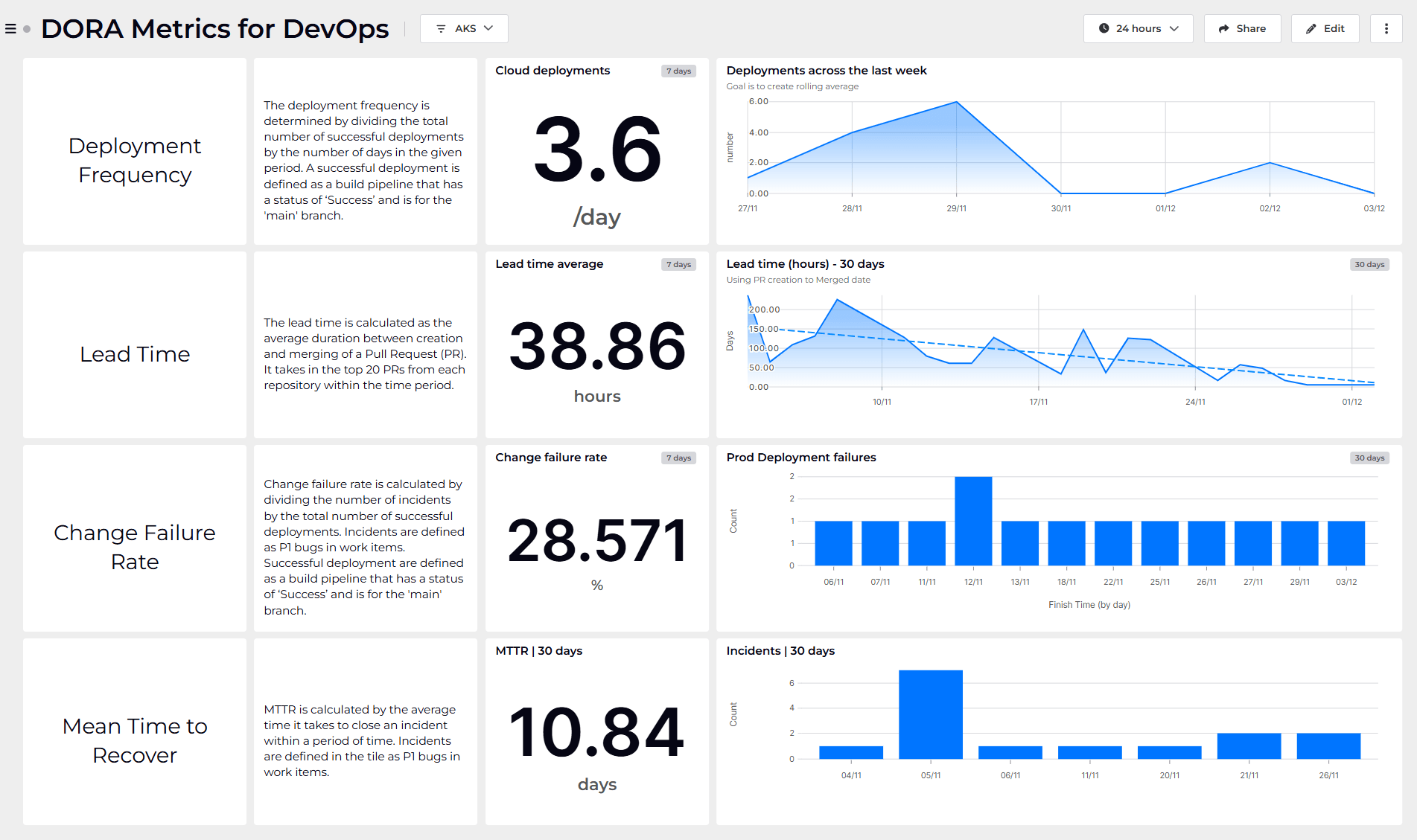
From this point on, you can try out different data streams and queries to create dashboard of your dreams. In addition, we also have many other plugins including Azure, Azure DevOps, PowerShell and many others.
SquaredUp’s smarter dashboards help engineering, product, and IT teams make better decisions through a deeper understanding of their data. Visualize and monitor any data from any tool, all in one place. Sign up for free now!
DevRel Engineer, SquaredUp & Microsoft MVP


Getting started with SquaredUp is free and easy. Our free tier includes: