Bruce Cullen
Director of Products, SquaredUp

Change history, Azure service health and maintenance schedules
Director of Products, SquaredUp
Using SquaredUp, you can query Azure Resource Graph with KQL to pull Change history, Azure Service Health and maintenance schedules. For the uninitiated, Azure Resource Graph is a series of tables holding information on Azure resources and how they are related. Its data is used many places within Azure itself (such as the Azure Portal’s native search) and it’s data can help us with many use cases as it is designed to help with queries at scale.
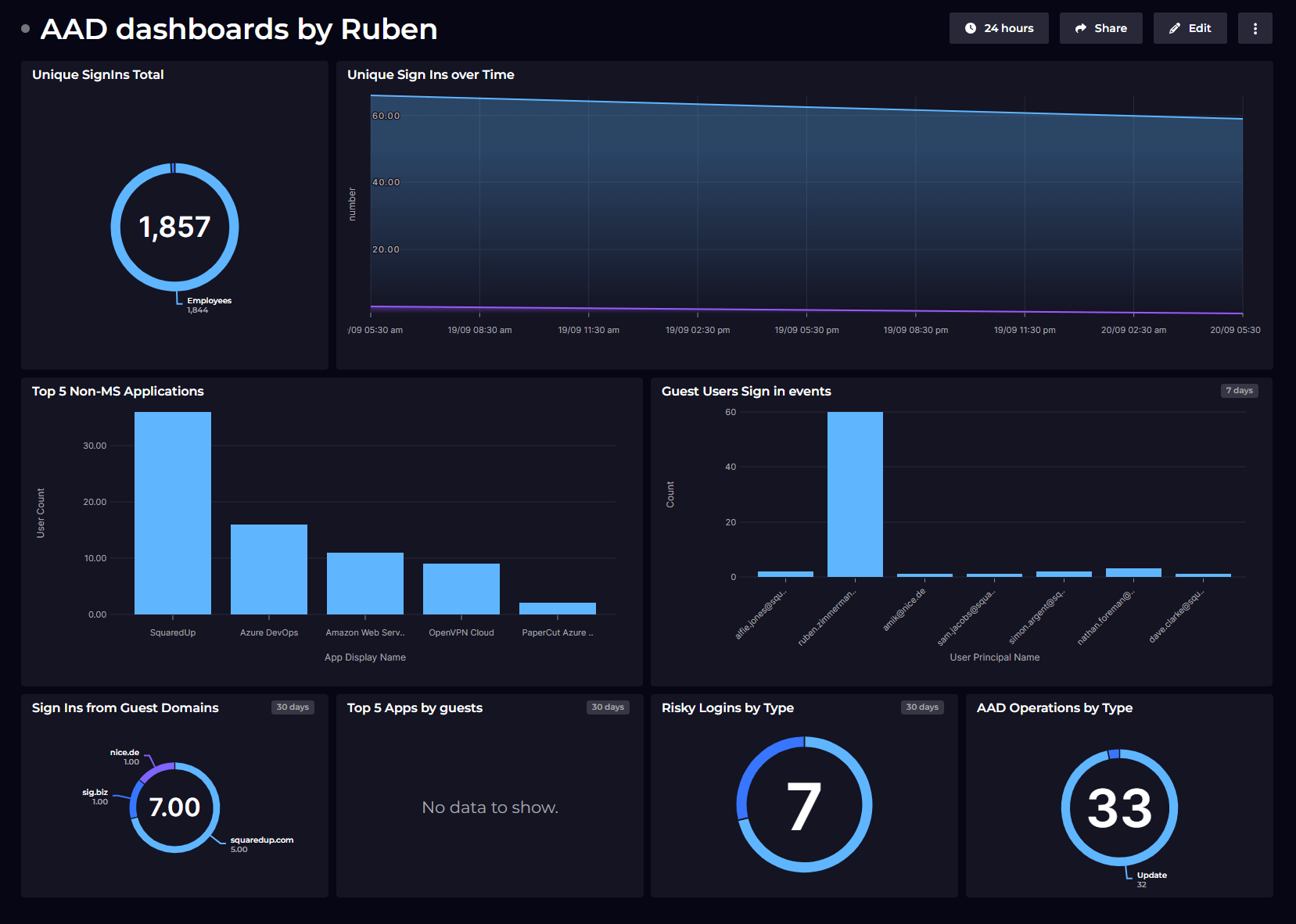
A while back, a customer, Ruben from SIG, approached me asking for help with visualizing data from the Azure Resource Graph using KQL. When I asked him what he would use it for he said, “Well, change history would be my first query. It is usually the same every time – someone changes something, it breaks, later it will be found. When seeing the latest changes I hope to reduce the MTTR.” And later he went on to talk about pulling Azure service health and maintenance schedules from it too (read more). These were several really clear use cases, so we went ahead and built it.
As a product manager, aside from helping solve customer pain I wanted to be able to show Azure service health on our out-of-the-box dashboards, as we have all spent hours troubleshooting a problem only to find the root cause is an outage caused by a downstream service or dependency, and the nice thing about pulling this info using KQL from the Azure Resource Graph is you can specify which subscriptions or even specific resources you want to understand the impact to, rather than simply showing all Azure service issues – a crude approach as Azure is not a single entity spanning many sites, services and countries.
Here is more detail on the Azure Resource Graph data stream and how to query it with KQL to pull Change history, Azure Service History and maintenance schedules.
This couldn’t be more simple, Once you have connected the Azure data source simply search data streams for Resource Graph or KQL:

You are then asked for the object or objects you wish to scope your queries to, here I have picked two VMs from my demo tenant:

On the next screen we give you some sample KQL which will (almost) always return some data and explains how to inject the selected objects into your query. While its possible to query Azure Resource Graph without injecting selected objects, you will get more from SquaredUp if you use our object aware capabilities, if you where to create a dynamic scope that might change over time you would never need to update the KQL in the tile to reflect object changes for example

Lets take a closer look at the KQL here:
resources
| where tolower(id) in (
  {{#.}} // Start of mustache iteration
    '{{{sourceId}}}', // Triple mustache handles special characters like / in the variable
  {{/.}} // End of mustache iteration
  '{{{0.sourceId}}}' // Duplicate final entry deals with a trailing comma produced on the final item. You could also just use an empty string or something along those lines
)
| project id, name, type, resourceGroup, location
This simple KQL is essentially pulling ID, name, type, Resource Group and Location for all objects you inject into the query using mustache, iterating over all objects one by one. The syntax {{#.}} indicates the start of the iterative loop using ID as the key, {{{sourceId}}} is where the object(s) that have been selected are passed in (note that three mustache brackets {{{ are used here to handle resources with special characters in their names such as “/” that require escaping) and finally {{/.}} denotes the end of the iterative loop. This logically reads like it should be sufficient to return results but due to syntax we also add {{{0.sourceId}}} at the end of the KQL query to return the first item without with trailing comma so the resultant KQL is in the correct syntax to be parsed. Without this line, the array returned would look like this: ('item1', 'item2', 'item3',).
Clearly this KQL is intended to serve as an example, so this is where we paste our KQL.
Let's take a look at how we provide Azure Service Health and Maintenance schedules, scoped to Subscription on our out-of-the-box dashboards using KQL and the Azure Resource Graph endpoint. This example is taken from the Virtual Machines dashboard, so if you want to see it in action, simply setup the Azure data source, install sample dashboards, navigate to the Virtual Machine Dashboard and edit the Azure Service Health tile on it.
servicehealthresources
| where properties.Status == 'Active' and properties.EventType in ('ServiceIssue', 'PlannedMaintenance') and subscriptionId in ({{#.}} split('{{{sourceId}}}', '/')[-1],{{/.}} split('{{{0.sourceId}}}', '/')[-1]) // Duplicate final entry to avoid trailing comma issue
| mv-expand impact=properties.Impact
| where impact.ImpactedService in ('Azure Arc enabled servers', 'Network Infrastructure', 'Virtual Machines', 'Virtual Machine Scale sets', 'Virtual Network')
| extend impactedService = impact.ImpactedService,
  status = properties.status,
  state = case (
properties.EventLevel == "Warning", "Warning",
properties.EventLevel == "Critical", "error","Unknown"),
  eventLevel = properties.EventLevel,
  eventType = properties.EventType,
  eventSubType = properties.eventSubType,
  eventTitle = properties.Title,
  level = properties.Level,
  startTime = todatetime(tolong(properties.ImpactStartTime)), // These are in ticks
  lastUpdateTime = todatetime(tolong(properties.LastUpdateTime)),
  mitigationTime = todatetime(tolong(properties.ImpactMitigationTime)),
url = strcat('https://app.azure.com/h/', name)
| project name, location, resourceGroup, subscriptionId, impactedService, status, state, eventLevel, eventType, eventSubType, eventTitle, level, startTime, lastUpdateTime, mitigationTime, url
Here's a step-by-step breakdown of what the query does:
In summary, this query identifies active service health events related to specific Azure services, enriches the data with additional details, and formats it for easy review.
Change History can be pulled from the Azure portal using “Change Analysis”. The data is always in tabular form and is fairly hard to get high level insights from:

With the below KQL I can pull the same information into SquaredUp (along with some extra columns)
resourcechanges
| where resourceGroup startswith "{{{0.name}}}"
| extend
  changeTime = todatetime(properties.changeAttributes.timestamp),
  targetResourceId = tostring(properties.targetResourceId),
  changeType = tostring(properties.changeType),
  correlationId = properties.changeAttributes.correlationId,
  changedProperties = properties.changes,
  changeCount = properties.changeAttributes.changesCount,
  changedBy = tostring(properties.changeAttributes.changedBy)
| where changeTime > ago(1d)
| order by changeTime desc
| project changeTime, changedBy, targetResourceId, changeType, correlationId, changeCount, changedProperties
The result in tabular form

This is useful but not very easy to read. With this same table of data and some of the visualizations in SquaredUp I can start making sense of the data

I also have this KQL which pulls friendly names for resources making it easier to see which resource was changed
resourcechanges
| where resourceGroup startswith "{{{0.name}}}"
| extend
  changeTime = todatetime(properties.changeAttributes.timestamp),
  targetResourceId = tostring(properties.targetResourceId),
  changeType = tostring(properties.changeType),
  correlationId = properties.changeAttributes.correlationId,
  changedProperties = properties.changes,
  changeCount = properties.changeAttributes.changesCount| where changeTime > ago(30d)
| join kind=inner (
  resources | project resources_Name = name,
  resources_Type = type,
  resources_Subscription= subscriptionId,
  resources_ResourceGroup= resourceGroup, id
  )
  on $left.targetResourceId == $right.id
| project resources_ResourceGroup, resources_Name, resources_Type, changeTime, changeType, changeCount, changedProperties
| project-away changedProperties, resources_Type
The resultant table of data:

And simple example of what it enables:

There are many other examples of KQL to pull change history from Azure Resource Graph in Microsoft documentation that can be used as inspiration for your dashboards.
Hopefully this blog gives you a good feeling for what is possible with Azure Resource Graph, why we built an integration for it and how to get started with it yourself!
Create a free SquaredUp account and try it for yourself. Free for up to 3 users and 3 data sources.
Director of Products, SquaredUp

Getting started with SquaredUp is free and easy. Our free tier includes: