Tim Wheeler
Director of Engineering Excellence, SquaredUp

Azure DevOps is a robust tool that integrates a wide range of development and project management functionalities into one platform. It covers various aspects of the software development lifecycle, from version control to continuous integration and deployment. However, when it comes to dashboards, Azure DevOps leaves much to be desired. Here’s why these dashboards often frustrate users.
One of the main criticisms of Azure DevOps dashboards is their lack of customization. Users can add and arrange widgets, but the extent of customization is limited. Tailoring the dashboard to reflect specific team needs or company branding is challenging, as options are restricted to a few basic themes and layouts. This results in dashboards that often appear generic and disconnected from the unique identity of the project or organization.
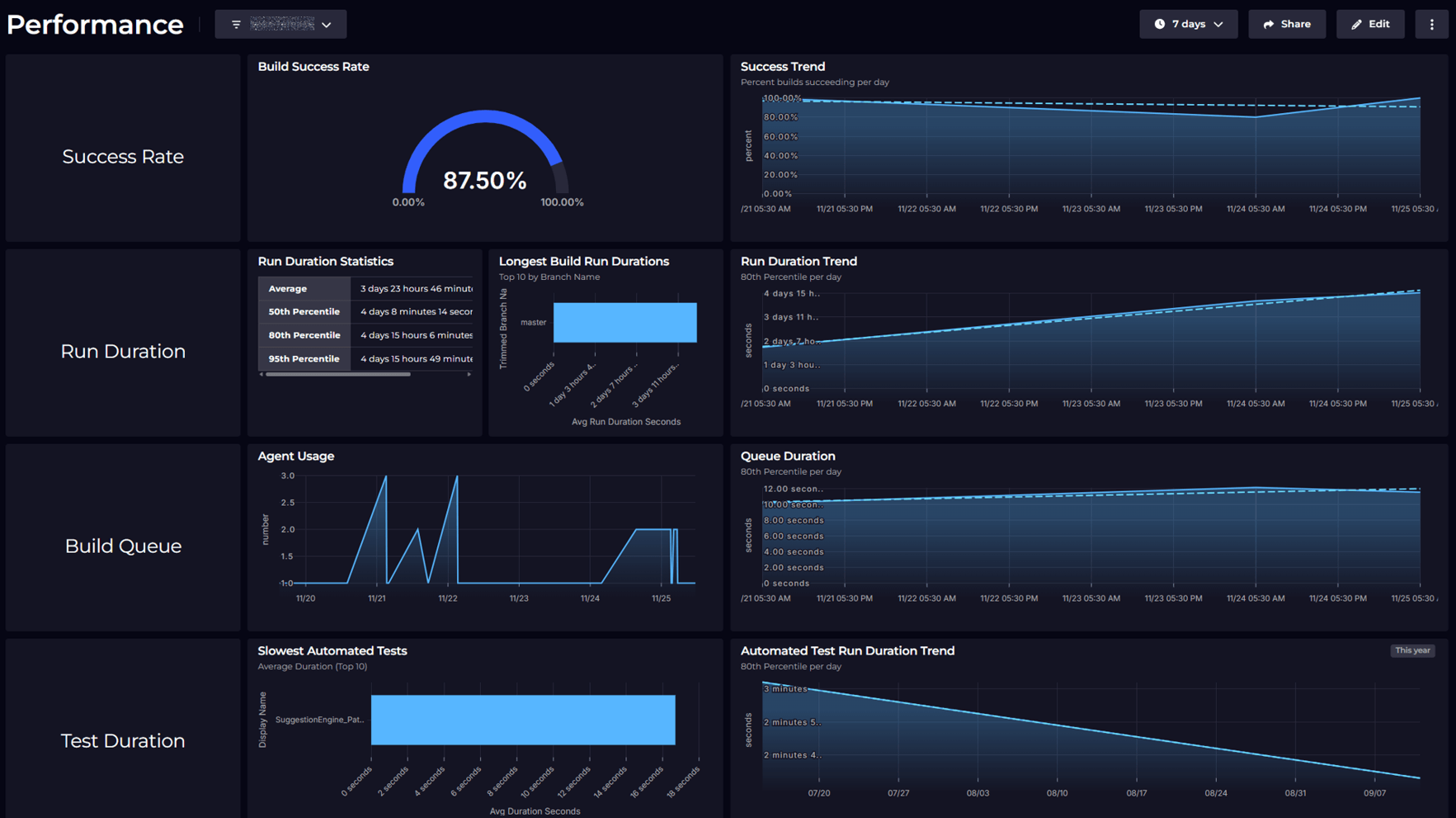
Effective data visualization is essential for understanding project status at a glance. Unfortunately, Azure DevOps dashboards offer limited visualization options. The available widgets are basic, and there is a noticeable absence of advanced charts, graphs, or interactive visual elements. This limitation necessitates the use of external tools like Power BI or SquaredUp for more sophisticated data analysis, which can interrupt workflow and complicate the user experience.
While Azure DevOps provides a variety of widgets, their integration and functionality can be problematic. Widgets often lack seamless interactivity, and features such as drilling down into detailed data are not always available. Additionally, some widgets may fail to update in real time, leading to outdated or incomplete information. This can hinder accurate and timely decision-making.
Azure DevOps dashboards can experience performance issues, especially with large-scale projects or when multiple widgets are used. Users may encounter slow load times, laggy interactions, and occasional timeouts. These performance challenges can significantly impact productivity, particularly during critical phases like release cycles or issue monitoring.
Configuring Azure DevOps dashboards can be complex, and the available documentation often lacks the detail needed to resolve common issues. Community support for dashboard customisation is also limited compared to other areas of Azure DevOps, leaving users to navigate challenges on their own. This can result in a steep learning curve and a lot of trial and error.
For organizations managing multiple projects, the lack of cross-project dashboard visibility is a significant drawback. Each dashboard is tied to a specific project, making it difficult to obtain an overarching view of progress across all projects. This limitation requires teams to switch between dashboards or manually aggregate data, which is time-consuming and prone to errors.
In an environment where collaboration is crucial, Azure DevOps dashboards fall short. There is no straightforward way to share dashboards with external stakeholders or to collaborate on dashboard design in real time. This can be particularly limiting for teams working across different locations or seeking to involve clients in progress tracking.
While Azure DevOps dashboards offer some integration benefits with other Azure DevOps services, they fall short in several key areas. Limited customization, basic data visualization, and performance issues make them less suitable for teams that depend on dynamic, real-time reporting. Until Microsoft addresses these limitations, many teams will likely seek alternative or supplementary tools to meet their dashboarding needs.
If Azure DevOps dashboards have been a source of frustration, you are not alone. Many users hope for future updates that will enhance these dashboards to better meet the needs of development teams.
In the meantime, check out SquaredUp – not only does it address the limitations described in this blog, it comes with additional benefits such as monitoring, Slack and Teams notifications, and seamless integration with other tools such as GitHub and Jira for a consolidated view of everything DevOps.
Director of Engineering Excellence, SquaredUp


Getting started with SquaredUp is free and easy. Our free tier includes: