John Hayes
Observability Advocate, SquaredUp

Getting started with SquaredUp is free and easy. Our free tier includes:
Visualize and monitor your critical workflows in GitHub Actions with SquaredUp.
Observability Advocate, SquaredUp
The GitHub Actions platform was first released in 2019 and has since established itself as one of the most popular CI/CD toolsets on the market. The core concept of GitHub Actions is workflows - which are analogous to pipelines in other products and function in a largely similar manner.
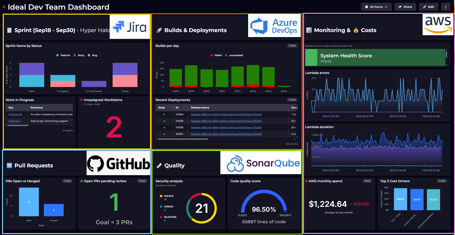
The SquaredUp GitHub plugin enables you to view key metrics on the health and performance of your GitHub Repos and Workflows in a single pane of glass. In this article, we will concentrate on GitHub workflows.
The first tile on our dashboard is a table view where we can see a listing of recent workflow runs:

Retrieving the data for this table is really easy. The Workflow Runs data stream gives me a list of workflows and all I need to do is select the repos that I want to include in my dashboard.

We are also not interested in the housekeeping workflows such as Close stale issues and PRs so in the data shaping step we are going to create a filter to exclude them:

I can now see my workflow runs and whether they completed successfully. Next, I want to visualize average build durations. Long-running builds can cause frustration and are also a drain on developer time. I want to see the build performance for each of my repos over a given time span. For a visualization such as this, I could also opt to make the time-frequency more granular so that I could see whether build performance varied depending on the time of day.

For our visualization, we want to see a separate line for each different repo so in the Shaping step we'll need to define a grouping for Repository and set the Bucket to display the data in hourly intervals:

For the next panel in my dashboard, I wanted to compare build frequency across my repos, and this is something I can achieve very easily with a bar chart visualization. Immediately, I can see that the materio repo is being built more than twice as frequently as the portal-service. Naturally, this could be a reflection of user requirements, but it could also indicate that developers are not committing their code frequently enough.

For the mapping configuration, we will set the X-Axis to Repository and the Y-Axis to Count. Then, in the Shaping screen, we will group by Repository:

If you are a DevOps Manager you will be keen to minimize the number of failures in your workflow runs. For the tile below we have used a scalar visualization, which helps us highlight important metrics:

For this tile, we have also created a monitor, which will enter an error state if the number of failed workflows is greater than zero. This is really easy to set up in the Monitoring tab of our visualization and will immediately give us a visual cue of the health of our workflows.

As you can see, monitoring and visualizing your GitHub workflows in SquaredUp is simple and frictionless. We also have support for a broad range of other DevOps tooling such as Circle CI, Jenkins, Azure DevOps and more.
If you don’t have a SquaredUp account, no worries! You can sign up for our Free Forever plan and get dashboarding right away!