Sameer Mhaisekar
DevRel Engineer, SquaredUp & Microsoft MVP
Being the most popular cloud solution provider, AWS needs no introduction. With its powerful and numerous services and solutions, many companies of all sizes and shapes run their applications and/or infrastructure on AWS.
With AWS being integrated with other internal services as well as external solutions hosting the business apps, it is crucial to be aware of what's happening across the landscape and beyond, to ensure business continuity. The AWS plugin for SquaredUp helps you achieve exactly that.
Let's explore why SquaredUp should be at the heart of your AWS data visualization strategy.
SquaredUp offers 2 different modes of authentication - IAM role-based and IAM user-based.
IAM role-based is the preferred mode of authentication, and thanks to intuitive setup, is quite easy and quick to do. The setup wizard guides you through the whole process by helping you create an IAM role as well as automatically populating the CloudFormation template with required information.

To learn more about authentication methods and process, visit the documentation.
Once you've deployed the AWS data source, you'll see it comes with a bunch of out-of-the-box dashboards. This makes it extremely easy to get started and helps you hit the ground running.
Let's explore a couple of dashboards.
The Account Cost dashboard displays your consolidated AWS usage at account level, for current as well as previous months. You can also see the cost distributed across services so you can keep track of specific cost areas.

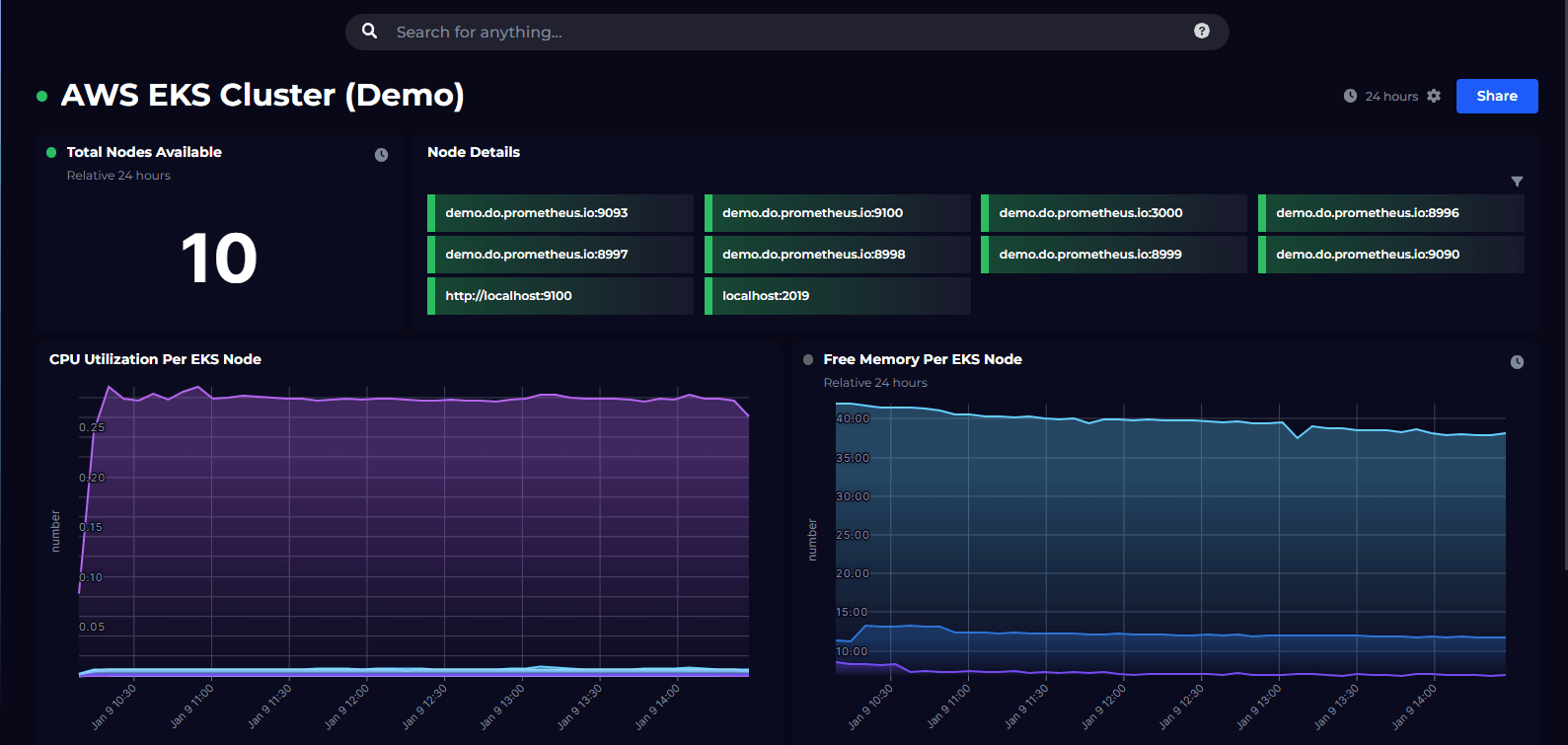
We also have an EC2 instance dashboard, with health of the instances as well as some common performance metrics. This is what you start with, you can adjust and add more metrics to this as you need.

There's a dashboard for Lambdas and their performance metrics, alongside any errors encountered and error distribution, etc.

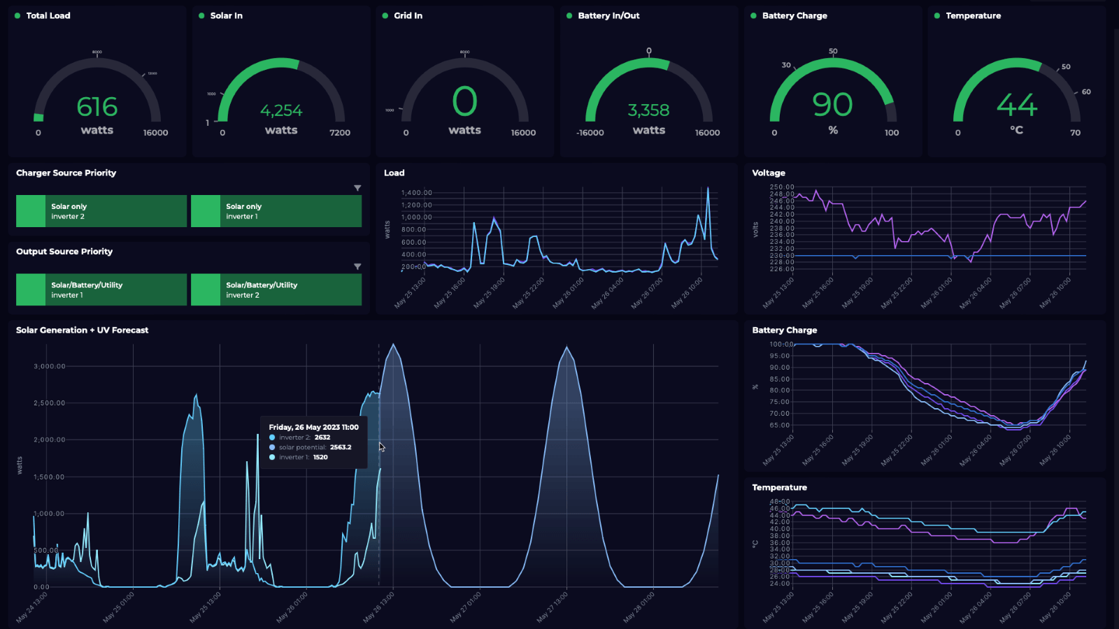
There are a few other dashboards that you can try out as well.
Hit the + button on a new dashboard to create a tile. You'll be greeted with this screen.

This screen lists out the other data streams you've got installed in your workspace and a list of data streams you recently used. For now, let's select the AWS data source.
This takes us to the list of data streams available for AWS. As you'll notice, there are quite a few of different data streams available. You can jump to the exact specific service/component you're interested in via the tags on the left.
Some of the most popular ones include Cost – which fetches costs for selected scope. CloudWatch – allows you to fetch metrics and logs using queries to build visualizations on top, and a bunch of other useful data streams like Alarms, Security, Support, and so on.
Lets try out the API Data Processed data stream. This gives us the amount of data processed by the API gateway in AWS. Select the Objects you want to fetch this metric for.

Choose the timeframe and boom - you already have populated a nice line graph with your metric plotted in!
You can optionally apply some shaping and filtering on the data in the next part of the configuration, or apply advanced data manipulation and processing using SQL Analytics.
SquaredUp monitoring makes it easy to turn our dashboard tiles into monitors, so that we can be alerted about changes. Let's set it up now. I'll set up monitoring for when the latest value of this metric crosses a threshold.
Switch over to Monitoring tab on the top right and toggle it on.

With these conditions, the monitor will trigger when the data bytes cross 70,000. Note that using the Columns modal I've formatted the original number returned in bytes to KBs, so it's easy to read.
Not only can I see this in SquaredUp, I can also set up Notifications to let me know if any alerts are raised so I can be aware anytime. They can be sent as an email, as an IM message, or forwarded it over to any of your automation workflows.
If the monitor triggers, we can receive a notification by email, Slack, Teams or via any system that supports webhooks. Read our docs to learn more about monitoring.

Sharing is very simple in SquaredUp. We just hit the Share button and have the option of inviting a user to the workspace, or sharing just the dashboard via a link:

From this point on, you can try out different data streams and queries to create dashboard of your dreams. In addition, we also have other plugins including Azure, Azure DevOps, PowerShell and many others.
SquaredUp’s smarter dashboards help engineering, product, and IT teams make better decisions through a deeper understanding of their data. Visualize and monitor any data from any tool, all in one place. Sign up for free now!
DevRel Engineer, SquaredUp & Microsoft MVP


Getting started with SquaredUp is free and easy. Our free tier includes: