Sameer Mhaisekar
DevRel Engineer, SquaredUp & Microsoft MVP
As an Azure admin, it is of critical importance that you keep an eye on how much cost you are incurring running your workloads in the cloud. You also want to have sight of any deployed resources that are not contributing to business and accumulating cost over time.
Using a dedicated Azure plugin, SquaredUp dashboards will help you understand your Azure costs across services, resources, locations and apps – so you can keep tabs on how much you're spending and identify opportunities to save costs.
Azure cost is a component of the broader Azure plugin. To deploy the Azure plugin as a data source, you have 2 options. You can either use your Azure credentials to log in and inherit all the permissions on the account, or you can create an app registration in Azure and use the client ID and secret to authenticate to SquaredUp.

Next, list the subscriptions you want to connect to and add the data source. Assuming everything is in place, SquaredUp should now have read-only access to Azure and start indexing objects.
The Azure plugin comes with a bunch of out-of-the-box dashboards, such as Alerts and some KQL and Metric-based dashboards for the most common services such as VMs, Logic Apps, Functions, SQL databases, etc.
What we are interested in for now are the cost dashboards. There are also some OOB cost dashboards, categorized by the MCA/MCP model or the EA model. Let's take a look at one of them – Actual Cost Analysis:

This dashboard displays costs incurred at various levels, categorized by service family, location, per subscription and resource group, etc. Feel free to make tweaks to the dashboard or take inspiration from it to create your own.
Hit on the + button on an empty dashboard and the tile editor window will come up. Browse the data streams and search for "cost" in the search box. A list of cost related data streams should come up.

Let's select the Cost data stream and hit next.
On the next screen, we choose the object(s) we want to see the cost for. For now, I'll go ahead and apply a couple of filters by choosing the data source I added and limiting my objects to only resource groups.
We've recently been playing around with AI internally at SquaredUp, so as an example, let's visualize how much cost we've incurred per service for our internal app. I'll select the appropriate resource group where these resources are deployed.
Configuring some basic settings such as the field I want to group costs by (Azure service in our case), granularity of data returned (daily, monthly or raw), and the metric type (amortized, actual, usage, etc.).
Next, we can choose what timeframe we want to fetch the cost data for. I will select 7 days for now.
On the next screen you can perform some data shaping such as grouping, sorting, filtering etc. on the data if required.
Lastly, in the Columns window you can define the type of data that is returned (if SquaredUp hasn't identified it already). The one particularly interesting here is the "Currency" data format. You can set your cost value as Currency – this gives you the ability to switch your cost to and from GBP, USD, and Euro.

Lastly, select the best visualization that suits the purpose of this data and just like that, we have our tile ready.

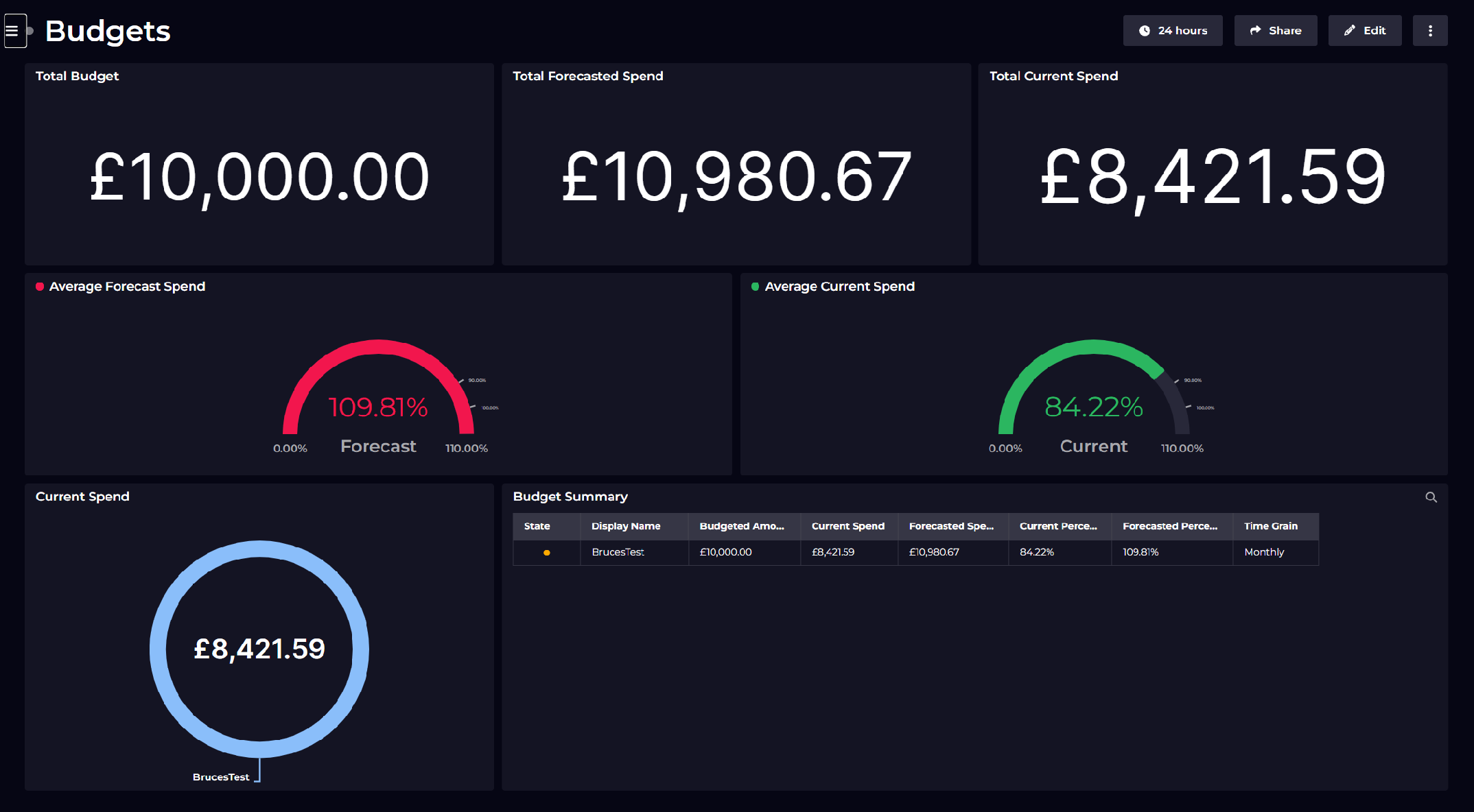
SquaredUp monitoring makes it easy to turn our dashboard tiles into monitors, so that we can be alerted about changes. This is especially useful when it comes to tracking costs. Suppose you have this tile that tracks the total cost incurred by a subscription.
We want to be notified when this number crosses £650. We dive into the tile configuration and turn Monitoring for this tile on.

Next we set up a threshold of 650, so the monitor will trigger when the value crosses this limit.

Not only can I see this in SquaredUp, I can also set up Notifications to let me know if any alerts are raised so I can be aware anytime. They can be sent as an email, as an IM message or forward it over to any of your automation workflows.
If the monitor triggers, we can receive a notification by email, Slack, Teams or via any system that supports webhooks. Read our docs to learn more about monitoring.

Sharing is very simple in SquaredUp. We just hit the share button and have the option of inviting a user to the workspace, or sharing just the dashboard via a link:

From this point on, you can try out different data streams and queries to create dashboard of your dreams. In addition, we also have many other plugins including Azure, Azure DevOps, PowerShell and many others.
Sign up for free and experience the power of SquaredUp yourself!
DevRel Engineer, SquaredUp & Microsoft MVP


Visualize and monitor Azure costs.

Getting started with SquaredUp is free and easy. Our free tier includes: