Noorul Huda N
DevRel Engineer

Getting started with SquaredUp is free and easy. Our free tier includes:
Pipeline monitoring sounds simple - until it isn’t. Tim Wheeler shares how the SquaredUp team handles Azure DevOps releases at scale.
DevRel Engineer
In this SquaredUp Live session, Tim Wheeler, Director of Engineering Services at SquaredUp, covers why pipeline visibility matters, where Azure DevOps dashboards fall short, and how SquaredUp brings release data together into a single, actionable view.
Below is a summary of the key takeaways from Tim’s presentation.
As Tim puts it, pipeline monitoring becomes essential as your DevOps environment scales. He identifies four key drivers:
Build status visibility: Email notifications work fine when you have one or two pipelines, but as that number grows, "it becomes a real challenge to understand exactly what's going through the system at any point in time."
Troubleshooting and optimization: Pipelines constantly evolve - teams add stages, remove them, adjust configurations. "Monitoring your pipelines will really help you target which areas need improvement and how you should tackle it," Tim explains. Maybe a pipeline suddenly takes twice as long, or a specific stage starts failing regularly. Without monitoring, it's difficult to know where to focus improvement efforts.
Cost management: Cost is always a factor in IT. Understanding what pipelines consume and how to optimize them delivers real benefits to both engineering teams and the business.
Deployment coordination: This is especially crucial for applications made up of multiple microservices or components built by different teams. As Tim explains, "You can have multiple pipelines doing multiple deployments, maybe to many environments, and all of that together is going to be what makes up one release of your product." Understanding what's stuck, lagging behind, or successfully deployed matters not just for DevOps practice, but for hitting business goals.
Azure DevOps provides some basic dashboards with pipeline views, but these have some critical limitations:
Limited widgets and visualization: Each widget supports only one visualization type with very few parameters to scope the data. The options are restrictive.
Limited configuration: There's minimal flexibility in displaying or manipulating data. The team needed more control.
Data scattered everywhere: It's difficult to pull all the information together - within Azure DevOps itself, there isn't a comprehensive way to do this. Teams often resort to running automation to scrape data, export it, and inevitably end up in Excel.
Project-based constraints: Widgets can only be created for one project at a time. Since using different projects for different teams or applications is standard practice in Azure DevOps, this means creating multiple dashboards and constantly jumping between them. This became the critical blocker for Tim's team.
Tim highlights what makes SquaredUp different:
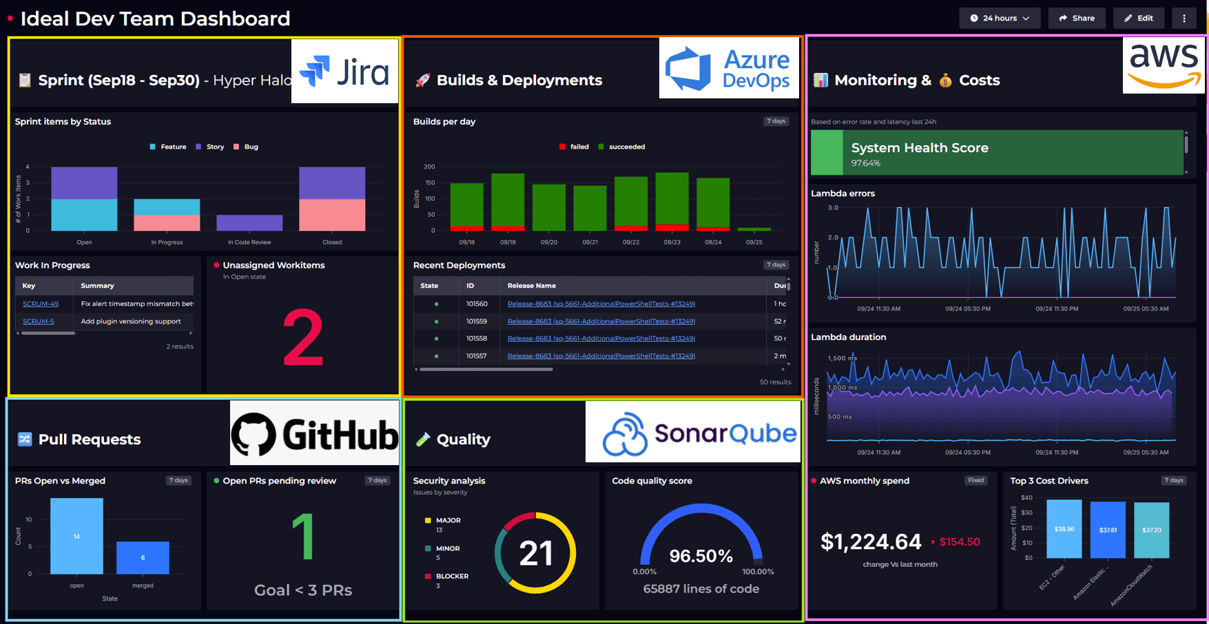
Connect to anything: SquaredUp integrates with Azure DevOps, GitHub, Jira, and virtually any data source. "One of the things we pride ourselves on is being highly configurable and being able to bring data in from pretty much anywhere," Tim says. Dashboards offer flexible visualizations with full control over tiles, layouts, and sizing.
See it your way: Dashboards support tables, charts, status indicators, and other visualizations so you can display data in the format that makes the most sense.
Break project boundaries: Unlike Azure DevOps, teams can combine data from multiple projects into one dashboard for a complete view.
Stream, don't store: SquaredUp uses a data mesh architecture that connects to data sources and streams information live, rather than having to build a large data warehouse and all of the challenges that come with that.

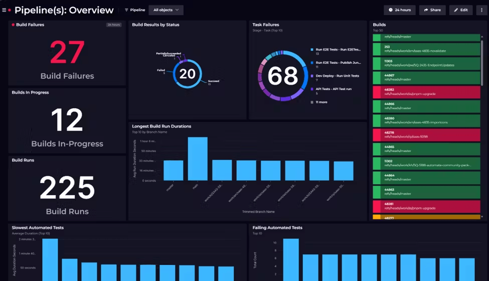
Tim demonstrates the Cloud Platform Release dashboard, which provides at-a-glance visibility into the entire release pipeline.
The dashboard shows:
Release Queue & Status
Release Outcomes
Pull Request Activity
The dashboard surfaces the key questions that matter in any release flow: How many releases are queued? What's currently deploying? Are there any failures blocking progress? Which PRs are ready to merge?
As Tim demonstrates throughout the video, monitoring pipelines shouldn't require jumping between tools, exporting to spreadsheets, or missing critical failures because information is scattered across multiple dashboards. The Cloud Platform Release dashboard shows how bringing everything into one configurable view transforms pipeline data into actionable insights.
Dashboards become even more powerful with SquaredUp's monitoring and notification capabilities. Alerts can be sent via email, Slack, Teams, or any webhook-enabled service. Dashboards can also be scheduled for delivery during quarterly planning or regular reviews. The share functionality provides read-only access without requiring a SquaredUp license.
Watch the full session above to see the dashboard in action and learn how to build similar visibility for your own pipelines.