Noorul Huda N
DevRel Engineer

Getting started with SquaredUp is free and easy. Our free tier includes:
What better way to show off our impact on people, planet and product than via a customized SquaredUp dashboard?
DevRel Engineer
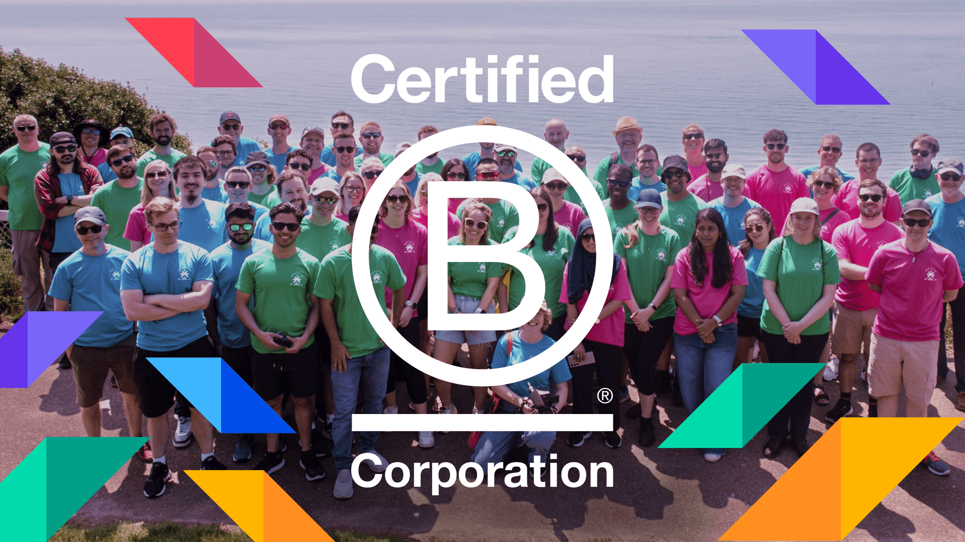
At SquaredUp, we’ve always believed that purpose deserves a seat at the table, alongside profit. So earning our B Corp certification (with a score of 90!) was a huge milestone for us.
Being a B Corp is a daily commitment to doing the right thing. But in order to keep an eye on our progress, we wanted to understand and visualize our impact in real time.
But numbers in a spreadsheet? Not our style.
We did what we do best: we built a dashboard in SquaredUp Cloud that turns scattered stats into a live, visual story of how we're making an impact across the five B Corp impact areas: Governance, Workers, Environment, Community, and Customers.

Watch the video below to hear from our leadership team on how we track our ESG goals internally at SquaredUp with a B Corp dashboard. Or, read on for a quick walkthrough of what we've included on our dashboard.
Let's explore this dashboard and uncover how each metric shows our B Corp journey.
Right at the top of the dashboard, you will see our total B Corp score of 90 points broken down across the five pillars.
It is a simple snapshot of where we are doing well and where there is room to grow. But that's just the starting point.

Nearly half our team has used their volunteer days this year, with a helpful boost from SQUPcon, our annual company meet-up, where we spent time litter picking at the beach and public gardens.
The Volunteering tile tracks our overall progress. Click in, and you’ll see:
Monitoring is also turned on. If we fall below 51%, the tile switches to a warning state, helping us stay on top of our goals.

This tile brings together real customer feedback and gives us a boost to keep doing better. It shows satisfaction scores, recent comments, and a score tracker that lets us know how we’re doing over time. A great reminder of who we’re building for.

We’ve donated 0.68% of our revenue through a mix of direct contributions, community investments, and volunteer time (converted into value). A donut chart makes it easy to see where it’s all going.

Our carbon tracking journey is just getting started, but the dashboard is already pulling live emissions data from Azure. You can see monthly breakdowns and even fun equivalents like cheeseburgers saved or trees planted.

This tile compares recycling rates to general waste over time. Red and green lines make the trends obvious at a glance, helping us stay aware and improve where needed.

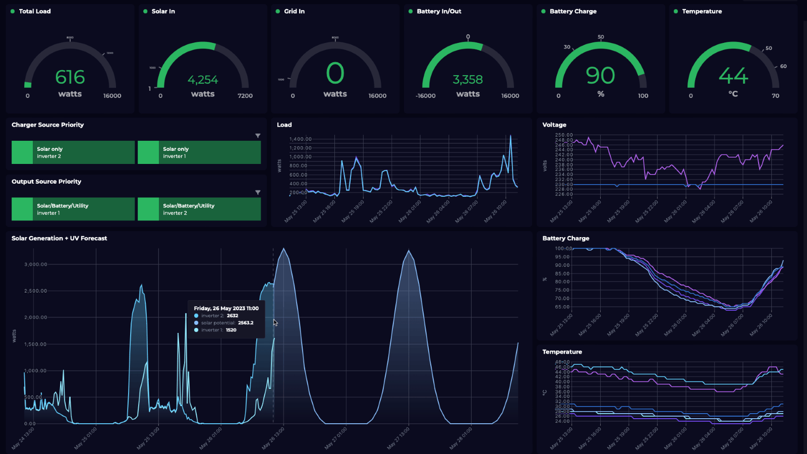
Every tile gives you the big picture up front. Click in, and it opens a dynamic drill-down view with richer detail underneath. The dashboard pulls live data from all over the place, including CSV files, Azure, Salesforce, and more.
This dashboard shows us where we’re making progress, where we’re falling behind, and what needs our attention and keeps the whole team moving in the same direction.
SquaredUp Cloud makes it easy to build dashboards that are more than just charts. Whether you're tracking people, planet, or product, it helps you see what matters and act on it.
Want to try it for yourself?
We’ve got a free tier ready and waiting.
SquaredUp’s smarter dashboards help engineering, product, and IT teams make better decisions through a deeper understanding of their data. We have a completely free tier available for you to use today. Sign up for free now!