Software Project Managers: get total visibility of all your tools
(And ditch report meetings!)
Bruce Cullen
Director of Products, SquaredUp
Project managing global software projects is always a challenge, contending with multiple time zones, tools, and teams. In these environments, the day-to-day life of a Project Manager is filled with status collections, project reporting, and little time for much else.
While the detail will always matter – like team bug data, feature status, and build progress – there is a better way than collecting and reporting on all this data manually.
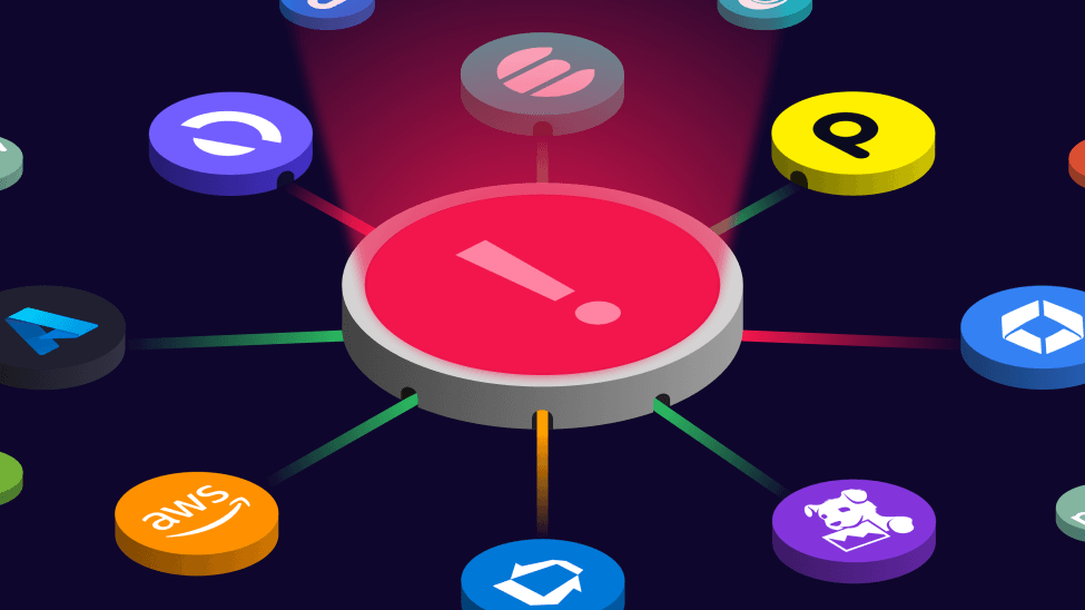
Does this scenario sound familiar? Your data spans multiple systems with bugs and features in Jira, build pipelines in Azure DevOps, and security vulnerabilities in Snyk. But this means your data, reports, and insights are scattered and siloed. So, you end up in endless status and reporting meetings.
What you need is a platform that can handle all your tools, statuses, and reports in one place. It also needs to handle varying styles of release, from Agile Release Trains (ARTs) to true continuous integration/continuous delivery (CI/CD) and DevOps releases where the release itself no longer matters and it is all about keeping on top of KPIs and metrics.
We have exactly what you’ve been looking for: SquaredUp.
What is SquaredUp?
SquaredUp provides near real-time insights and beautiful dashboards on top of data from any platform. You get an analytics engine in the middle and a powerful Knowledge Graph that maps all your data. Data from any system can be brought in, correlated, analyzed, and visualized in powerful dashboards.
Think business intelligence (BI) for engineering teams.
SquaredUp gives you all the reports and data you need at your fingertips so you can kill endless report meetings and gain back some time.
How to get started with SquaredUp
If you could use direct access to all your tools’ data in one place, a single place for all your status updates, and insanely powerful dashboards, here’s how to get started with SquaredUp.
Let’s get Jira & Azure DevOps connected into SquaredUp, build team dashboards, and roll up KPIs from those to a high-level dashboard.
First, sign up for a free SquaredUp account. It takes 30 seconds, and no card information is needed.
When you are logged in, click Settings at the bottom left corner, then the plugins tab.
On the “Select a Plugin” screen, choose Atlassian Jira (under the Issue Tracking group or it can be string searched).
Enter the Display name if you want to change it from the default. This name will be seen in the list of installed plugins. You might have multiple instances of the same plugin configured if you have multiple Jira instances, for example, so we recommend being descriptive here.
Enter your Jira instances URL (into Domain URL) and the email address of the account you will be connecting SquaredUp with.
Copy and paste an API token for the account you want to connect with. This account will need access to the projects you want to pull issues from (read only). Here’s how to create an API Token in Jira.
Uncheck the Workspace checkbox to automatically create a workspace when the plugin is saved. Workspaces are used like folders to group dashboards, scopes, and more. They also have health status, which is derived from the health of their contents. A workspace's health can be rolled up and information from a workspace can be shared with other workspaces using the “KPIs” feature, which we will explore later. Hit Save when done and the plugin will begin populating the knowledge graph with information from your Jira instance.
Repeat steps 1-6 for Azure DevOps. The Azure DevOps plugin is located under the CI/CD group and to connect this plugin you will need your Azure DevOps Organization Name, and a Personal Access Token with permissions to access the resources you want to see on your dashboards (read only). How to create a Personal Access Token. Again, we won’t create a workspace for this plugin. Your plugin config will look like this:
Hit the + button by Workspaces and create a new workspace called “Engineering” then hit save.
How to build dashboards for teams and management in SquaredUp
Now you’ve connected to everything, let’s create an overarching dashboard that will contain information specific to multiple individual teams. This will be the dashboard that rescue you from status collection meetings.
From these dashboards we will roll up specific KPIs to a higher-level overview dashboard – the one your boss will look to for reporting.
Let’s create a dashboard with critical data from each of these teams:
Open bugs
Security bugs
Globalization bugs
Team backlog
Defect clustering
Build Runs
Build Durations
Bug open and close rates
With all this data at your fingertips, you will be well equipped to assess the overall health of the teams that contribute to your products, get a grip on status meetings, and keep your superiors happy with dashboards to replace reporting.
Create a new dashboard
Start by creating a blank dashboard. To do this, click the plus (+) icon next to Dashboards. Rename the dashboard from the default name to “Team \x”, where x is the name of one of your teams. We will then follow these steps for each tile (a block on the dashboard that contains a data visualization).
Configure your first tile – Open Bugs
We are going to start by creating an “Open Bugs” tile.
Hit the plus button in any area of whitespace on your dashboard to create a new tile. Call the tile “Open Bugs” then select Configure.
You are now asked for a Scope, Data Stream, and Visualization. A scope is a subset of the data from a plugin. Scopes, once created, can be used for multiple tiles and are stored within each workspace. View them by clicking the Scopes item under Graph.
We will explain two options for scoping here, but if these don’t match how a team’s total work is defined at your company, select the correct scoping option for your needs. The most common options are to scope to Filters (pre-saved JQL from your Jira instance) or the two we explain next:
Scope by component - Select the Atlassian Jira plugin, then select Components and select the components that this team owns. Or...
Enter JQL – Select Atlassian Jira plugin then in the Data Stream column select + “JQL Query” to copy paste JQL directly into SquaredUp.
Note that our Data Stream has “Cookdown Jira” in its name – that is because we have multiple instances of the Jira plugin configured to pull data from multiple Jira instances.
Once a scope has been selected, the list of data streams is shown.
If you scoped by Component or Filter, select “Issues/Open (anytime)” and hit Save. There is also an “Issues/Opened (Created date)” option, which will return issues sorted by when they were created. That can be filtered either in the tile configuration or dashboard (note the clock in the top right corner). This is useful for seeing the most recent issued opened but not the entire backlog.
If you scoped by JQL, enter a name for your JQL and the JQL itself before hitting save. Note the preview at the top won’t show data until the JQL is saved
(If you scoped by entering JQL, skip to step 6.) If you scoped by component, the list of visualizations available is now shown. Before we look at them, we need to filter everything that isn’t a bug. To do this click “Configure” next to the data stream.
Turn on Filtering and in the options filter on Type Equals Bug (or the Jira issue type that equates to bug in your projects), then hit done.
Now let’s look at visualizations. Take a moment to click through the available visualizations to see how the data is displayed. Then select Scalar and you will be presented with something like the below (assuming you have bugs, sadly. But who doesn't?).
If we hit Save and Close, we have our first fully configured tile. Easy.
How to add Monitoring to a SquaredUp dashboard
You will see that my Open Bugs tile has an orange dot in the top left corner of it, indicating the number returned is higher than desired (green) but not critical (red). Let’s now configure “monitoring” for Open Bugs to set this behavior up and see visual alerts when bugs get too high:
Edit the config of your existing Open Bugs file
Click the Monitoring at the top of the screen
Slide Monitoring to On. Set Monitor type to threshold, Aggregation to count, and frequency can be left at the default (5 mins).
Set the Error and Warning conditions to “on” with “Greater than” operators selected and a sensible number for your teams use. In our example, we want the tile to go red when we have more than 30 bugs and amber where we have over 20 bugs (and otherwise be green). When you’re set up hit save.
You will see the tile gain its colored monitoring dot as expected. You will also notice the dashboard itself gains a colored dot on the lefthand menu.
The status of a dashboard reflects the worst status of all the tiles configured with status. In other words, if you configure two tiles with monitoring and one is green and one is red, the dashboards health is shown as red.
Configuring the other tiles
The process for configuring the other tiles is very similar but with different scopes, filters, and visualizations.
To finish building this dashboard, follow the same steps as for the first "Open Bugs” tile but with the below configuration:
Security bugs
Plugin: Atlassian Jira
Scope: Filter, Component, Labels or JQL
Data Stream: Issues/ Open (anytime)
Visualization: Scalar
Filtering/Grouping/Sorting: Filtering as needed but otherwise none
Globalization bugs
Plugin: Atlassian Jira
Scope: Filter, Component, Labels or JQL
Data Stream: Issues/ Open (anytime)
Visualization: Scalar
Filtering/Grouping/Sorting: Filtering as needed but otherwise none
Team backlog
Plugin: Atlassian Jira
Scope: Filter, Component, Labels or JQL
Data Stream: Issues/ Open (anytime)
Visualization: Donut
Filtering/Grouping/Sorting: Group by = Type, Aggregate column = Column, Aggregate type = Count. Filter as needed
Defect clustering
Plugin: Atlassian Jira
Scope: Filter, Component, Labels or JQL
Data Stream: Issues/ Open (anytime)
Visualization: Donut
Filtering/Grouping/Sorting: Group by = Component, Aggregate column = Key, Aggregate type = Count. Filter as needed
Build Runs
Scope: either to Project(s), Build Pipleline(s) or Release Pipeline(s)
Data Stream: Build Runs
Visualization: Scalar
Filtering/Grouping/Sorting: None
Build Durations (Average)
Scope: either to Project(s), Build Pipleline(s) or Release Pipeline(s)
Data Stream: Build Runs
Visualization: Line Graph
Filtering/Grouping/Sorting:
Filter on the “Source Branch” that equates to your branch if needed
Group by “Start Time (by day)”. Aggregate by column “Run Duration”. Use Aggregate type “Average”.
Issues closed by resolution date
Plugin: Atlassian Jira
Scope: Filter, Component, Labels or JQL
Data Stream: Issues/ Closed (resolution date)
Visualization: Bar chart
Filtering/Grouping/Sorting: Group by = Resolution Date (by day), Aggregate column = Key, Aggregate type = Count. Filter as needed
Issues opened by resolution date
Plugin: Atlassian Jira
Scope: Filter, Component, Labels or JQL
Data Stream: Issues/ Open (created date)
Visualization: Bar chart
Filtering/Grouping/Sorting: Group by = Created Date (by day), Aggregate column = Key, Aggregate type = Count. Filter as needed
How to return data for set timeframes in SquaredUp
One thing we have yet to touch on is the timeframe you wish data to be returned for. You will notice that in the top right corner of each tile’s configuration there is a clock icon. If you click the clock, you can set the timeframe that data is returned for. The default is “Use dashboard timeframe”:
When viewing a dashboard, you will notice a similar clock icon in the top corner which changes the timeframe for all times set to “Use dashboard timeframe”:
In general, tiles are most effective when set to “Use dashboard timeframe”, but there are times when you want to see less/more data. For example, the above dashboard shows Build Durations for the last 30 days to flatten out anomalies and focus on overall build time (rather than breakages/issues that cause the build to run long). If the dashboard’s timeframe was 12 hours, this tile would expose anomalies much more clearly. That can be useful too but has a different purpose.
To speed up creating our second team dashboard we will simply clone the first one that we created above and modify the scope to match the things your next team, or group of teams, owns.
How to clone a dashboard
To clone a dashboard:
On Dashboard 1 click the Settings gear icon then click the </> icon
Copy and paste the JSON displayed. The configuration for all dashboards is stored in the JSON format.
Create a new Dashboard by clicking the + by Dashboards.
Click the Settings gear then click </> icon
Paste in the JSON
Now we need to modify the tile scoping using the UI as we did for dashboard 1 to reflect the second team’s scope of ownership.
Build an overview dashboard that rolls up KPIs for the boss
We’ve built two teams dashboards, so now you will want to define some KPIs and have them rolled up to a third dashboard for reporting purposes.
How to create a KPI in SquaredUp
To start, we must define the types of KPI we care about rolling up. For the purposes of this blog, we will define one called “Open Bug”. We created a tile for this in the first team dashboard but now we want to report on it as a KPI.
To create this KPI Type:
Click on settings, go to KPIs then click Add KPI Type. Give your KPI the name “Open Bugs” then hit Save
Click KPIs in the left hand nav bar and you will see the KPI “Open Bugs” but with no data yet. This area of SquaredUp is where your KPIs will show up when configured.
Go back to your first team dashboards, enable editing, then edit your “Open Bugs” tile. Once in the editing view, click the KPI Tab at the top.
Slide KPI to “On”, give your KPI a name (the name of the team in this case), and select the KPI type you created earlier. Then click Save and Close.
Repeat steps 3 + 4 to create KPIs from other team tiles in any of your dashboards.
Go back to KPIs in the left hand nav bar and you will see the tiles you defined as KPIs are rolled up.
Create a new top-level dashboard called “Reporting Roll Up”. Place a new tile on it and hit Configure.
Set the scope to SquaredUp > KPI > one of the KPIs you created (EG Team/ Auth from my example above).
Select the Open Bug data stream and Scalar visualization
When saved, you have created a KPI on the roll up dashboard. Configuration changes to the KPI on the team dashboard will flow through to this dashboard. This is a great capability for allowing teams the autonomy to own how they present and consume data for the things they own while still rolling up KPIs that Project Managers, Directors, and VPs want to see in a standardised format
Repeat these steps for your other dashboards Open bugs so both teams Open Bugs are defined as a KPI and rolled up to the Reporting Roll up dashboard
Rolling up dashboard status to an overview dashboard
As you will have seen earlier in this guide, our team dashboards have a status (red/amber/green) where one or more of the tiles on the dashboard have monitoring configured. The overall health of these team dashboards can be rolled up to our Reporting Roll Up dashboard too.
Create a new tile on the Reporting Roll Up dashboard
Configure the tile’s scope to SquaredUp > Dashboards > select all the team dashboards you have created
Select Data Stream Health
Select Visualization Blocks, then click Save and Close
You will see that the status of the dashboards is rolled up. These colored blocks can be clicked to drill down into the specific dashboard to see why they are red/amber/green. You can roll up the health state of dashboards from any workspace so the degree of separation between the VPs reporting dashboard and the teams themselves can be greater than shown in this example. A higher-level overview is often more desirable than digging into data that requires explanation or a certain level of understanding to interpret.
Pulling together the Reporting Roll up
On our Reporting Roll Up dashboard we should now have our KPIs and team dashboard overall health status. Let’s round this view out by adding an overall release status from Jira and an Open Bugs count from our KPIs.
Add the Open Bugs KPI
The scope for this tile is SquaredUp > KPIs > the two team KPIs. The data stream is Open Bug (our KPI type) and the Visualization is Scalar. The Data stream requires Grouping configuring as below:
We also set up Monitoring as per the below configuration.
It is worth noting that there are other ways to create this Open Bugs total, like querying Jira for it directly. The downside of querying Jira directly for a VP level reporting style dashboard is that, if the teams themselves change their KPIs (e.g., the components that contribute to them), there is a risk the reporting dashboard is not updated at the same time. By configuring roll ups using the method shown, this risk is removed.
Release status from Jira
The releases in our Releases grid tile in the top left of our Reporting Roll Up dashboard are being pulled from Jira’s Fix Version list:
Scope to Atlassian Jira > Project and select one or more project from which to pull the Fix Version data
Select the Releases Overview data stream
Configure the data stream and filter out Released Fix Versions (assuming you don’t want to see them)
Select the Table visualization and configure it
Turn off any columns of data you do not want to see by clicking the eye icon
Click the Monitoring tab and enable Monitoring
Select Monitor type of State, Column of State, and leave the default Frequency
Hit Save and close
You will have created a release table complete with monitoring. The links you can see on this table take you through to Jira.
Note that the way we defined monitoring (by state) has some hard coded definitions for red/amber/green:
Unshipped releases
Red = current date is greater than release date
Amber = Release date is less than 7 days away and progress is less than 80%. Or progress is 100% and ‘Released’ is false. Or progress is 100% and release date is not set.
Green = all other cases
Shipped releases
Red = marked as shipped but progress is not at 100%
Amber = marked as shipped but no release date provided
Green = all other cases
Go build your software project management dashboards
And that's how you build SquaredUp dashboards for software project management to get total visibility of your tools and KPIs. All that power for free. Download SquaredUp now and get started.