
Ready for total visibility?
Our free tier includes:
- 2 users
- 3 data sources
- 10 monitors
- Unlimited dashboards
Our free tier includes:
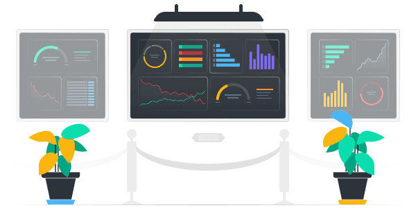
See our smart dashboards in action. Real-life use cases and example dashboards, brought to you by the SquaredUp community.

A simple, smart way to track my reading life

A quick look at a dashboard on M365 license allocation for Teams, Exchange, OneDrive, and SharePoint.

This dashboard integrates with our HaloPSA plugin to provide a view of ticket activity, improving visibility and response times.

Visualize and monitor your critical workflows in GitHub Actions with SquaredUp.

Monitor Google Workspace user activity, admin actions, and security posture at a glance via SquaredUp's Web API plugin.

See how easy it is to report on your Microsoft 365 metrics with SquaredUp's dedicated M365 plugin. We look at Sharepoint site numbers and Outlook platform distribution as examples to get you going.

A fun dashboard displaying LinkedIn analytics using the CSV plugin.

This dashboard tracks carbon emissions by service type, helping organizations visualize and manage their environmental impact. It shows monthly trends and key metrics such as total emissions, changes from the previous month, and specific service contributions.

This cost optimization dashboard displays savings recommendations, reserved instance advisories, and a detailed cost comparison by resource group.

This dashboard is focused on governance and compliance, with the goal of enhancing cloud security and operational hygiene. A huge side benefit is that it also helps with cutting costs!

This dashboard provides a comprehensive view of application health and performance. It is the main dashboard we look at every morning.

This dashboard provides an overview of the support tickets that have been raised in Zendesk for the last 24 hours.