CircleCI’s powerful features help dev teams automate and accelerate their build pipelines—while also allowing the flexibility that engineering teams need to build, test, and ship code across environments and tool stacks.
But with scale comes complexity—tracking and observing your CircleCI pipelines and workflows across different teams throughout your organization will become increasingly challenging as you grow.
As such, there are a few reasons you might be looking to build a CircleCI Dashboard that aggregates and connects pipeline and workflow data across projects and teams:
- To visualize CircleCI pipeline status alongside data locked away in other cloud resource—like your Kubernetes clusters, Cloud platforms, and more
- To share build pipeline or workflow data with someone who doesn’t have access to the console
- To roll up the status of all your production-level CircleCI pipelines to a wallboard or single pane of glass
- To set up more complex monitoring and send alerts to Slack, Teams, or ServiceNow
- To automate the creation or modification of Dashboards (e.g., with every new deployment)
- To monitor a complex product made up of many microservices in one place
- To enable Command and Control teams to see deployment and test errors at-a-glance
Whatever the reason, we’ve put together a write-up to help you plug into your CircleCI environment and surface any of its data in one place, for easy alerting and sharing, using SquaredUp.
Getting started with SquaredUp
Creating an account and getting started with SquaredUp is simple. Just head over to squaredup.com/sign-up to register for a free account.

Once you’ve created and verified your account, you’ll be able to quickly connect to CircleCI and start dashboarding! Let’s walk through the process.
Step 1: Connect to CircleCI
SquaredUp has more than 60 out-of-the-box plugins (with more on the way) that enable you to connect to a range of cloud platforms, dev tools, databases, service management tools, and more. Feel free to check out our other blog posts to learn more after this walkthrough.
Upon creating your SquaredUp account, you’ll land in an empty workspace where you’re prompted to add a data source. For context, workspaces are where different teams can organize their data and knowledge across the tools they use, so feel free to leverage this organizational feature as you expand your monitoring.

Click ‘add data source’, and choose from over 60 options. You can search a specific data source using the search bar at the top, or browse using the filters on the right hand side.
Once you've selected CircleCI, you’ll be prompted to configure your data source by choosing a display name and inputting any other required information ((API keys, domain URLs etc). These requirements differ slightly between tools.
To get all available out-of-the-box dashboards automatically loaded up with your live data, simply hit the bottom toggle “Install Sample Dashboards”.
You also have the option to restrict access to your data source, which is available to everyone in your organization by default.

It’s worth noting that SquaredUp doesn’t store your data (i.e., won’t create yet another database). SquaredUp plugins are lightweight connections that leave the data where it is and stream it on demand via API (e.g., when viewing it on a Dashboard).
Step 2: Visualize your data
Once you’ve successfully configured the CircleCI data source, we index all of the objects and object types you have access to.
Out-of-the-box dashboards
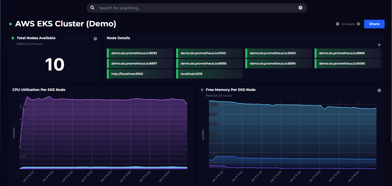
To get you started, this is the dashboard we offer out-of-the-box. If you'd like the details of what data is included, check out the CircleCI dashboard breakdown.
Projectsdashboard

Customize your dashboard
Out-of-the-box dashboards can easily be edited to make them your own. Simply hit the “edit” button in the top right.
Hover over an empty space on your dashboard and hit '+' to add a new data, image or text tile. You can then choose from a selection of pre-defined scopes.
To edit an existing tile, simply click ‘edit’ in the top right to add monitoring, KPIs and more.
Building your own dashboard
If you’d like to build your own custom CircleCI dashboard, our revamped dashboard designer now makes it even easier. Find the metric you're looking for, shape the data, configure your visualization and add monitoring, all in a few clicks.
The tile editor allows you to configure the data from CircleCI and display it in any way you wish.
Let’s jump right in and build our dashboard.
In the left nav bar, click the ‘+' sign next to the 'Dashboards’ tab.
You can add a title and description for your tile at the top of tile editor.
There are 3 tile types to choose from: Data, Image or Text. For the purpose of this example, let's start with data.

Configure the tiles on your dashboard by choosing the following (steps may vary depending on which data stream you select):
- Data streams: a list of all available data streams for your chosen data source
- Objects: scope the data stream to show particular objects you want to visualize (only necessary if you select a scoped data stream)
- Visualization: choose from line graph, stacked bar, gauge visualization and more.
- Monitoring: set custom monitoring thresholds and receive notifications to Slack, teams, email, or custom webhook.

The visualization options are shown on the right of the dashboard designer. Which visualizations are offered to you depends on the data available, for example Line Graph will only be offered if there is time series data.

Customize your tiles even further by sorting, filtering or grouping the data, and setting custom timeframes.
From here, we can continue adding and adjusting tiles until we have created our ideal dashboard.
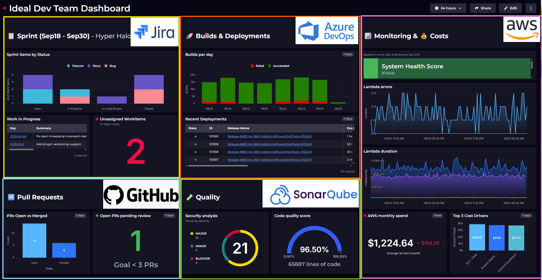
Of course, each team and organization will want to dashboard different data in different ways. We hope the example above offers some inspiration and insight into the many ways you can visualize different data streams from CircleCI.
See how SquaredUp Product Manger, Dave Clarke, uses the beautifully simple dashboard designer to create an AWS dashboard visualization in under a minute:
Getting more out of your CircleCI Dashboard
Getting a Dashboard up and running is a great start, but it’s just that...a start.
SquaredUp enables you to get so much more mileage out of its integration with CircleCI. Here are just a few possibilities:
- To put these insights to use, you might want to set up monitoring and configure notifications (e.g., for email, Slack, Teams or ServiceNow). You can easily manage all your monitoring and notification settings in one place. Just head to the ‘Monitors’ tab of your workspace.
- When you monitor individual tiles within a dashboard, you can then roll up status to the dashboard and workspace levels, enabling your team to easily report KPIs across different teams in your organization.
- Additionally, you could scope this Workspace to include additional related tools—Azure DevOps, AWS CloudWatch, GitHub, Zendesk, etc.—to better connect, aggregate, and monitor crucial data across your dev tools, all in one place.
- Check out our blog on how to get complete CI/CD pipeline observability to ensure you're getting the most out of your CI/CD dashboard.
If you or a teammate uses Azure DevOps as your CI/CD tool, check out our article on Azure DevOps dashboards.
Good luck, and happy dashboarding!
Visualize over 60 data sources, including:


JFrog Artifactory
By SquaredUp
Import your Artifactory data into SquaredUp for monitoring and visualization.