Sameer Mhaisekar
DevRel Engineer, SquaredUp & Microsoft MVP

Looking for the ultimate dashboard solution for Microsoft SCOM?
If SCOM is a key monitoring platform for your business, we recommend exploring our dedicated Dashboard Server product. It runs on-prem and is designed specifically for SCOM.
For SCOM integration with our SaaS product, SquaredUp Cloud, continue reading below...
In this blog, we will use the SquaredUp Cloud SCOM plugin to connect to our SCOM Management Group and take a look at what we get out of the box. SquaredUp Cloud is a data visualization tool that can connect to 70+ data sources – perfect for bringing varied data together in a single pane of glass. Display your SCOM data alongside other important metrics.
Head over to the workspace you created and add a data source. Note that that are two SCOM versions, the traditional on-prem one and the recently released cloud version, SCOM Managed Instance (MI). We will work with the former since it is by far the most widely used.

Next, to connect to the SCOM management group, I need to fill out a few basic fields.

Enter your management server, which is part of this management group, and the SquaredUp <Agent Group>, which is required to send your on-prem data to SquaredUp Cloud securely.
Once that is done and the connection is established, you will notice the objects being indexed from your SCOM environment.

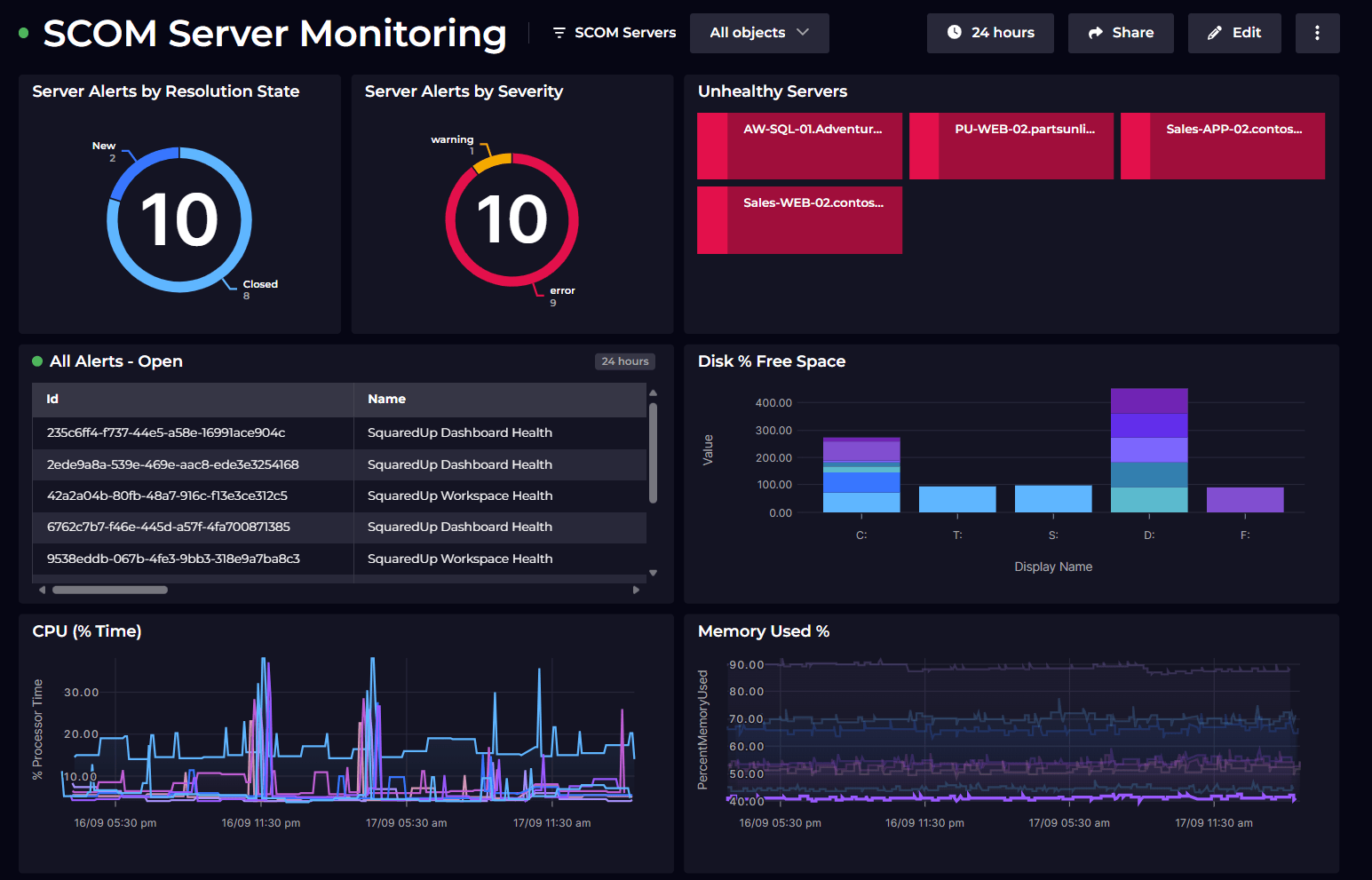
The SCOM plugin comes with a bunch of really useful out-of-the-box dashboards including dashboards for actionable alerts, server health, DB health and so on. Let's explore a couple of them.
There's one called "NOC Operator" – this dashboard is your classic wall-mounted dashboard for your 1st level teams to quickly identify issues as they come and optionally assign them to more specialized teams based on the nature of alerts.

Another dashboard pertains to the health of the Management Servers themselves. In this variable-driven dashboard, you can pick and see the KPIs for the health of the Management Server(s).

The last one to look at is the Alert History dashboard. This one gives us information about the alerts that have been raised for the specified period of time and someuseful insights on them.

There are a couple more of these dashboards, which I encourage you to explore.
Now, let's get hands on and create our own dashboard.
In your workspace, hit the + icon and choose to create a new data tile. To see all the data streams related to this plugin, let's filter it down to "SCOM". Here's the result.

As you can see, there are a few data streams about Alerts, one about health state, and a few for performance.
Let's start with the Alerts one. We know that SCOM is driven by a class-based object model where we have classes as parents/children and instances discovered by them. For now, let's see what alerts are raised on the instances of class "Logical Disk".
We'll select the "Alerts by Class" data stream.
Next, in the parameters section, search for and choose the right class you're looking for.

As you can see, after selecting my class, it shows that I have one alert. In most cases, I'd advise filtering the request, so you don't overwhelm the API, resulting in errors.
On the next modal, you can select the timeframe for the data requested. The default is 24 hours, but if I select 7 days, you can now see I have a few more alerts raised within that timeframe.

Let's try health states. Let's display the health state of all my Windows Servers. For this, I'll choose the "Health State" data stream in a new tile.
Since all the objects in SCOM do have a health state, you may be presented with quite a long list. To filter this out, you can either search for the specific servers in the search box, or filter the list down by "Host" type, or add a custom filter by "Class" and then select the one you want. In this case, it'll be Microsoft.Windows.Computer

Here, choose all the servers you want to display the health of. And voila, we have another tile ready.

Note that the colors in the dashboard correspond to the health state of that object in SCOM.
Now for the last tile, let's plot some metrics. There are some preset metric data streams in there already, but we will demonstrate the "Metric" data stream since it is the most generic.
In a new data tile, find and select the "Metric" data stream.
Again, there are a number of objects that have performance data for them, so we will have to filter this list down. For now, I'll apply the "database" type as a filter, which returns all my objects that are of that type.

For this demo, I'll choose the SCOM OperationsDW as my database. On the next page, you'll be able to choose the specific metric for this object by selecting the right Object Name and Counter Name. Both these boxes will provide you with a drop-down of what counters are being collected for this object in SCOM.
I selected my object and counter, and I'm done! A nice line graph of all the active connections to this database over a period of time.

You can now play around with other metrics and data streams to build the dashboard of your dreams!
SquaredUp monitoring makes it easy to turn our dashboard tiles into monitors, so that we can be alerted about changes. For example, I want to be notified when the number of active connections to my database goes beyond a certain number.
Simply switch over to Monitoring on the right and toggle it on. Here you can define your error condition. For example, mine is "send me an alert if the number of active connections crosses 20".

Not only can I see this in SquaredUp, I can also set up Notifications to let me know if any alerts are raised so I can be aware anytime. They can be sent as an email, as an IM message or forward it over to any of your automation workflows.
If the monitor triggers, we can receive a notification by email, Slack, Teams or via any system that supports webhooks. Read our docs to learn more about monitoring.
Sharing is very simple in SquaredUp. We just hit the share button and have the option of inviting a user to the workspace, or sharing just the dashboard via a link:

From this point on, you can try out different data streams and queries to create dashboard of your dreams. In addition, we also have many other plugins including Azure, Confluence, AWS and many more!
Sign up for free and explore the power of SquaredUp yourself!
When it comes to SCOM, what SquaredUp Cloud can offer is quite literally the tip of the iceberg. To unlock the full potential of what SquaredUp can do with your SCOM deployment, including more vizualizations, more features, drilldowns, application mapping and monitoring, check out our dedicated SCOM product SquaredUp Dashboard Server.
Happy dashboarding!
DevRel Engineer, SquaredUp & Microsoft MVP


Getting started with SquaredUp is free and easy. Our free tier includes: