
CloudWatch is a powerful tool for monitoring anything across your AWS stack – from applications and services to infrastructure and network. But there are several reasons you might want to build an AWS CloudWatch dashboard somewhere outside of the CloudWatch console.
Why create an AWS CloudWatch dashboard with SquaredUp
Our dashboards offer the following benefits:
- No extensive knowledge required around the AWS console required
- Visualize multiple AWS accounts and regions in one place
- Integrate with your full tech stack. Combine CloudWatch with data from other sources
- Share CloudWatch dashboards via a simple URL with people without access to the console
- Automate dashboard creation or modification (e.g., with every new release)
- Powerful dashboards out of the box
- Data manipulation capabilities. Combine related data from different sources into actionable insight using SQL Analytics
- Flexible notifications that alert users via their channel of choice (email, Slack, Teams, ServiceNow, etc.)
Here's an example of a dashboard that combines data across regions and accounts.
And here's another example that shows the wide range of data sources it is possible to connect to and visualize alongside CloudWatch.
If either of these appeals to you, read on to learn how easy it is to create an AWS CloudWatch dashboard in SquaredUp! We'll walk you through step by step.
Getting started with SquaredUp
Creating an account and getting started with SquaredUp is simple. Just head over to squaredup.com/sign-up to register for a free account. SquaredUp is free to use with unlimited dashboards for up to 3 users.
Once you’ve created and verified your account, you’ll be able to quickly connect to any data and start dashboarding! Let’s walk through the process.
Step 1: Connect to AWS CloudWatch
SquaredUp has more than 60 out-of-the-box plugins (with more on the way) that enable you to connect to a range of cloud platforms, dev tools, databases, service management tools, and more. Feel free to check out our other blog posts to learn more after this walkthrough.
Upon creating your SquaredUp account, you’ll land in an empty workspace where you’re prompted to add a data source. For context, workspaces are where different teams can organize their data and knowledge across the tools they use, so feel free to leverage this organizational feature as you expand your monitoring.

Click ‘add data source’, and choose from over 60 options. You can search a specific data source using the search bar at the top, or browse using the filters on the left hand side.
Once you've selected AWS, you’ll be prompted to configure your data source by choosing a display name and inputting any other required information (Access keys, Account details, target regions, etc.).
SquaredUp supports IAM User and IAM Role based authentication when configuring the AWS data source. While IAM User authentication gives you all the permissions associated with that user, IAM Role authentication provides a much more granular approach and instead restricts you to the permissions associated with a configured role. It is a highly flexible approach that means you can grant permissions as granularly as you like without ever having to contend with a host of changing keys.

To get all available out-of-the-box dashboards automatically loaded up with your live data, simply hit the bottom toggle “Install Sample Dashboards”.
You also have the option to restrict access to your data source, which is available to everyone in your organization by default.
It’s worth noting that SquaredUp doesn’t store your data (i.e., won’t create yet another database). SquaredUp plugins are lightweight connections that leave the data where it is and stream it on demand via API (e.g., when viewing it on a Dashboard).
Step 2: Visualize your data
Once you’ve successfully configured the AWS CloudWatch data source, we index all of the objects and object types you have access to.
Out-of-the-box dashboards
To get you started, there are several dashboards we offer out of the box.
- EC2 dashboard
- Lambda dashboard
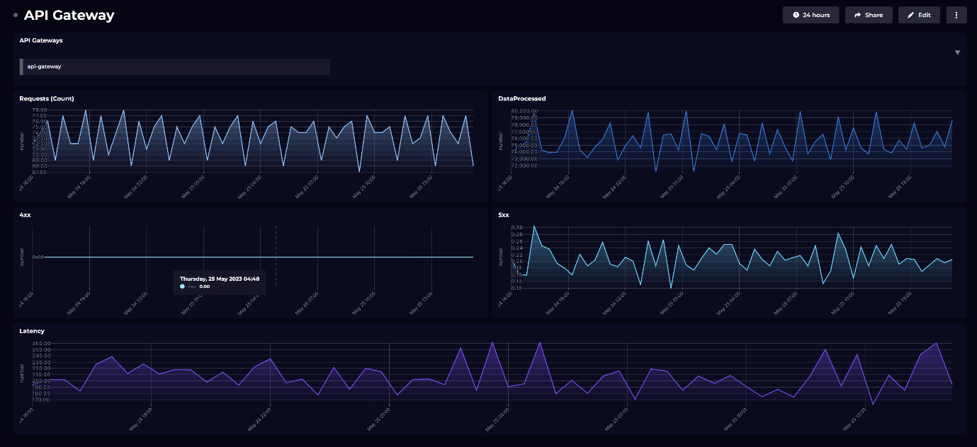
- API Gateway dashboard
- Elastic Load Balancer dashboard
- Route 53 dashboard
- S3 dashboard
As an example, this is the Lambda dashboard. It shows metrics such as Lambda logs, duration, errors, and so on. To check out our other out-of-box dashboards head over here.

These metrics are helpful for understanding the amount of traffic being served by Lambda and could also highlight issues if total number of errors is high.
Step 3: Customize your dashboard
Out-of-the-box dashboards can easily be edited to make them your own. Simply hit the “edit” button in the top right.
Hover over an empty space on your dashboard and hit '+' to add a new data, image or text tile. You can then choose from a selection of pre-defined scopes.
To edit an existing tile, simply click ‘edit’ in the top right to add monitoring, KPIs and more.
Build your own custom dashboards
Building a dashboard from scratch is easy too.
In the left nav bar, click the ‘+' sign next to the 'Dashboards’ tab.
You can add a title and description for your tile at the top of tile editor.
There are 3 tile types to choose from: Data, Image or Text. For the purpose of this example, let's start with data.

Configure the tiles on your dashboard by choosing the following:
Data streams: a list of all available data streams for your chosen data source. For CloudWatch in particular, there are 3 data streams that you can choose from - CloudWatch Metric, CloudWatch Metrics Query and CloudWatch Logs.

If you choose CloudWatch Metric, you'll be prompted to choose the objects you want to fetch metrics for.

And next, you'll get a dropdown list of all the metrics that are available to you for the object type that you've selected. For example, the metrics below are for object type "Hosts":

If you choose CloudWatch Logs, you will be prompted to choose the Log Groups where your logs are stored and the query for getting the data.

Shaping:
Next, you can customize your tiles even further by sorting, filtering or grouping the data, and setting custom timeframes.

Visualization: choose from line graph, stacked bar, gauge and more visualizations.

Which visualizations are offered to you depends on the data available, for example Line Graph will only be offered if there is time series data.
From here, we can continue adding and adjusting tiles. For example, this AWS CloudWatch dashboard here that is made entirely using CloudWatch Metrics and Logs:

However, as it is very likely, you may also want to display this data alongside data coming from somewhere else. That is entirely possible as well, like what I've done here:

Here you'll notice I've got data from not only AWS CloudWatch, but many other tools you may be interested in. This includes Azure data, Application Insights data, Cost data and so on.
The fun doesn't quite end here. Using a feature called SQL Analytics, you can even combine datasets coming from different data sources and manipulate that to get actual insights, not just isolated dashboards.
Step 4. Set up monitoring and notifications
The ideal dashboard alerts users about critical events so that there is no need to perform routine checks.
On a tile you've created, navigate to the "Monitoring" section and you'll notice you can set alerts, based on a condition of violation.
For example, I can set an alert to notify me when the number of Log Events crosses a threshold.

Even better, I can send this alert as a notification via the channel of my choice, such as Slack, Teams, Email, or to a custom webhook.

You can even opt for a dashboard / tile preview to be included in your alert, so you have the necessary context before opening up the dashboard!
Step 5. Share your AWS CloudWatch dashboard!
Lastly, now that you've created this AWS CloudWatch dashboard, you can easily share it with other teams without them having access to your tools or interfering with your data. You've got two options:
1) Manually share as a link
Simply click "Share" in the top right and select your permissions settings. It's then as simple as sharing a link.

2) Automatically send a dashboard or tile on a routine, according to your rules
On top of our regular Notifications, which trigger when a Monitor changes state, we have a Notification API feature that lets you build that trigger into other tools. Here are some examples of workflows we use internally:
- Every morning at 9am, send the live sales dashboard to the team email group. Just a quick micro-report that brings together key stats from across their tools.
- Five minutes before any check-in meetings, use Power Automate to drop my project summary dashboard into Teams... who's unprepared now!
- Add an action to our company Slackbot so it can post a channel's pinned dashboard live and on-demand.
- When an issue is caught in an Azure DevOps pipeline, send the build summary dashboard to the DevOps team.
See how SquaredUp Product Manager, Dave Clarke, uses the beautifully simple dashboard designer to create an AWS dashboard in just a few clicks:
Create a free account to try creating a AWS CloudWatch dashboard for yourself.
Happy dashboarding!
Visualize over 60 data sources, including:

AWS CloudWatch
Plug directly into AWS CloudWatch for instant dashboards, reports and analytics.
Continue learning

Dashboard Story
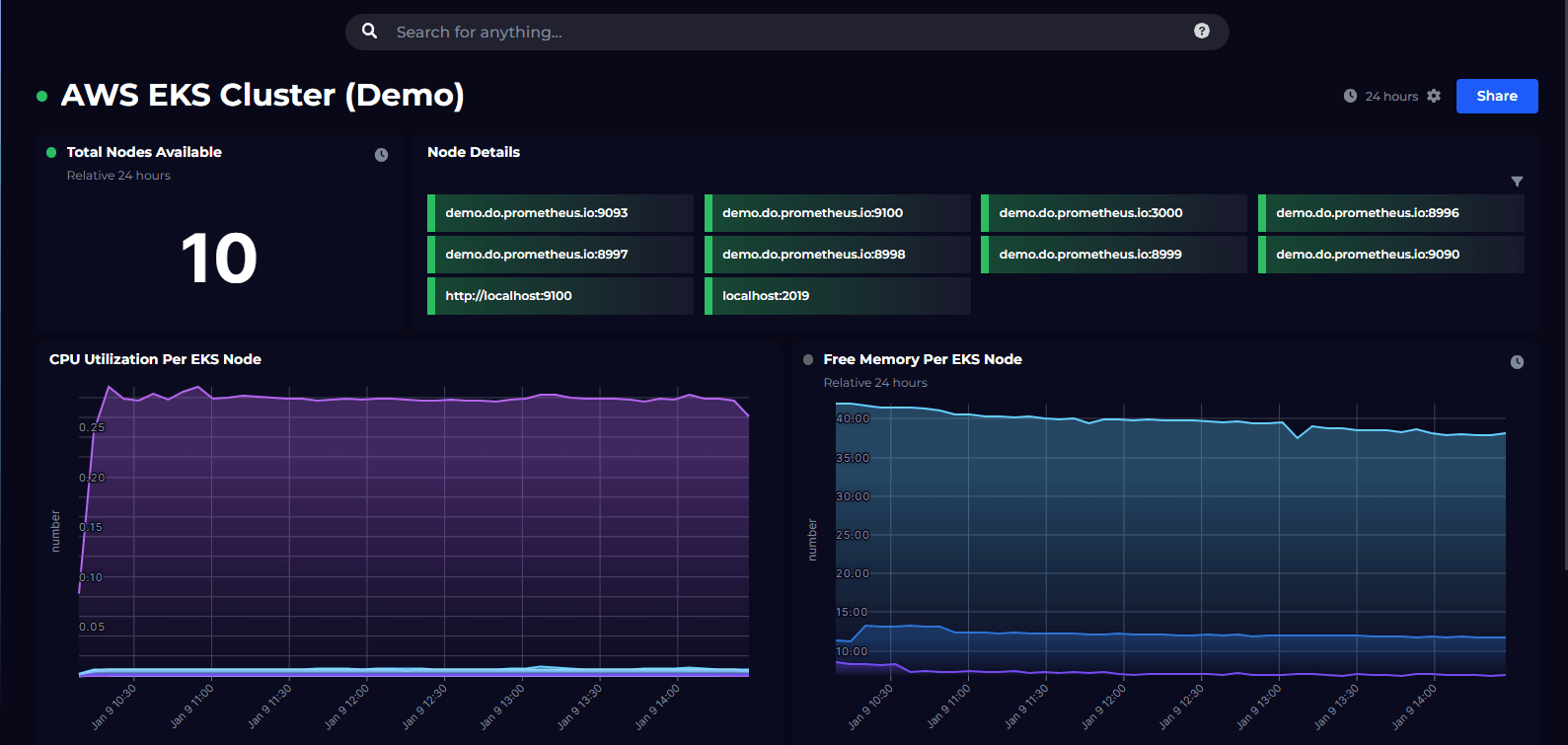
Monitoring AWS EKS using Prometheus

Dashboard Story
