Sameer Mhaisekar
DevRel Engineer, SquaredUp & Microsoft MVP


Join me on my Azure Monitor journey as I learn all there is to know about the platform. Check out my series introductionfor a brief overview and a bit about me (tl;dr former SCOM admin, avid tech blogger, SquaredUp tech evangelist).
So far, we’ve learnt how to collect data (part 2) and pull it into Azure Log Analytics (part 3), as well as how to actually work with the data using Kusto (part 4). Now it’s time to explore how we can visualize this data, make dashboards, share them with other teams in our organizations and so on.
Unfortunately, dashboarding in Azure is not very sophisticated, and neither is it centralized. There are a few approaches you can take to visualize this data, and the visualization options you get depend on the approach you decide to go with. If you're interested, check out our direct comparison of Azure portal dashboards vs. SquaredUp.
As we know by now, there are some host-level platform metrics that are available to us for each resource we create, out of the box. These metrics start collecting data from the time the resource is created, with no additional configuration. For example, if you navigate to the “Overview” option in a VM, you see a bunch of perf views there, already collecting data:

Also, if you navigate to “Metrics” under the Monitoring section, there are a bunch more metrics available to you to simply select and view. I’ve highlighted some of the key options below:

Of course, you can also do the same from Azure Monitor:

I’d encourage you to take a look at this bit of documentation from Microsoft to better understand metrics and their types:
https://docs.microsoft.com/en-us/azure/azure-monitor/platform/data-platform-metrics
Once you’re done with creating your charts, you can then pin these graphs to a dashboard, which we will discuss further below.
Also, remember how we said in part 2 of this series that the guest-level monitoring data you’re collecting using the agents is stored as logs in the workspace? To show graphs with that data, you’ll need to extract it using a query. An example of that is also discussed below.
We’ll start with the most obvious option. After logging in to your Azure portal, search “Dashboard” in the global search.

Once you’re in, you’ll see a screen like the following:

Click on the “New dashboard” option to create a new dashboard. You’ll be presented with a canvas on the right and a gallery of “tiles” on the left. These tiles are basically different visualizations that you can select.

You can now give it a fitting name, and you can just go on adding the tiles that you’re interested in. Note that if you can’t see some specific data or can’t select the metrics, etc. you should check if you have the right permissions to access that data.
You’ll notice while adding tiles that you can move them around, change their size, etc. Note that while some of the tiles are ready-to-go, others will require you to write queries for the data you want to see.
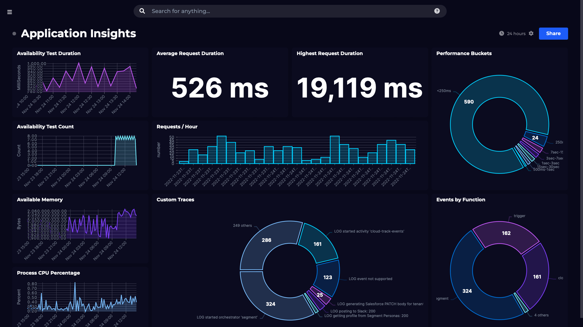
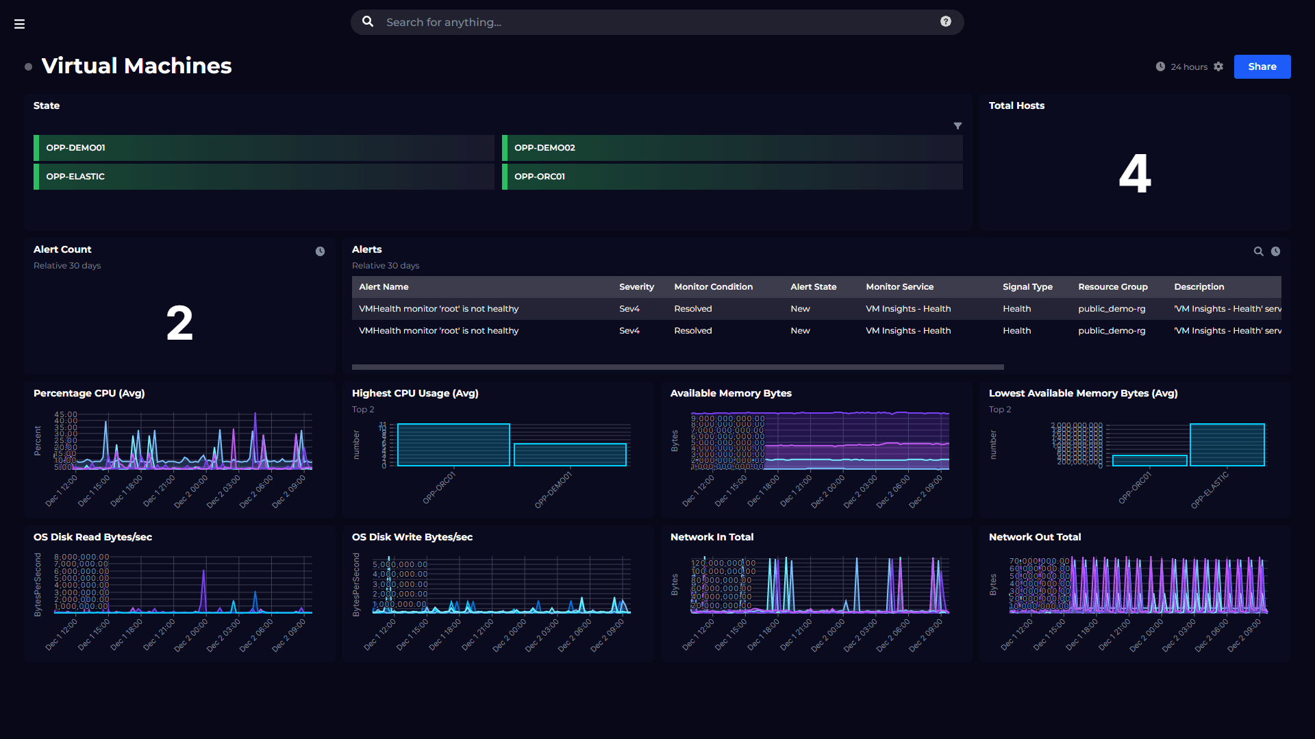
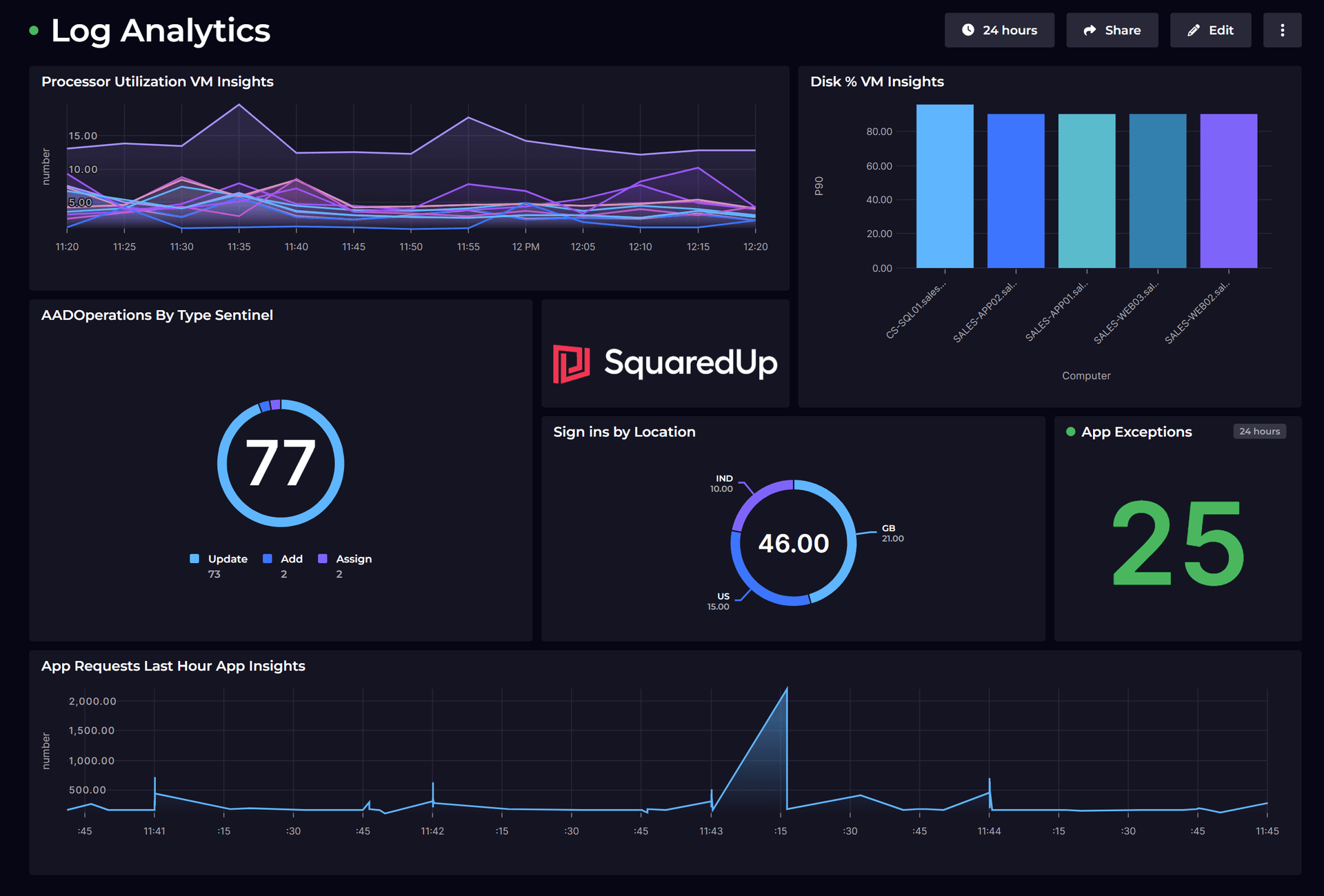
So, after adding a bunch of tiles onto my dashboard, this is what I’ve put together:

This dashboard is, for now, private to you. If you want to share it with others, hit the “Share” button at the top. Save it in the subscription you wish, and hit publish.

You may be thinking – “okay cool, but I want to restrict access to only to a certain team.” Sure, you can do that. Like so:

Navigate to your workspace and go to the Logs section.
After you’ve written the query, you can pin the results of this query directly to your dashboard. For example, I have a query like this:

Great, that shows me the result I want, but this won’t look very appealing on the dashboard. So I will switch to the “Chart” section in the results pane below and see if I get a chart for my results.

Oh cool, I do! As you can see, I can also switch between different chart visualizations to choose the one that works best. Let’s pin this to the dashboard instead. Hit the “Pin to dashboard” button at the top and it prompts you to select the dashboard you want to pin it to. If you don’t see the one you’ve created, make sure you’ve published that dashboard first.

I’ve selected the dashboard we just published, named SMDemoDashboard. Let’s see how it is looking now!
Navigate to “shared dashboards” from the homepage and select the one you just created.

There it is! I’ve changed the name of the chart to “% Processor time” so it’s easy to find.
There are actually a lot of things you can simply pin to dashboards directly. Remember the solutions we deployed earlier? You can also browse into them and simply pin those charts to dashboards as well. Like this Update management solution we talked about in part 3 of this series:

Workbooks let you combine log analytics, metrics, text and parameters into reports with deeper insights.
Workbooks are fantastic because they let you present a lot of data in one visualization, which you can then pin to dashboards. To read more about workbooks from Microsoft, click.
Let’s try and create our first workbook. Navigate to your log analytics workspace and look for “Workbooks”:

Once selected, you can create your workbook from a template, or choose from some pre-built workbooks.
Let’s create ours using the default template.
First thing you’ll notice is the sample query, it’s output and at the bottom, options to add more visualizations with a query, a metric, parameters, etc.

Right, let’s play around with this and see if we can add something shiny in here to see.
I added a sample plain text, a heartbeat query in the donut and the Disk read bytes metric in the workbook for example.

Ideally, you’d use workbooks to make reports much more useful than this. The Microsoft documentation I linked earlier has a detailed set of instructions about that. You can pin this workbook to the dashboard (as always) for quick access.
And there you go! You are now familiar with ways to present your data from a log analytics workspace in easy to interpret visualizations, and share them with your teams.
If you are interested in a flexible Log Analytics dashboard that allows you to combine data across multiple tools, check out our Dashboard Gallery.

Next, we are starting on another major component of the Azure Monitor – Application Insights. Just like we did for Log Analytics, we will talk about collecting data in Application Insights, working with the data collected and visualizing it for easy interpretation. Stay tuned!
We’ll discuss a new topic each week, so stay tuned. Drop your email address in the box below to get notified with each new post, or join our dedicated Slack channel to be a part of the discussion.
Next chapter: Getting started with Application Insights
DevRel Engineer, SquaredUp & Microsoft MVP


Getting started with SquaredUp is free and easy. Our free tier includes: